Master Book Illustration Art: Workflows & AI Tools 2026
You can finish a manuscript and still feel oddly stuck. The words are there, the chapters are in order, but now you're staring at a blank space where the book's visual identity should live, and every choice feels expensive, permanent, and a little technical.
That's usually the moment authors realize book illustration art is not a decorative add-on. It's part of the reading experience, part of the pacing, and part of how a book feels when someone opens it for the first time.
Table of Contents
- What Book Illustration Art Really Means for Authors
- Visual Styles and How to Choose the Right One
- Building a Consistent Illustration Workflow Across Your Book
- AI-Assisted Illustration Versus Hiring a Professional Illustrator
- Technical Specifications for Print and Ebook Illustrations
- Using Perspective as a Narrative Tool Beyond Basic Camera Angles
- Licensing, Budgeting, and Finding the Right Creative Partner
What Book Illustration Art Really Means for Authors
A first-time author often thinks of illustrations as the last polish step, something you add after the text is finished. In practice, book illustration art changes how a reader moves through the page. It can slow a scene down, speed it up, clarify a concept, or give emotional weight to a moment that the words only hint at.
Illustration is storytelling, not decoration
A picture book proves this most clearly because the art carries a large share of the narrative load. Middle-grade fiction uses spot illustrations differently, often to break up heavy text and give the reader a visual reset. Nonfiction leans on diagrams, labeled artwork, and process images to reduce confusion, especially when the subject is abstract or technical.
That means the first real question is not “What style do I like?” It's “What job do the illustrations need to do in this book?” If the art needs to create pacing, then page turns matter. If it needs to explain a process, then clarity matters more than atmosphere. If it needs to build a fantasy world, then continuity matters across every scene.
Practical rule: decide whether the illustration is carrying mood, information, pacing, or all three, then brief the art around that job.
The author's visual brief starts before the first sketch
An illustrator can't solve a blurry brief. The author has to know how many images the book needs, where they sit on the page, and what the reader should understand from each one. A cover-ready character might look wonderful in isolation, but if the same character has to appear in 12 scenes and still read as the same person, the job becomes a production system, not a single drawing.
That's why book illustration art has to be planned like part of the manuscript. You're not only commissioning images, you're building a visual language that needs to stay coherent from opening spread to back matter. If you skip that step, the result often looks inconsistent even when each individual image is strong.
A good illustration plan answers three questions, who is the reader, what should they feel, and what should they understand at a glance?
For authors, that shift in mindset changes everything. The art stops being a separate creative expense and becomes part of the book's structure, the same way chapter order or scene transitions are part of the prose.
Visual Styles and How to Choose the Right One
A style decision should start with reproduction, not taste alone. A lush painted look may feel perfect on screen, but some styles survive print better than others, especially when they need to be reproduced cleanly across paperback, hardback, and ebook versions. The late-Victorian jump in illustration volume shows how quickly publishing changes when the medium supports the art, and the broader history of illustration economics makes one thing clear, the style has to fit the production system as much as the story. In Britain, the move from earlier illustration counts to 2,773 illustrations in books from 1881 onward and the jump to 55 illustrations per book in that period shows how format and output method can reshape what publishers are willing to print. Historical illustration study
Match style to the book's purpose
Watercolor works well when softness matters. It suits bedtime picture books, nostalgic memoir, and stories that need warmth at the edges. It can feel fragile in print if the detail is too subtle, so the artist has to protect contrast and avoid muddy mid-tones.
Digital painting gives more control and is easier to revise. It's a strong fit for fantasy, middle-grade fiction, and projects that may need multiple rounds of editing. It also adapts well to mixed print and digital delivery because highlights, shadows, and color balance can be tuned without rebuilding the image.
Vector or flat art is the most predictable when scale and clarity matter. Educational nonfiction, branded children's material, and simplified chapter openers often benefit from this style because shapes stay crisp and readable. That same clarity can feel too rigid for a lyrical story if the composition needs a hand-made emotional texture.
Pen and ink works when line quality carries the mood. It can feel classic, witty, or precise depending on the hand behind it. Collage and mixed media bring texture and surprise, but they also ask more from production because layered elements can flatten strangely if scanned or compressed badly.
Think about the reader before you think about the palette
The most common mistake is choosing a style because it looks beautiful on a mood board, then discovering it doesn't support the reading experience. A younger reader often needs strong shape contrast and clear character silhouettes. A nonfiction reader needs visual hierarchy. A literary audience may care more about atmosphere than literal realism.
A useful way to frame the decision is to ask what the art should do when the reader glances at it for three seconds. If the answer is “orient them,” choose clarity. If the answer is “draw them into a feeling,” choose texture and tonal depth. If the answer is “explain a concept fast,” choose a style that keeps edges and labels clean.
For authors who want to experiment with AI-assisted visual development, the style choice also affects prompting. A structured tool, including the AI illustration generator inside Storyloft, is easier to direct when you already know whether you're aiming for flat art, painterly scenes, or line-driven compositions.
Useful filter: if the style depends on tiny brushwork, layered transparency, or subtle surface detail, ask how it will look once the printer, scanner, or ebook converter touches it.
That's the difference between a style that merely looks good in a portfolio and a style that survives a published book.
Building a Consistent Illustration Workflow Across Your Book
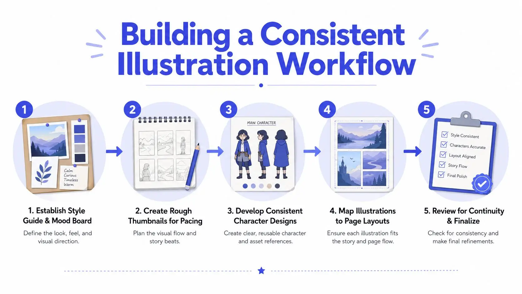
Consistency is where illustration projects usually wobble. One scene looks right, the next scene drifts, and suddenly the character's coat, hair shape, or proportions feel unrelated to the rest of the book. That problem isn't about talent, it's about process.
Lock the visual rules before page one
Start with a mood board, but don't stop there. A mood board only tells you what feels right. A working style guide tells the illustrator what must stay the same, including character proportions, palette boundaries, line weight, and recurring props. For series work or picture books, that document becomes the guardrail that keeps the book from changing personality halfway through.
Character consistency usually fails in small ways first. A jacket changes shade. Eyes drift wider. A pet loses a distinctive marking. Those shifts look minor in one spread and glaring across a full manuscript. A turnaround sheet and expression studies solve that by defining what the character looks like from the front, side, and in emotional states that recur throughout the story.
Practical rule: if a trait matters to recognition, define it in a reference sheet, don't trust memory to preserve it across 15 or 20 images.
Use thumbnails to protect pacing and text space
Rough thumbnails are where the whole book can be saved from expensive rework. At this stage, you're not judging beauty. You're checking whether the art leaves room for text, whether the gutter will eat a face or hand, and whether the page turn lands on the right emotional beat. A spread that looks elegant in isolation can fail badly once it's inside a book block.
This is also where ebook and print versions need to be thought through together. A composition that depends on a full-bleed panoramic spread may work in print, then collapse into a cramped mobile ebook view. The fix is often not a separate illustration system, but a layout plan that allows the same core art to be cropped or repositioned without losing the scene.
The workflow guide at Storyloft's knowledge base on illustrating characters and scenes is useful here because the hardest part isn't making a single image, it's keeping the same visual logic across a whole project.
Review for continuity before final export
By the time final art is finished, continuity errors are expensive to correct. A checklist review should compare clothing, palette, scale, and page relationships scene by scene. It should also test whether text areas still remain clean after the art is placed in context, because an illustration that crowds the manuscript can force a late layout change.
This is one reason many indie authors benefit from a single project workspace rather than a scattered tool stack. It keeps sketches, references, and layouts in one place, which makes continuity checks much easier to perform before anything is exported.
AI-Assisted Illustration Versus Hiring a Professional Illustrator
A first-time author often reaches this decision after the manuscript is already taking shape. The question is not whether AI or a human illustrator is better in the abstract, but which path can hold the book together from page to page. That means thinking about character continuity, perspective choices, and how the art will behave in both print and ebook formats before the first image is finalized.
AI-assisted illustration and professional illustration can solve overlapping problems, yet they do so with very different workflows.
Compare the trade-offs objectively
AI is useful when speed matters and the project needs visual exploration without a long commission cycle. It can support concept art, mood studies, and draft scenes, especially when an author is still deciding whether the book should feel playful, cinematic, restrained, or highly stylized. It also helps when you want to test several directions before committing to a final illustration plan, much like sketching a room layout before choosing the furniture.
A professional illustrator is stronger when the book needs interpretation, subtle storytelling, or tight character continuity across many pages. Human artists notice narrative friction that software usually misses. They can shift pose, composition, and emotional tone in response to the text, which matters when a character has to look like the same person in a scene, a close-up, and a page-turn reveal.
Good fit for AI: early concepts, rapid mockups, stylized series assets, and projects where the author is still refining the visual direction.
Good fit for a human illustrator: final art, character-driven scenes, and books where every page has to carry a consistent emotional register.
The choice also affects production discipline. AI can generate many options quickly, but that only helps if you already know which details must stay fixed, such as clothing, hair shape, prop placement, or the angle of a recurring setting. A human illustrator usually builds those anchors more deliberately, which can reduce continuity drift later in the book.
Licensing clarity matters more than many authors expect
AI output also needs a clear licensing posture. If you plan to use generated art commercially, the platform's terms matter, especially around reuse, exclusivity, and derivative editing. Storyloft's commercial-use guidance for AI illustration is relevant because the question is not only whether the image looks right, but whether you can publish it with confidence.
For authors who want to work on style references before commissioning or generating scenes, a useful outside resource is Armox Labs' mastering style transfer for designers. It helps clarify how style can be translated rather than copied, which is a practical distinction when you are directing visuals without flattening originality.
Hybrid workflows often make the most sense
Many books sit between the two extremes. AI can create a visual starting point, a mood study, or a rough scene layout. A human illustrator can then redraw, refine, or complete the final image set. That approach gives authors room to explore without asking one person or one tool to solve every stage of the project.
Storyloft's AI book illustration generator fits that middle ground because it is designed for manuscript-aware scene and character generation rather than isolated art experiments. Used well, that kind of tool works as a planning layer, not a substitute for editorial judgment.
The strongest workflow is often the one that matches the book's actual risk points. If your pages depend on polished final spreads and the same characters appearing believably from scene to scene, a professional illustrator still has the advantage. If you need fast development, internal experimentation, or a lower-friction way to begin shaping the visual language, AI can be a practical first step.
Technical Specifications for Print and Ebook Illustrations
Technical mistakes usually show up late, which is why they're so painful. A file can look fine on a laptop and still print soft, crop awkwardly, or shift color once it's inside a production pipeline. The safest approach is to set the canvas correctly from the beginning and treat export settings as part of the creative process, not an afterthought.
Resolution and file setup
For most raster artwork, 300 DPI/PPI at final trim size is the production standard. Black-and-white line art needs more protection, because edge detail is where blurring becomes obvious, so the recommended floor is 800 DPI minimum with 1200 DPI ideal for line drawings. If you create art smaller than the finished page and scale it up later, the effective resolution drops, and the line quality can start to soften.
The simplest workflow is to work at the final book size plus bleed from day one. If the illustration is being scanned, keep the master at the highest practical source quality, then downsample only when needed for export. For file formats, TIFF is the safest print choice, JPEG can work if compression stays low, and EPS is mainly suited to black-and-white line art rather than photos or painted work. Temple University's art file prep guide is explicit on those practical distinctions.
Color space and bleed
Print wants CMYK, ebook delivery usually wants RGB. That difference matters because RGB illustrations often look brighter on screen, then shift when converted for press. Saturation can drop, shadows can darken, and certain tones can move enough to change the mood of the page. One production guide recommends capping total ink coverage at 240% ink saturation to reduce drying and color-loss issues, which shows how much the print process itself can shape the final image. Childrens book print-ready artwork guide
Full-bleed pages also need 0.125 inches (3 mm) bleed on all sides, with the final art matching trim size exactly so the cut doesn't leave white edges. That's one of the most common invisible errors in self-publishing, because the art can look correct in a PDF preview and still fail once it's trimmed.
| Specification | Print (CMYK) | Ebook (RGB) |
|---|---|---|
| Color space | Required for press and POD | Used for screens and most ebook delivery |
| Bleed | 0.125 inches (3 mm) on all sides for full bleed | Usually not required for standard ebook viewing |
| Resolution | 300 DPI/PPI at final trim size, higher for line art | Resolution still matters, but delivery is screen-based |
| Preferred file types | TIFF, high-quality PDF, JPEG only with low compression | RGB JPEG, PNG, or ebook-exported image formats |
Build two deliverables from one source file
The cleanest production model is a dual-output workflow. One source illustration can become a CMYK TIFF for print and an RGB JPEG or PNG for ebook use. That way you're not redrawing the art twice, you're adapting the export settings to the channel.
This is especially important for authors using integrated writing and illustration tools, because the platform should preserve editable source files until the end of the pipeline. Flattening too early makes color correction and final layout much harder than it needs to be.
Using Perspective as a Narrative Tool Beyond Basic Camera Angles
Most advice about perspective stops at the obvious camera angles, close-up, medium shot, wide shot, bird's-eye, worm's-eye. Those are useful, but they only scratch the surface of what perspective does in a book. The deeper question is not how to make a scene look realistic, it's how to make the scene read clearly and feel right.
Break linear perspective when the story benefits
Linear perspective is only one option. Chinese scroll-style vertical perspective and Persian miniature flat perspective are both valid compositional systems when realism gets in the way of storytelling. They can make a scene feel more spacious, more symbolic, or easier to read when a rigid vanishing point would flatten the narrative.
That matters in picture books and stylized fiction because the reader's eye needs guidance more than it needs photographic accuracy. A child reading a crowded spread may understand the story faster if the illustrator simplifies depth, stacks action vertically, or flattens background space to keep attention on the character.
Choose perspective by readability, pacing, and mood
Perspective can slow a page down when the book needs suspense. It can open a page out when the story needs breath. It can also isolate a character emotionally by placing them in a composition that feels too large, too small, or too compressed. The right choice depends on what the reader should feel before they even process the text.
That's why “technical correctness” is not the same as “effective illustration.” A perfectly measured room can still be a bad choice if the scene needs emotional focus. A flatter system can work better if the aim is narrative clarity rather than spatial realism.
A scene that is easy to read is often stronger than a scene that is perfectly constructed.
For authors directing illustrators, the useful language is not just “make the perspective better.” It's “make the character feel isolated,” or “keep the room readable,” or “flatten the background so the action stands out.” That wording gives the artist a story goal instead of a geometry problem.
Licensing, Budgeting, and Finding the Right Creative Partner
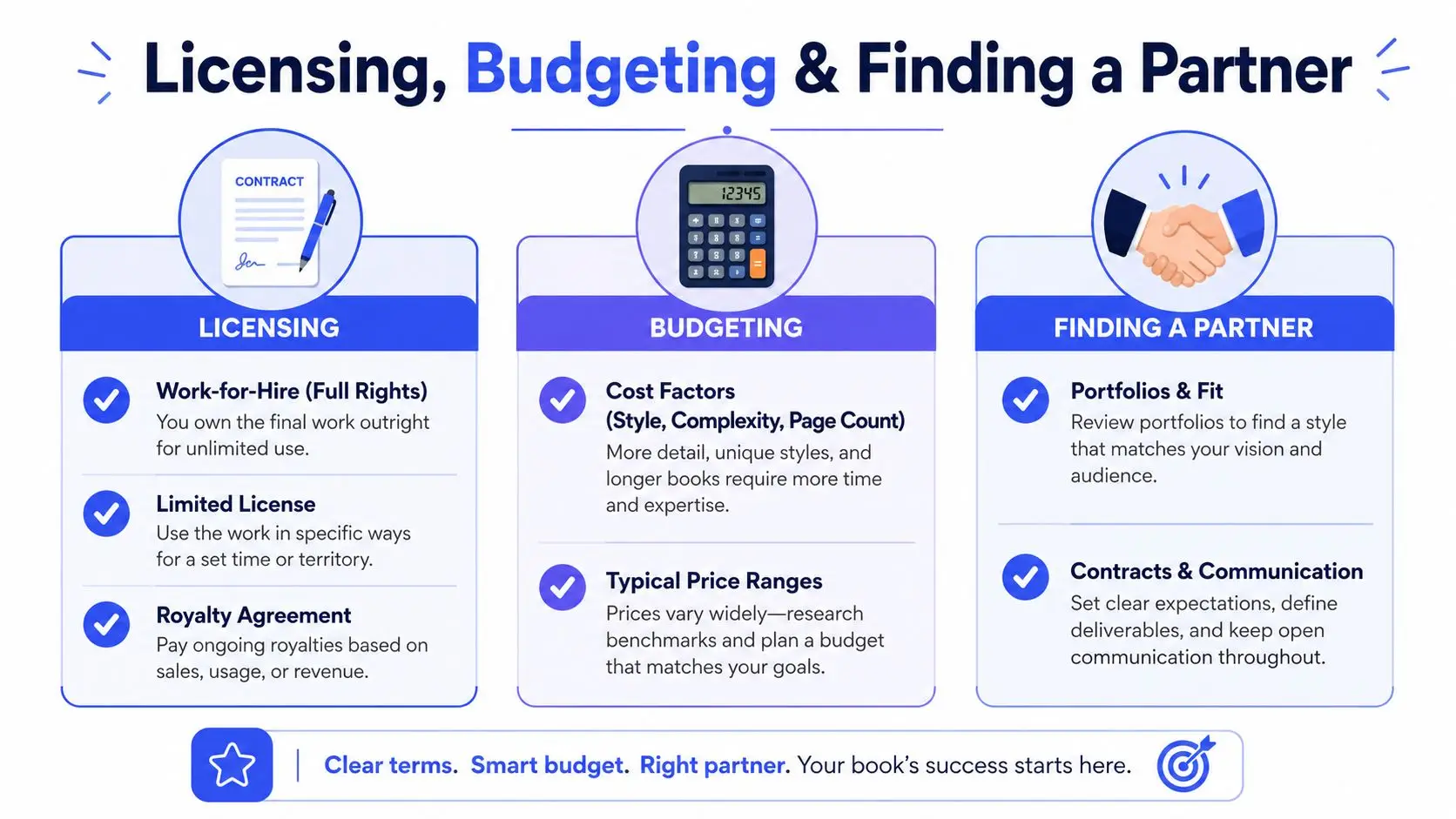
A book can have strong visuals and still run into trouble if the rights are vague. Before you hire an illustrator, decide whether the project needs full ownership, a narrower usage license, or a royalty-based arrangement. Different publishing paths ask for different contract terms, and the agreement should match how the book will be used in print, ebook, and promotional formats.
Start with rights, then budget
Work-for-hire gives the author more control over the finished art. Limited licenses can be enough for some indie projects, especially when the illustrator keeps portfolio rights and the author only needs book-specific usage. Royalty-sharing arrangements are less common for tightly controlled illustration programs, but they can make sense when both sides want long-term upside from a series.
Budget planning should follow scope, not the other way around. Style complexity, page count, revision rounds, and whether the book needs print plus ebook assets all affect the workload. A simple portfolio review is never enough, because a lovely sample image doesn't tell you whether the artist can repeat the same character cleanly across many scenes or keep lighting consistent when the file has to work in both color spaces.
That last point catches many first-time authors off guard. A spread that looks rich on screen can shift in print if the illustrator has not planned for paper stock, trim size, and export settings at the start.
Evaluate portfolios for consistency and delivery readiness
Look for more than beauty. Check whether the illustrator can keep a figure on-model across multiple images, whether they've handled your genre before, and whether they understand print-ready delivery. If their samples only show single images with no evidence of sequence work, ask for a multi-scene example or a series test.
It also helps to ask how they communicate revisions. A good partner can take notes without losing the project's center. That matters more than many authors expect, because illustration work involves iterative decisions, not one perfect approval round.
A useful portfolio review also shows how the artist handles recurring details. Hair color, costume pieces, room layout, and even the angle of a character's hands need to stay stable from one chapter illustration to the next. If those details drift, readers notice the inconsistency even when each individual image looks polished.
Portfolio test: can the artist show the same character, same mood, and same visual language across several pages without the work drifting?
For authors who want to check commercial-use terms for AI-assisted or generated assets, the commercial-use overview in Storyloft's knowledge base is a useful reference point before any final file is released.
A strong illustration project starts with a clear visual brief, a workflow that protects continuity, and file settings that won't collapse at print time. Storyloft brings drafting, AI-assisted illustration, scene creation, and publishing workflows into one place, so you can keep the manuscript, visuals, and output formats aligned while you work. If you're planning a book and want a single workspace for illustration, layout, and export, visit Storyloft's integrated illustration workspace and start mapping your visual plan there.