Cover Design: A Step-by-Step Guide for Authors
You can have a strong manuscript and still feel stuck the moment you open a blank cover file. The title is set, the story is solid, and yet the thumbnail on Amazon still has to do the hard work of stopping a distracted reader mid-scroll. That's where cover design stops being a creative indulgence and becomes a retail decision.
Table of Contents
- Why Your Book Cover Is a Marketing Tool First
- Building Your Creative Brief and Concept Direction
- Composition and Typography Principles That Sell Books
- Sourcing and Creating Cover Imagery
- Print Versus Ebook Technical Specifications
- Testing Your Cover Before Launch
- Streamlining Your Workflow with Integrated Design Tools
Why Your Book Cover Is a Marketing Tool First
A lot of authors start cover design by asking, “What feels right for my book?” That's a fair question, but it's the wrong first question if the cover has to sell in a tiny rectangle on a retail page. I've seen authors spend days choosing between two beautiful concepts, only to discover that neither one reads clearly at thumbnail size. A cover can be elegant and still fail.
That tension isn't new. Book covers began shifting in the 1820s, when mechanical bookbinding made cloth covers cheap enough to replace leather and printable with new color methods, and by the 1920s the dust jacket had become a true design surface rather than just a protective wrapper, as outlined in this history of book cover art. Once covers became visible selling surfaces, the job changed. They were no longer just about protection, they were about persuasion.
The cover is the first sales conversation
For online retail, that persuasion happens fast. Readers don't inspect the whole jacket or read your back matter first. They see a small image, often while comparing several books in the same genre, and decide in seconds whether the cover looks familiar enough to trust.
Practical rule: if a reader can't tell the genre at thumbnail size, the cover is doing too much of the wrong work.
That's why the best covers don't chase personal taste first. They signal category, tone, and reading promise. A thriller cover that looks literary may win design praise and lose clicks. A romance cover that looks too abstract may feel tasteful and still miss the shelf code readers expect.
The modern cover is a marketing asset because discovery is visual and compressed. In a physical store, the spine and front panel matter. Online, the front cover has to carry nearly all the load. That's also why Storyloft's book cover importance guide matters in practice, because it frames the cover as part of the book's market entry, not just its packaging.
What good design actually serves
Good cover design serves recognition first, then differentiation. It should tell a reader, “This is for you,” before it tries to say, “Look how original I am.” That doesn't mean every cover has to look generic. It means the creative choices need to work inside reader expectations, not against them.
The biggest mistake is designing for admiration instead of conversion. A beautiful cover that feels vague at small size can lose to a plainer one that reads instantly. The market rewards clarity, not hidden meaning, especially when the reader is browsing fast and comparing many options at once.
Building Your Creative Brief and Concept Direction
Before opening any design tool, build a brief that turns your book into decisions. If you skip that step, you'll keep making changes for aesthetic reasons instead of strategic ones. The easiest way to waste time in cover design is to start with colors and fonts before you know what the cover has to communicate. I've watched that mistake create endless revisions.
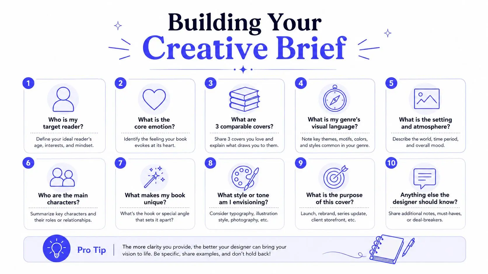
A fast brief you can complete before design starts
Start with the reader, not the manuscript. Write down who the book is for in plain language, then list three to five comparable covers from the same category that are currently performing well in the market. You're not copying them. You're identifying the visual language readers already know how to read.
Practical rule: if your comparable covers all share a common image style, text treatment, or color mood, that pattern is part of the genre grammar.
Use these questions to shape the brief:
- Who is my target reader? Name the person, the reading mood, and the buying context.
- What emotion should the cover trigger first? Pick one core feeling, not five.
- What are three comparable covers? Choose books that share your shelf space, not just your theme.
- What visual metaphor fits the book? A literal scene, a symbolic object, or a type-led idea.
- What should a reader assume in two seconds? Genre, tone, and promise.
Once those answers exist, the cover direction stops being fuzzy. A book described as “dark and mysterious” might become a muted palette with high contrast, a narrow focal image, and restrained typography. A book that needs to feel intimate and warm might lean toward softer shapes, lighter spacing, and a more human image style. The point is not to choose the most dramatic idea. The point is to choose the idea that says the right thing fastest.
Turning vague mood words into visual choices
Design briefs fail when they stay abstract. Words like “powerful,” “elegant,” or “haunting” don't mean much until they're translated into visual terms. A designer can work with “deep navy, sharp serif, central object, strong negative space.” They can't work well with “make it more magical.”
That's also where genre boundaries matter. Some conventions should stay intact because they help discovery. Others can be bent if your book has a clear reason to stand apart. The useful question is always whether the deviation helps the reader recognize the book faster or just makes the cover feel clever to you.
A short brief is enough if it contains the right decisions. One paragraph, five comparable covers, one emotional target, and one visual metaphor can save days of back-and-forth. That discipline also makes it easier to compare concepts later, because every draft is measured against the same criteria instead of changing taste.
Composition and Typography Principles That Sell Books
A cover can have strong art and still fail if the hierarchy is wrong. Readers need to know where to look first, what matters second, and how to process the title at a glance. That's why composition and typography should be treated as sales tools, not decoration. If the eye has to hunt, the cover is already losing.
The modern bestseller market makes that especially clear. A design study of 701 U.S. New York Times number-one bestsellers from 2000 to 2024 found that photographic covers peaked in 2012, when they made up 68% of the list, and it also showed sharp genre shifts, including thriller covers using white on 45% of covers in 2001 and 92% in 2002, while romance moved from 50% illustrated covers in 2023 to 71% in 2024, reaching 100% by 2025 in the data set cited in the study video presentation. The lesson is simple. Reader expectations and platform behavior change, and the visual language of a strong cover changes with them.
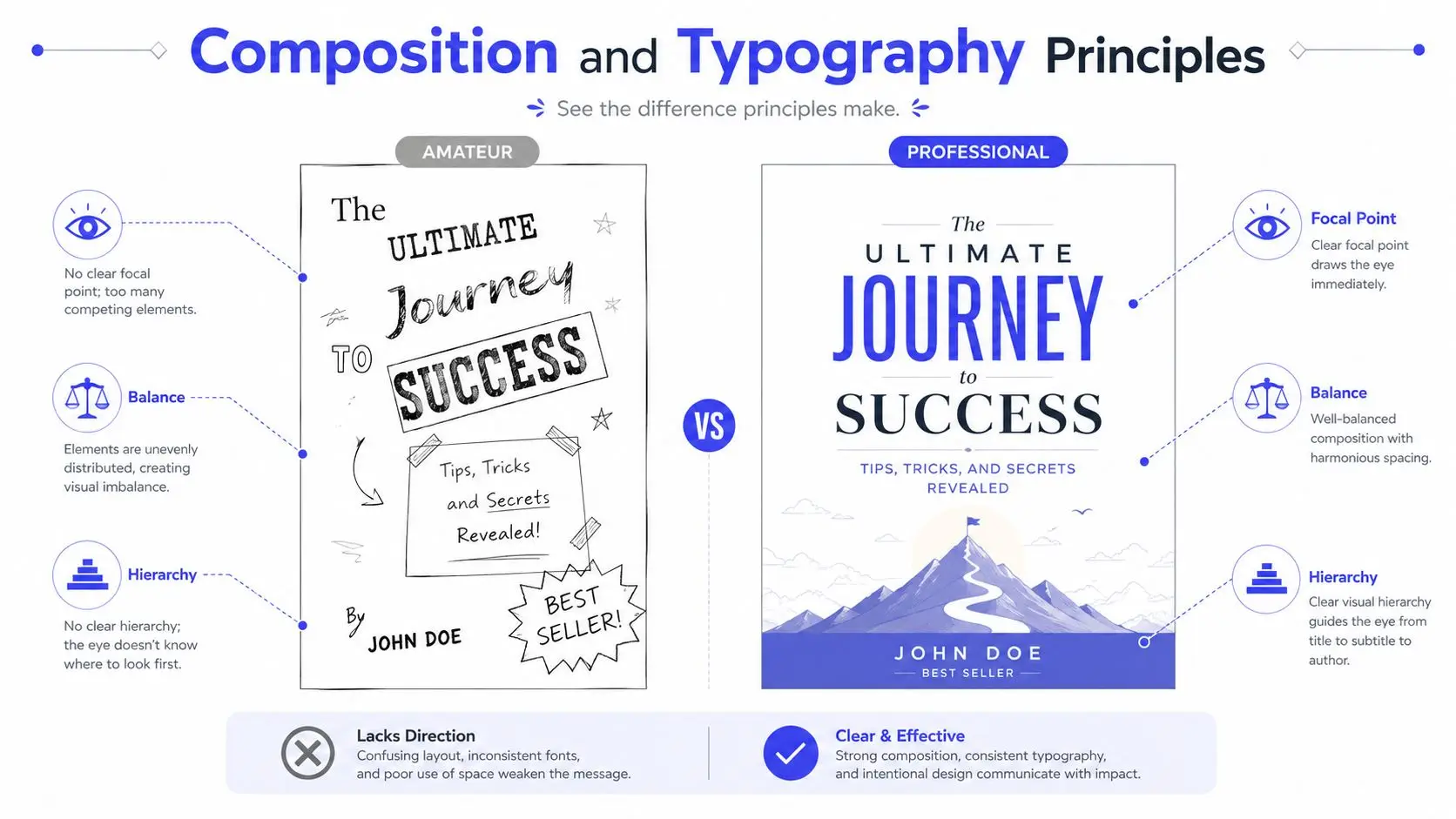
Hierarchy, contrast, and the thumbnail test
The first job of composition is to create a focal point. That can be a face, an object, a striking title lockup, or a simple symbolic image. The point is singularity. Multiple competing ideas make the cover feel busy, and busy covers collapse when shrunk down.
Contrast matters just as much. Light text on a pale background, or dark detail packed into a dark field, disappears fast. A strong cover usually gives the title room to breathe and keeps secondary elements secondary. That doesn't mean the page has to be empty. It means the eye has to know what wins the battle for attention.
A cover should remain readable when it is reduced to the size readers actually encounter on retail platforms.
For practical font pairing advice, the SendPhoto guide to fonts for photos is useful because it treats type as part of the image, not an afterthought. That mindset helps avoid the common error of choosing a decorative font that looks stylish in a large mockup but turns muddy in a listing tile.
Typography also carries genre. Thriller type often needs sharper tension and higher contrast. Romance can lean softer, more expressive, and more emotionally open. Literary fiction often survives on restraint, which is why a quieter title treatment can work there when the concept is strong. Nonfiction usually needs the title to promise clarity and authority immediately.
Genre signals that readers recognize instantly
The best covers borrow from reader memory just enough to be legible. That's why category bestsellers are so important during concepting. If your title treatment, spacing, and image language all fight the genre, the reader has to do extra decoding work. Most won't.
The details matter at the small end. A title that looks elegant at desktop size may become a blur on mobile. A beautifully arranged author name can sink if it competes with the image instead of supporting the hierarchy. That's why I check designs at thumbnail scale before I care about how they look in a mockup with perfect lighting.
Storyloft's book cover best practices page reflects the same practical logic. Good cover work isn't about maximizing effects. It's about making sure the right information is readable in the most common browsing conditions.
Sourcing and Creating Cover Imagery
Every cover image choice comes with trade-offs. Stock photography is fast and flexible, but it can feel generic if you're not selective. Commissioned illustration gives you more control and more originality, but it takes more coordination. AI-generated imagery can move fast and help you explore concepts, but it still needs human judgment to avoid weak anatomy, inconsistent lighting, or the flatness that makes a cover feel synthetic.
Choosing between stock, illustration, and AI
Stock works best when the concept depends on a realistic scene, a person, or a clean symbolic object and the market already accepts that visual style. You still need to screen for overused images and licensing limits, because a stock choice that appears on too many covers loses distinctiveness quickly.
Illustration gives you the cleanest path for custom branding. It's especially useful when the book needs a stylized universe, a symbolic composition, or a controlled mood that photography can't deliver without looking staged. The downside is time, because detailed briefs and revision rounds can stretch longer than authors expect.
AI is strongest as a concept engine. It can generate visual directions quickly, and it's especially useful when you need to test several moods before committing. If you want a practical primer on create AI-generated art, that resource is helpful for understanding how style transfer thinking can shape the output. I'd still treat AI as part of the art pipeline, not the whole pipeline.
Here's the decision logic I use:
- Use stock when speed matters and the genre already supports recognizable photographic language.
- Use illustration when the book needs a distinctive, ownable world or symbol.
- Use AI when you need rapid concept exploration, then refine the strongest direction manually.
- Use mixed methods when you want AI for exploration and human cleanup for final polish.
What to watch for when you generate or refine art
AI imagery has its own failure modes. Fingers, jewelry, hems, light direction, and eye placement can all betray the final piece if you don't inspect carefully. The fix is not to accept the first usable image. The fix is to generate variations, compare them on the same canvas, and reject anything that breaks consistency.
If you're working in Storyloft's AI book cover design workflow, keep the cover in dialogue with the manuscript so the imagery matches the book's actual tone and not just a prompt's surface description. That matters because a cover can be technically polished and still feel disconnected from the story.
For AI or any other art source, I'd look for three things before approval:
- Lighting consistency so shadows and highlights feel physically believable.
- Style consistency so the art matches the genre promise.
- Thumbnail clarity so the main subject survives compression.
The goal isn't perfection in a vacuum. The goal is a believable, readable image that supports the title instead of competing with it. If the artwork feels clever but doesn't hold together when reduced, it's not ready.
Print Versus Ebook Technical Specifications
A lot of cover problems have nothing to do with taste. They come from the file itself. Wrong dimensions, missing bleed, poor spine math, and barcode placement issues can turn a good design into a rejected upload or a reprint headache. Print and ebook covers solve related but different problems, so they need different setups.
| Specification | Print (Paperback) | Ebook |
|---|---|---|
| Canvas | Full wraparound cover with front, spine, and back | Front cover only |
| Bleed | Required for edge-to-edge artwork | Not used |
| Spine | Must be sized to page count and paper stock | Not applicable |
| Barcode | Usually placed on the back cover | Not used |
| File focus | Prepress accuracy and wraparound alignment | Screen readability and crop-safe layout |
| Color | Prepared for print workflow | Prepared for digital display |
The print file has more moving parts
For print, the back cover and spine are part of the design, not afterthoughts. IngramSpark's cover guidance notes that the back cover should prioritize the description and reviews, with the author bio, ISBN, and barcode pushed into the lower quarter, while the spine should keep the title largest and the author name and imprint secondary, as explained in its book cover design basics article. That structure matters because print buyers see the whole package.
The spine also needs discipline. Too much text, or text pushed too close to the wrap edge, creates a sloppy result when the book is on a shelf. I've seen covers that looked perfect on screen but failed once the wrap was imposed. A proper print layout checks the trim size, the spine width, and the safe areas before export.
Ebook files need different priorities
Ebook covers don't need a spine or back panel, but they do need to read clearly in a digital storefront. That means the focal image and title need enough separation to survive crops and preview panes. A design that relies on the back-cover text or the full jacket layout won't translate well.
Color handling also changes. Print and screens don't behave the same way, so a file that looks great in one workflow can shift in another. That's why I keep separate export presets rather than trying to force one file to do both jobs. It saves time and prevents the kind of errors that lead to expensive corrections later.
The safest habit is to build each version for its actual use case. Print cover for physical production. Ebook cover for screen display. One concept, two technical executions.
Testing Your Cover Before Launch
Launching with an untested cover is expensive because it locks in a visual decision before you've seen how readers respond. Design opinions are useful, but sales behavior is better. The cleanest validation process starts with simple self-review, then moves toward feedback from actual readers and controlled comparison testing.
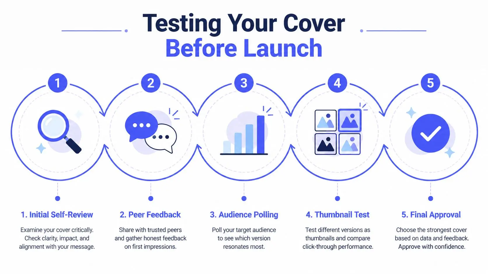
Thumbnail testing catches what full-size mockups hide
The thumbnail test is nonnegotiable. I shrink every concept down to the size it will appear in a storefront tile, then check whether the title, genre, and focal point still read instantly. If the cover needs zooming to make sense, it's too fragile.
The practical workflow from expert cover guides is to build 2 to 3 concepts, compress each to about 100 px wide or roughly 1 inch tall, then compare them against current category bestsellers before spending launch money, as recommended in Authors Unite's cover design guide. That process forces the design to prove itself where discovery really happens.
Practical rule: never ask, “Do I like this full-size?” Ask, “Would a reader stop for this at thumbnail size?”
Target reader feedback matters more than friend feedback. Friends usually comment on taste, not shelf behavior. Genre readers tell you whether the cover feels like it belongs where you're trying to sell it. That's the audience that counts.
A/B testing gives you the cleanest signal
Controlled A/B testing removes a lot of guesswork. The method is straightforward. Run two variants with the same copy and the same audience targeting, then compare the response. One reported redesign case found new covers generated 51% more clicks than originals, with gains ranging from 6% to 122%, according to BookBub's cover testing report.
Those numbers don't mean every redesign wins. They do show that the cover can materially affect discovery performance. Even a small change in title treatment, image emphasis, or contrast can shift reader behavior in a meaningful way.
When results conflict, I trust behavior over preference. If readers in the target genre keep choosing the same version, that's the version that deserves the launch slot. A cover is not a mood board. It's a market test.
Streamlining Your Workflow with Integrated Design Tools
Most cover workflows still force authors to bounce between separate apps for writing, illustration, layout, export, and revision. That fragmentation slows decisions because every change means a file hunt, an export step, or a version mismatch. Integrated tools reduce that drag by keeping the manuscript, imagery, and cover in the same working environment.
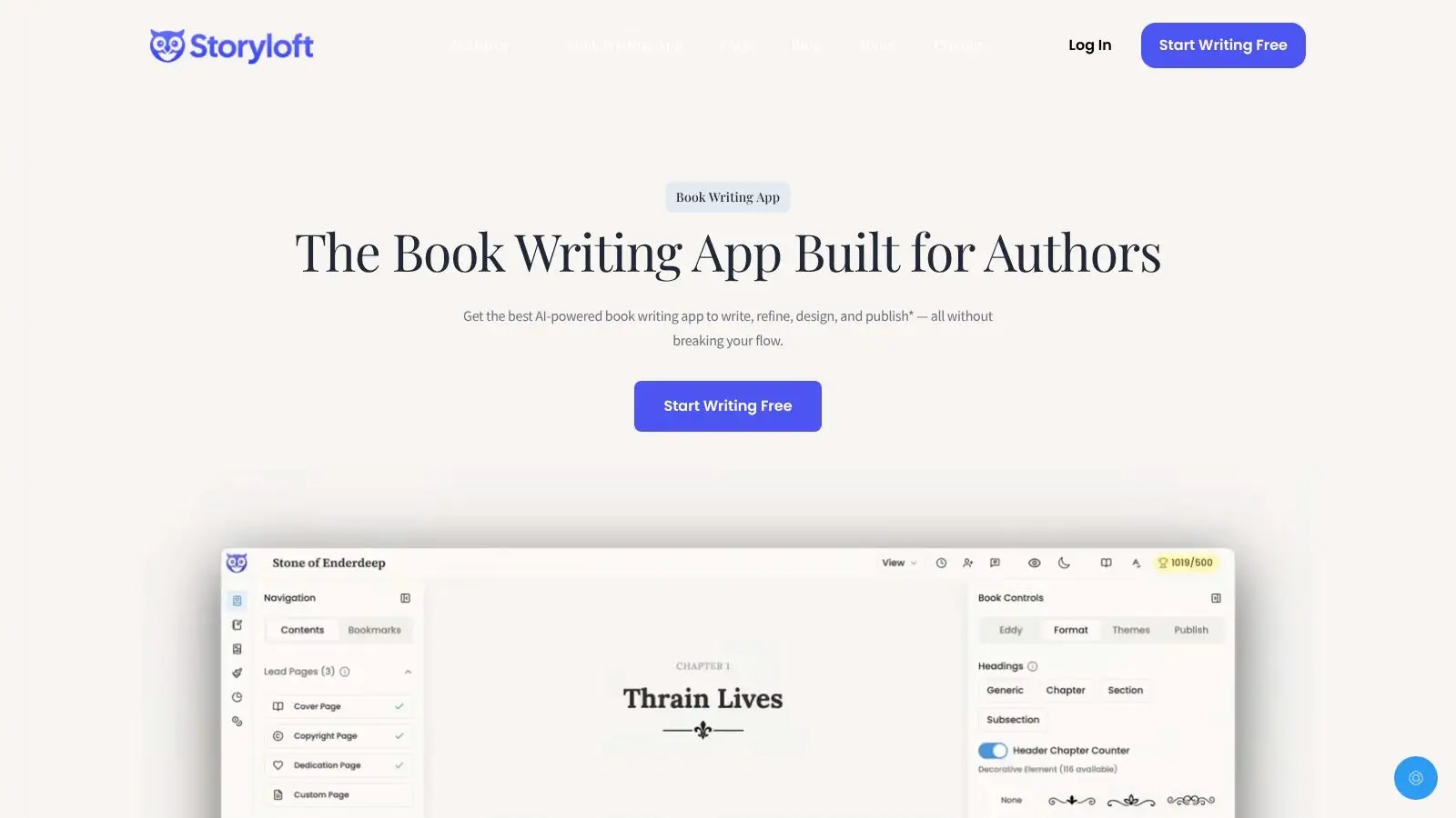
One workspace keeps the cover tied to the manuscript
A platform like Storyloft combines drafting, AI-assisted editing, illustration, cover design, and publishing workflows in one place, so cover concepts don't drift away from the book they're supposed to represent. Its cover studio supports AI-generated layouts, custom imagery import from the manuscript, ISBN barcode generation, and synchronized testing across ebook and paperback outputs, which is useful when you want the cover to stay linked to the project instead of becoming a separate asset.
That consolidation matters because cover choices often change after revision. If the manuscript tone shifts, the cover direction should be able to shift with it without rebuilding the whole pipeline. It also helps when you want editors or beta readers to react to iterations without sending raw files back and forth.
For authors comparing toolsets, the 925 Studios AI design tool guide is a useful reference point for understanding how different design workflows are being packaged for creators.
Integrated tools reduce technical friction
The practical advantage is fewer handoffs. A theme system keeps fonts and layouts consistent. Print-ready presets reduce setup mistakes. Role-based collaboration gives editors and co-writers controlled access without scattering feedback across email threads. That sounds small until you've lost an afternoon to mismatched versions and broken exports.
Storyloft's software for book cover design page is relevant here because it places cover work inside the larger publishing process, which is where most indie authors need it. The useful part isn't just making a cover. It's making one that can be revised, tested, and exported without leaving the project.
If you want a cleaner path from concept to launch, build the cover where the manuscript already lives. Then the image, typography, and print files all move together instead of fighting each other.
If you're ready to bring your manuscript, imagery, and cover work into one place, try Storyloft and see how the cover studio fits into your writing workflow. You can draft, refine, and test cover concepts without juggling separate tools, which makes it easier to move from idea to publishable file with less friction.