How to Illustrate a Children’s Book With AI and Keep Characters Consistent
A beautiful illustration is wonderful. But when you’re creating a children’s book, you need more than one beautiful picture. You need characters who belong together, colors that feel consistent, and scenes that carry the personality of your story from page to page.
In Storyloft, that starts with the character, not the scene. You create a reusable character with an appearance, traits, and a persona, then bring that character into your illustrations. The goal is artwork that feels like it belongs in a book you would be proud to put on a bookshelf.
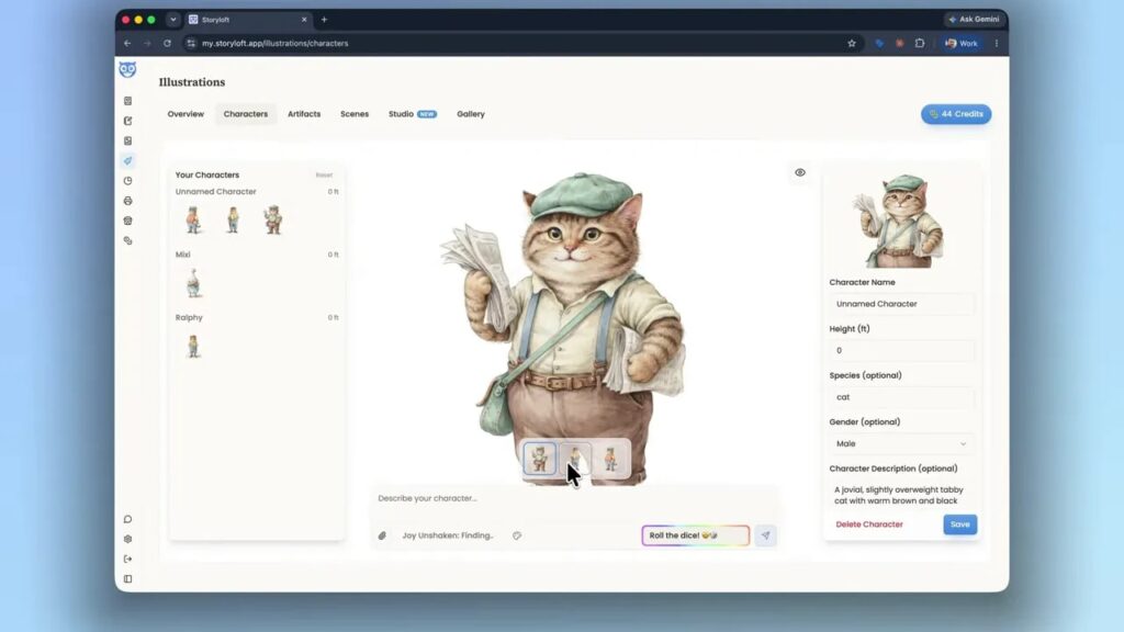
I’ll use my children’s book, Joy Unshaken, as an example. We’ll create Max, a jovial tabby cat dressed like a 1920s newsie, then put him in a picnic scene with his friend Mixie.

Key Takeaways
- Create reusable character profiles before generating scenes, including appearance, personality, and habits.
- Use one illustration style and a shared color palette to help the whole cast belong together.
- Tag saved characters with @mentions so Eddy can combine their profiles with your scene description.
- Choose full, vignette, or spot illustrations to give the same story moment different page treatments.
Table of Contents
- Why Characters Come Before Illustrations
- 1. Choose Your Book, Illustration Style, and Color Palette
- 2. Create a Character With a Clear Starting Description
- 3. Add Persona Details That Can Carry Into the Artwork
- 4. Choose a Character Design That Fits the Cast
- 5. Name, Describe, and Save Your Character
- 6. Tag Your Characters in Illustration Studio
- 7. Choose Full, Vignette, or Spot Illustrations
- Build the Character Once, Then Bring Them Into the Story
Why Characters Come Before Illustrations
A character is much more than an illustration. You’ve probably spent time thinking about how yours behaves, what they enjoy, and how they respond to different situations. Those details should travel with them into the artwork rather than stay separate from it.
That’s the idea behind characters in Storyloft. A character profile connects the person or creature in your story with their illustrated appearance. Eddy, Storyloft’s built-in AI, works across your manuscript, characters, illustrations, and world-building, so the profile provides context for later scenes.
Instead of treating each illustration as a fresh introduction to your character, you establish who they are once and reuse that foundation.
1. Choose Your Book, Illustration Style, and Color Palette
Start by selecting the book you’re illustrating. Storyloft initially selects the book you’ve been working on most, but you can choose another project.
For Joy Unshaken, I’m using the Nursery Animal Watercolor style. I like it because the artwork has a lovely, authentic storybook feel. It’s a great fit for a children’s book, and despite the name, it doesn’t have to be used only for animals.
In the illustration settings, you can choose both the style and the color palette. Save those settings before creating your character.
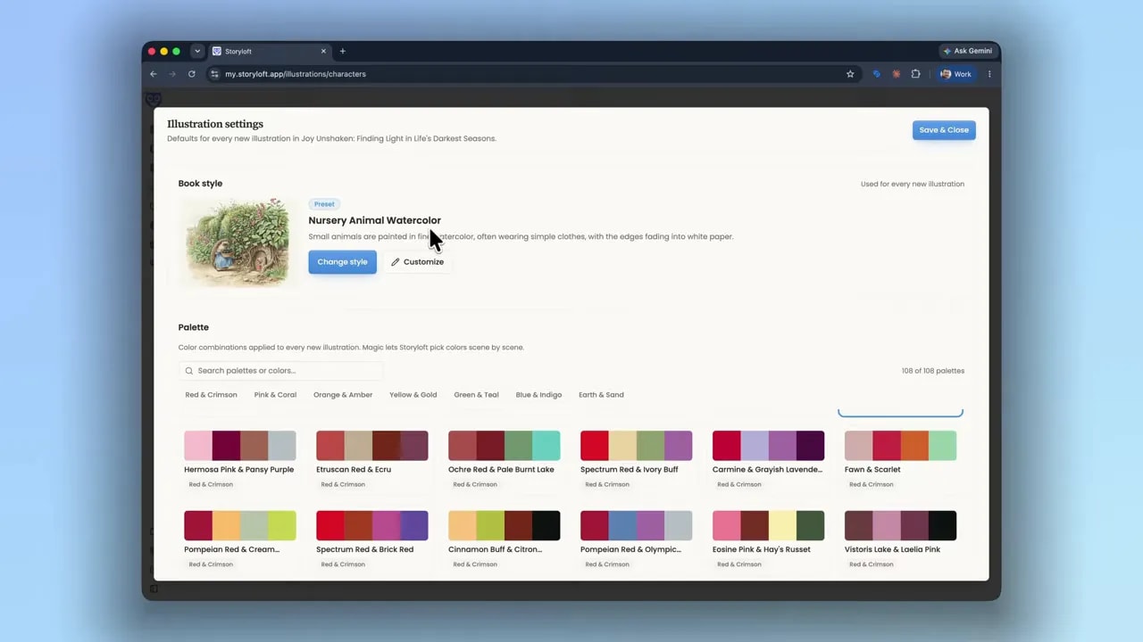
The shared palette matters. Max needs to look as though he belongs in the same book as Mixie and Ralphie, the characters already in this project. When their illustrations draw from the same palette, they have a common visual foundation.
Think of consistency in two parts: the character profile establishes who appears in the scene, while the book’s style and palette help the artwork belong together.
2. Create a Character With a Clear Starting Description
Open the character creation area. If you’re already looking at an existing character, use Reset to return to the creation screen.
For Max, I want a hardworking little cat who enjoys his job and takes a break when he can. The starting description gives Eddy his main physical and personality traits:
- A jovial tabby cat
- A slightly overweight build
- Clothing inspired by a 1920s newsie
- A kind disposition
You don’t need to write an entire biography to begin. This description is the starting point Eddy uses to build an initial character profile and generate illustration options.
The important thing is to describe more than the species. “Tabby cat” gives you a subject. His build, clothing, and disposition begin to give you Max.
3. Add Persona Details That Can Carry Into the Artwork
Appearance is only part of character consistency. The other part is behavior.
Suppose Max likes to lean back and enjoy a warm saucer of milk whenever he relaxes. That’s a useful detail to put in his persona. It tells Eddy something about what relaxation looks like for this particular character.
Then, when you illustrate a passage in which Max is relaxing, Eddy has context for including that saucer of milk, even if the manuscript doesn’t explicitly describe it.
That’s valuable because you don’t always want to explain every visual detail in your prose. Sometimes you want the illustration to carry it. Your text can move the story forward while the artwork reinforces a familiar habit.
Think of the association between Gandalf and his pipe. A recognizable character detail can become part of how we imagine someone without needing a fresh explanation every time.
Use the persona to capture what your character does in a situation, not just what they look like. Habits and responses give Eddy more context to work with when it’s time to illustrate your book.
4. Choose a Character Design That Fits the Cast
Once the character options are ready, open them and compare the designs. In this example, there are three starting options. You can create more, but three is often enough to find a direction you like.
This is the fun part. Look at the expression, the clothing, and the little details that make the character feel alive. Then consider how the design fits beside the characters you’ve already created.
For Max, I compare the options with Mixie and Ralphie. Their shared palette helps the colors feel related, even though each character has a different appearance.
Once you’ve found the right direction, you can keep that version and delete the alternatives you don’t need. You can also continue developing an option if it’s close but not quite right. Here, I’m happy with one of the generated designs, so there’s no need to keep refining it.
5. Name, Describe, and Save Your Character
With the design selected, finish the character profile. I name our tabby cat Max and set his height to three feet. Eddy has already inferred details such as species and gender from the starting description.
Review those fields, then give the character description some attention. It’s optional, but I strongly recommend filling it out.
The more useful context you give Eddy here, the more it has to work with when illustrating scenes later. This is where the thinking you’ve already done about your character can become part of the illustration process.
Before saving, check that you have:
- The character design you want to reuse
- The correct name and physical details
- A description that captures their personality
- Any habits or behaviors that should inform future illustrations
Click Save. Now Max is ready to become part of a scene.
6. Tag Your Characters in Illustration Studio
Move into Illustration Studio to create the scene. You don’t need to describe Max’s entire appearance again. Instead, tag the saved characters with @mentions and describe what’s happening.
For this example, the scene prompt is simple:
@Max and @Mixie happily walking to a picnic.
Make sure both names are selected as character tags. Those tags connect the scene to Max’s and Mixie’s saved profiles.
When you click Generate, Eddy brings together the two character profiles and the scene description. The book’s illustration settings provide the shared visual style and colors.
That’s why the preparation matters. The short scene prompt doesn’t need to carry every detail by itself. The character profiles already supply much of the context.
For a more detailed walkthrough of the workspace, the Illustration Studio tutorial covers how to use it.
7. Choose Full, Vignette, or Spot Illustrations
For the picnic scene, I generate three illustration types: full, vignette, and spot. You don’t have to generate all three, but doing so makes it easy to compare how the same scene works in different formats.
Full Illustration
A full illustration fills the frame with the scene. Here, Max and Mixie appear together with the surrounding landscape, giving us a fuller sense of their walk to the picnic.
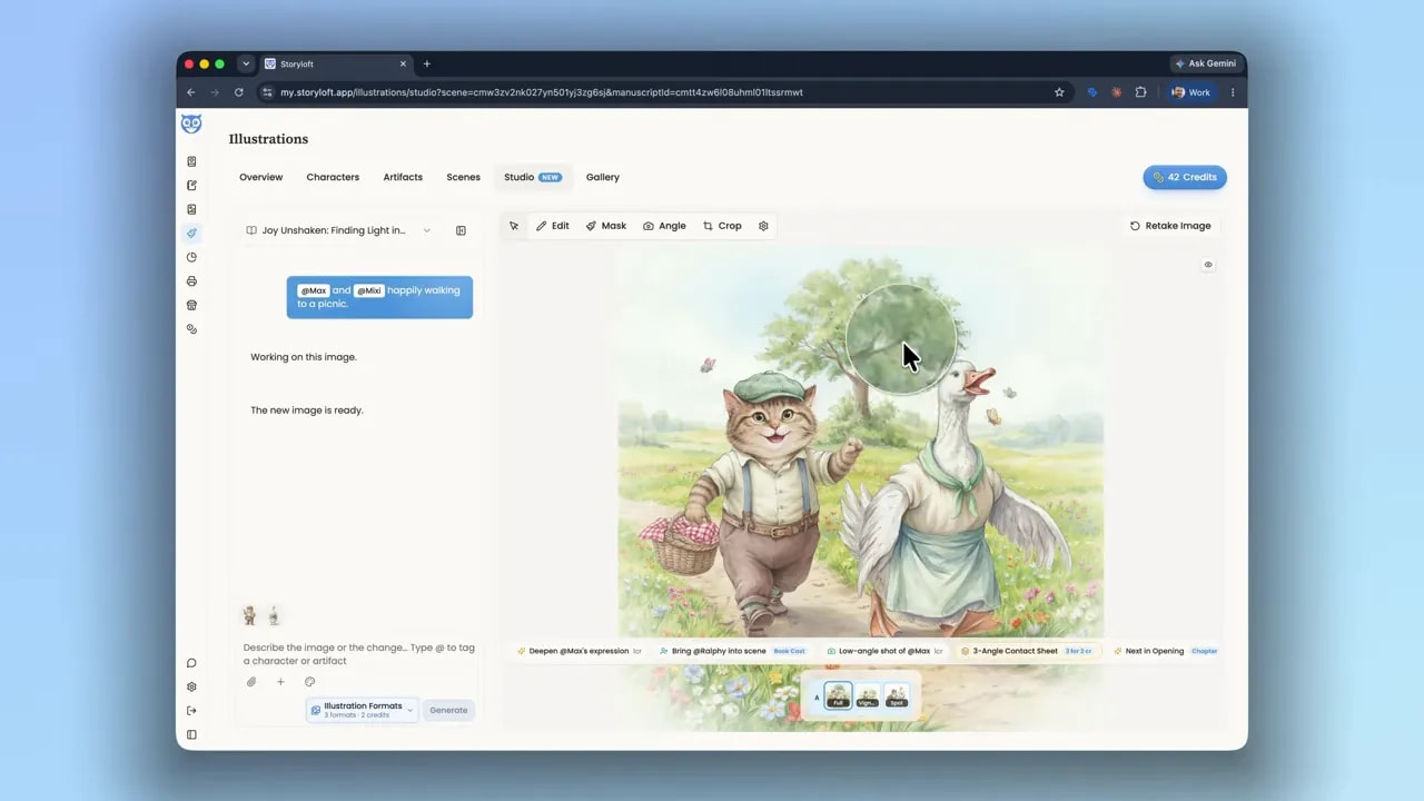
I’m looking closely at their expressions and the way the colors relate to the original character designs. The result brings the two characters into the same setting while carrying through the book’s watercolor look.
Vignette Illustration
A vignette has softly fading edges rather than a fully defined rectangular scene. The colors taper into the surrounding white space, which gives this version a lovely quality for print.
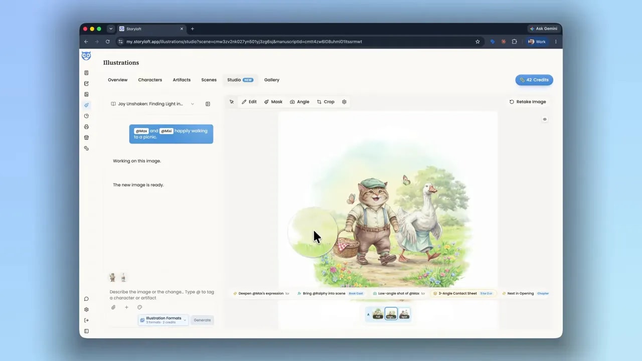
It still includes the characters and some of their surroundings, but the soft edges change how the illustration sits on the page.
Spot Illustration
A spot illustration is a smaller, more focused image. It’s useful for a quick illustrated moment in the text without including a full background scene.
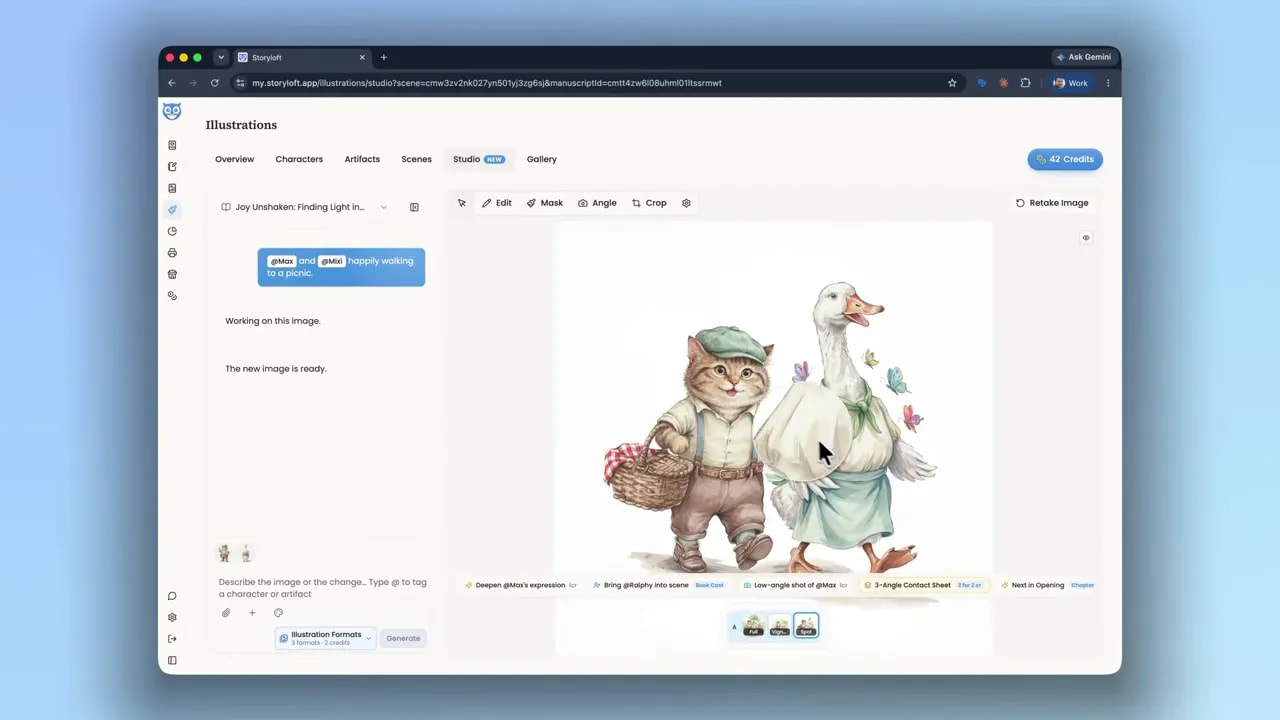
In this version, the focus stays on Max and Mixie, their expressions, and their picnic baskets. It’s a different treatment of the same story moment, with the same characters at its center.
Build the Character Once, Then Bring Them Into the Story
The foundation for consistent AI children’s book illustrations is the work you do before generating a scene: choose a shared style and palette, create a character you’re happy with, and give that character meaningful context.
From there, you can tag your saved characters, describe the moment you want to illustrate, and choose the format that suits the page.
Most importantly, don’t stop at appearance. Your characters have personalities, habits, and ways of moving through their world. Give those details a place in their profiles so the illustrations can help tell the story, too.