Why Most AI Book Art Looks Cheap (And How to Fix It)
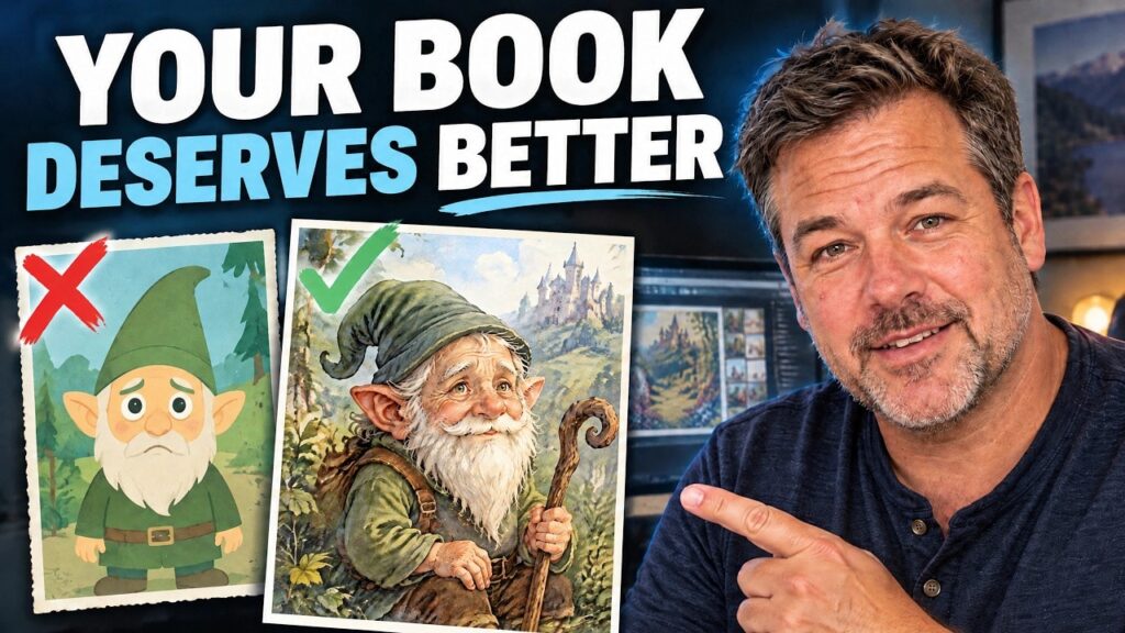
A beautiful image is not automatically a beautiful book illustration. The characters might look impressive, but do they look like your characters? Does the scene carry the right emotion? And when you place it beside the text, does it belong on the page, or does it feel pasted in?
That is the difference I care about. I want illustrations with expressive faces, believable relationships, and the little imperfections that make pencil and paint feel authentic. Most importantly, I want the artwork to serve the story.
Storyloft’s Illustration Studio puts you in the director’s seat for that process. You can establish a book’s visual style, bring in consistent reference characters, build scenes, and refine individual details before placing the finished illustration in your manuscript.
For this example, I’m illustrating a scene from my children’s novel, The Stone of Enderdeep. It features Balin, an elderly dwarf king; Stella, a princess and our protagonist; and Snow Gold, a pegasus. The goal is a classic storybook illustration that feels at home in a printed book.
Key Takeaways
- Set a book-wide illustration style and palette before generating individual scenes.
- Use character references and @-tags to build scenes around your established cast.
- Refine storytelling through retakes, larger composition edits, local masking, and subtle angle adjustments.
- Inspect the finished illustration in the manuscript and print preview, not just in the studio.
Table of Contents
- Start With a Visual Style for the Whole Book
- Understand Full, Spot, and Vignette Illustrations
- Set Up Reference Characters Before Building Scenes
- Build a Multi-Character Scene With @-Tags
- Compare the Results Before Committing
- Use Retakes to Refine the Emotion
- Make Big Edits Serve the Story and Composition
- Use Masking for Small, Local Changes
- Try Subtle Perspective Changes With the Angle Tool
- Place the Illustration in the Manuscript
- Judge the Final Result in Print Preview
Start With a Visual Style for the Whole Book
Before generating a scene, give the book a visual foundation. Choosing the style, palette, and illustration format first gives you something coherent to work toward.
Open Illustration Studio using Open Studio or the Studio button in the navigation. Eddy, Storyloft’s AI assistant, appears alongside the workspace. The same assistant that helps with writing can help interpret your story visually.
If this is your first illustrated book, a setup wizard walks you through the initial choices. For an existing project, click Style, then Change Style to adjust the book’s settings.
Choose a medium that suits the story
The studio includes more than 30 curated illustration styles, along with the option to create your own. You can browse the library or filter by style, genre, and age group.
Some of the choices include:
- Literary styles: graphic pencil, impressionist oil, and linocut.
- Mystery styles: paper silhouettes and noir charcoal.
- Faith-oriented styles: stained glass and gold leaf.
- Classic children’s book styles: nursery watercolor.
For this book, I choose nursery watercolor. It has the gentle, classic quality I’m after. If you’re comparing traditional media, Tate’s brief explanation of watercolour offers useful context for the medium behind that look.
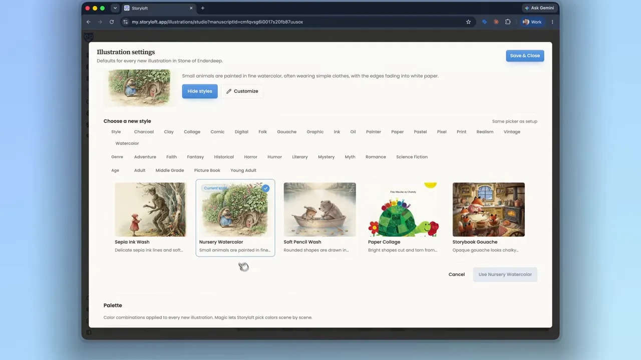
The important decision is not simply which thumbnail looks nicest. It is which visual language fits the book you are writing. A charcoal mystery and a soft watercolor children’s novel should not feel interchangeable.
Pick a coordinated color palette
Next, choose the palette. Storyloft includes more than 100 classic book color palettes, organized into color families such as yellow and gold, orange and amber, and pink and gold.
These give you coordinated color sets rather than leaving every illustration to establish its own unrelated colors.
I settle on a warm pink-and-brick palette for this example. It supports the slightly romanticized, classic children’s book feeling of the nursery watercolor style. Together, the medium and palette begin to give the project its own visual identity.
Understand Full, Spot, and Vignette Illustrations
The next setting is your default illustration type. You can change it later, and you can generate different formats for the same scene. The default simply gives the studio a starting point.
- Full illustration: fills the image area from edge to edge. In this example, that means a fully illustrated square.
- Spot illustration: concentrates on the characters, objects, and their interactions rather than illustrating the entire surrounding environment.
- Vignette: presents a developed scene, but allows the painted edges to fade away instead of stopping at a hard boundary.
Vignettes are my favorite for this kind of book. That soft, painted edge can look lovely in print because the illustration feels as though it belongs to the paper rather than sitting inside a rigid box.
I choose Vignette as the default, then save and close the settings. That does not lock us into using it for every result. Comparing formats is part of finding the best illustration.
Set Up Reference Characters Before Building Scenes
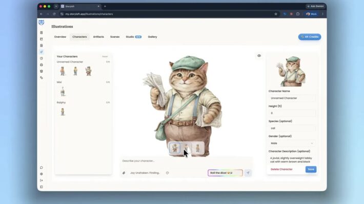
Character consistency starts before the scene prompt. For a novel or storybook, set up your characters and important artifacts first. Those references give Eddy something specific to bring into each illustration.
Without that foundation, it is easy to get a perfectly pleasant dwarf king who is not recognizably the same dwarf king from the previous page.
The studio offers suggested starting prompts, and you can also return to earlier projects through the saved history. I begin a new illustration using a suggestion for Balin.
Eddy consults the character sheet and interprets details such as his gentle, wise eyes and regal posture. That matters because a character’s appearance is more than a collection of physical features. His expression and bearing should communicate who he is in the story.
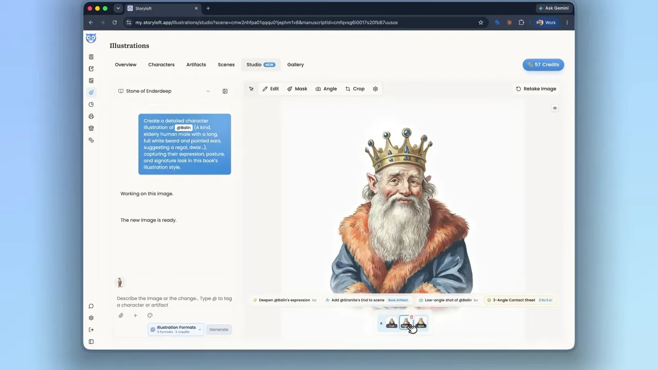
The resulting portrait is a good starting point. Balin looks expressive and recognizable. But a character portrait is not yet a scene. Now we need to give him something to do, and other characters to interact with.
Build a Multi-Character Scene With @-Tags
To add the rest of the cast, click the plus button in the reference area. You can add reference images, or select existing characters and artifacts from your project.
For this illustration, I add Snow Gold and Stella alongside Balin. Once those references are available, I use the @ symbol to tag each character in the scene description.
The action is straightforward: Snow Gold leaps into the air while Balin and Stella wave goodbye, hopeful that he will return.
Notice that this gives the studio more than a list of subjects. It establishes:
- Who is present: the three referenced characters.
- What is happening: Snow Gold is taking flight while the others see him off.
- How the moment should feel: a farewell with hopeful anticipation.
That emotional direction is important. The illustration should not merely prove that a king, a princess, and a pegasus can fit into one image. It should express their relationship in this particular moment.
Decide whether to retain the existing context
If you have already been working on an illustration, Eddy may ask whether the next request belongs to the existing set or represents a new idea.
For a continuation, keeping context helps carry forward the work you have already done. Here, the scene is a new idea rather than another version of the character portrait, so I choose to start fresh.
Eddy then interprets the scene in the context of the story, the selected illustration style, and the emotion we want the reader to feel.
Compare the Results Before Committing
For the first scene generation, I request all three formats: full, vignette, and spot. Generating them together lets me compare different interpretations of the same moment.
I like the initial direction. The angle is interesting, and the artwork fits the style we selected. But this is also the point to look beyond the overall composition.
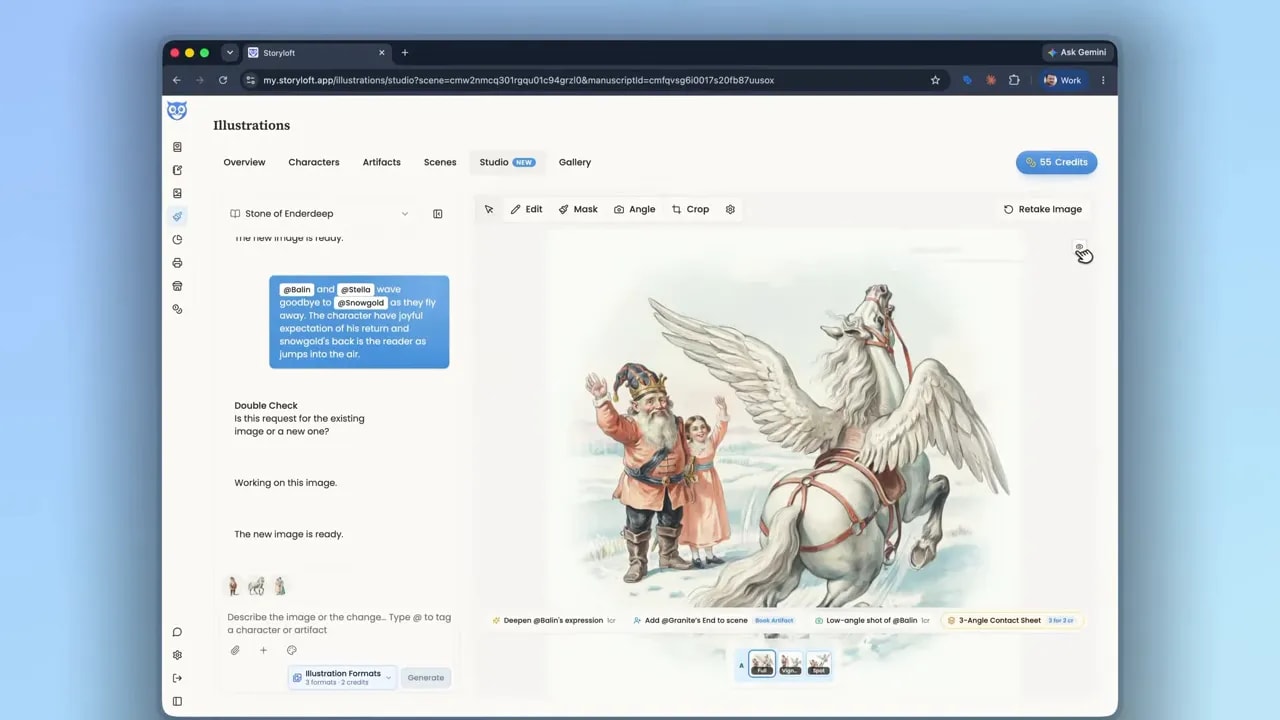
Look at where pencil marks taper off. Look at the small irregularities in the painted details. Those qualities help an illustration feel like it belongs in a book, rather than resembling a generic image generated for the internet.
Here, realism does not mean turning a watercolor illustration into a photograph. It means making the chosen medium feel convincing. The marks, textures, expressions, and composition need to work together.
Use Retakes to Refine the Emotion
A promising first result is a starting point, not an obligation. You can explore alternatives without abandoning everything you like.
I take the full illustration I prefer and use Retake, changing the format to vignette. In this example, the retake costs one credit and gives me another version to compare before moving further.
The new version feels stronger, mainly because of Balin’s gesture and expression. His hand points toward Snow Gold, reinforcing the movement and direction of the scene. Stella’s expression feels idealistic and undeterred as she looks toward him.
That is a more useful reason to choose an image than simply deciding it is prettier. The better version tells the story more clearly.
I also try increasing Balin’s expression slightly. The result is interesting, but I return to the earlier version because it feels more genial.
More expression is not always better expression. For this moment, a warmer, quieter reaction feels more authentic than the stronger alternative.
Make Big Edits Serve the Story and Composition
With the characters working, I move on to a larger change: adding a cityscape in the background.
There are two reasons for it. First, the city gives us context for where the characters have come from. It connects the illustration back to the story’s world.
Second, it adds depth. I want Snow Gold up front, visibly rising from the snow, with the other elements arranged behind him. A distant city helps establish foreground, middle ground, and background.
That layering makes the scene feel more believable. The background has a job beyond filling empty space.
This is a useful way to think about larger edits: ask what the addition contributes. Does it clarify the setting? Improve perspective? Reinforce a story detail? In this case, the city helps with all three.
Use Masking for Small, Local Changes
For a small addition or removal, use the masking tool rather than asking for a broad reinterpretation of the entire image.
The tool lets you paint the area you want to adjust. You can add to or erase the mask and choose different brush sizes.
I use it to add a dog beside Balin’s feet:
- Open the masking tool.
- Choose a brush size appropriate for the area.
- Paint the small region next to Balin’s feet.
- Describe the addition: a dog at his feet.
- Apply the edit and inspect the result.
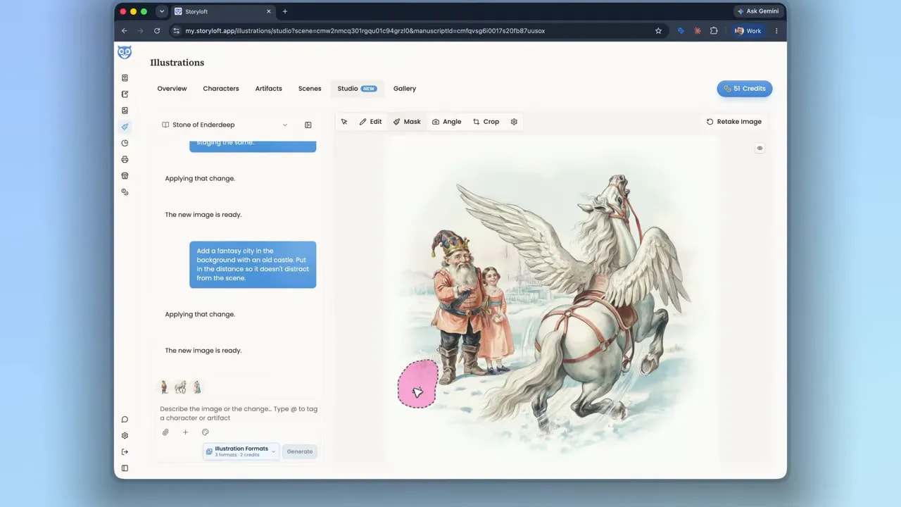
Eddy uses the marked area to fit the dog into the existing scene. The result is not just about whether a dog appears. I check whether it looks naturally placed.
In this version, the shadow and lighting work with the surrounding illustration. That is what makes the addition feel integrated rather than attached afterward.
Those little relationships matter: the dog’s position, the light falling across it, and the way it occupies the same ground as the characters. Small details can either support the scene or make it feel inconsistent.
Try Subtle Perspective Changes With the Angle Tool
The angle tool offers another way to reconsider a promising image. I would use it for minute adjustments rather than treating it as a reason to radically change a composition that already works.
Here, I want to explore seeing Snow Gold slightly more from the side. My intention is to strengthen the feeling of flight and potentially bring the distant city toward the center-left of the composition.
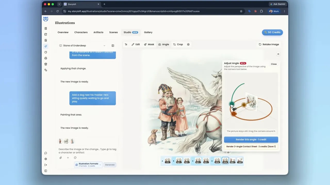
I compare several angled versions. They offer different interpretations of the same scene, and each has something appealing.
One gives the moment a gentler sense of anticipation. Another keeps the dog looking toward his master in a way I particularly like. Ultimately, I choose the version where the movement of the wind feels strongest and the dog also looks expectant.
Again, the deciding factor is the story. I am looking for the arrangement that best supports the farewell, not simply the most unusual camera angle.
Place the Illustration in the Manuscript
Once the image is ready, return to the book itself. In The Stone of Enderdeep, this illustration belongs in chapter two, “Homecoming.”
Use Manage Images to open the available illustration options, select the version you prefer, and insert it into the manuscript.
Seeing it alongside the text is an important check. An illustration can feel finished in the studio and still need to be considered in its actual home on the page.
At this stage, I want to know whether the artwork feels connected to the surrounding writing and whether its shape and edges suit the layout.
Judge the Final Result in Print Preview
The last step is to open the publishing tool and inspect the page in print preview. Storyloft also supports ebook preparation, but for this example I am particularly interested in the paperback.
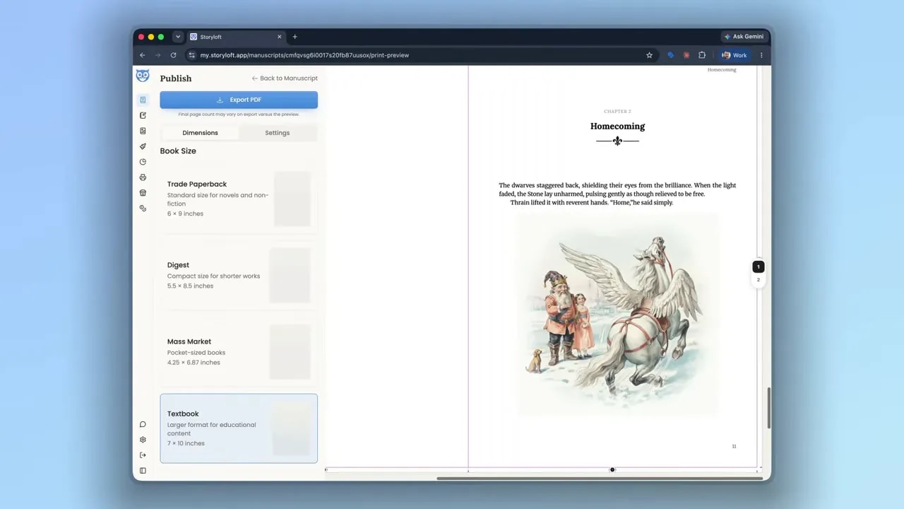
This is where the vignette treatment pays off. The soft painted edges blend into the white page, making the artwork feel integrated with the layout and the paper behind it.
That is the result I am after: not an attractive image pasted beneath a paragraph, but an illustration that feels like part of the book.
The fix for generic AI book art is a series of deliberate choices. Establish the style and palette. Give the system recognizable characters. Describe a meaningful scene. Compare expressions and gestures. Use broad edits for composition, masking for local details, and subtle angle changes where they help. Then judge the result on the page where a reader will encounter it.
You are still directing the story. The tools give you ways to make the illustration live up to it.