
How to Format a Script Title Page the Right Way
You've finished the draft, exported the PDF, and now that blank first page is staring back at you like it's waiting for instructions. That moment is normal, whether you're sending a screenplay to an agent or printing a stage play for rehearsal. The title page feels small, but it carries the first professional signal your script sends.
A clean script title page tells a reader you understand the format they expect. It keeps the cover page separate from the paginated body, which matters because screenplay format is built for fast, uniform reading, and a correctly formatted screenplay page is commonly treated as about one minute of screen time, so the title page stays visually distinct from the script itself. For screenplays, that usually means a minimalist first page. For stage plays, the tradition is different, and that difference matters before you start placing text on the page.
Table of Contents
- Why the Script Title Page Matters
- What Belongs on a Screenplay Title Page
- How Stage Play Title Pages Differ
- Building the Layout Step by Step
- The Draft Date Question
- What to Leave Off the Title Page
- Templates, Exports, and Submission Tips
Why the Script Title Page Matters
A writer opens a fresh export and sees the first page still empty. The instinct is to add more, a logo, a tagline, maybe a tidy little summary. That impulse makes sense, but it works against the job of the page, which is to help a reader identify the script instantly and move on without friction.
The title page is a professional handshake
Agents, producers, contest readers, and festival programmers often scan submissions quickly, so the first page has one job, make the script feel familiar. The standard title page does that by staying simple, centered, and easy to parse. In screenplay practice, that means the reader gets the title, the writer credit, and the contact path without any decorative detours, which is why the title page developed as a minimalist industry form rather than a design exercise, as outlined in this screenplay title page format guide.
Practical rule: if a page tries to impress before it identifies, it usually slows the reader down.
That same logic is why screenplay and stage play title pages diverge. Screenplays are built around a one-page cover that keeps the submission stack clean. Stage plays often carry a different front-matter tradition, with the title page doing less of the visual heavy lifting and more of the identification work for rehearsal and production contexts.
For anyone who sends scripts regularly, that distinction saves time. You stop guessing, stop over-designing, and start treating page one like part of the submission itself. If you're also preparing other front matter for agent queries, the practical framing in this manuscript formatting guide for agents helps reinforce the same restraint.
Why one page matters so much
A screenplay title page is usually kept to one printed page and separated from the script body, because the industry wants the cover to be fast to read and easy to remove when needed. That single-page discipline isn't a decorative preference, it's a workflow choice. Readers want to recognize the project, confirm the contact details, and get to page one without sorting through extra material.
That's why ten careful minutes here pay back across every submission you'll send. Once the title page is right, it becomes a reusable professional habit instead of a repeated source of doubt.
What Belongs on a Screenplay Title Page
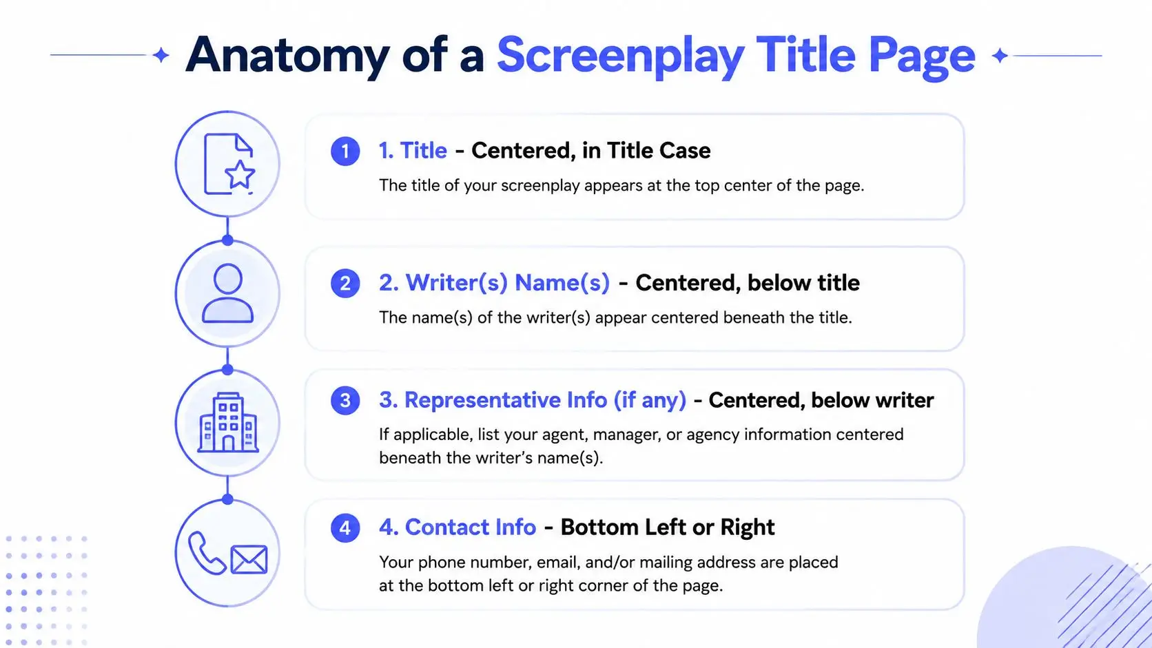
A screenplay title page works best when it carries only the identifiers a reader needs at a glance. The standard inventory is short, and that's the point. The more closely you follow the industry's normal layout, the less time a reader spends wondering whether the file is formatted correctly.
The core elements that belong
At minimum, the page should include the title, the writer's name, and contact information. If the script is adapted, a credit such as “based on” or “story by” can appear as well. That's the practical core, and it aligns with common screenplay guidance that keeps the page to a single sheet in 12-point Courier or Courier New, single-spaced, with no page number and no extra content beyond the essentials.
A useful way to think about it is this:
- Title: centered, usually in ALL CAPS or title case depending on the guide you follow.
- Writer credit: directly beneath the title, centered.
- Optional adaptation credit: only if the script comes from source material.
- Contact details: usually in a lower corner, so the reader can find them without scanning the page.
The rule of thumb about placement is steady across mainstream guides, the title sits about one-third down the page, which usually means roughly 20 to 22 line spaces below the top margin or about 4 inches from the top. That spacing gives the page enough white space to feel intentional without turning it into a design piece. A practical front-matter workflow in Storyloft's title-page template documentation follows the same idea of separating the title page from the main text.
The geometry matters as much as the words
Several layout guides converge on the same physical expectations. One cited benchmark puts the title around 4 inches from the top, with margins commonly reported around 1.5 inches left, 1 inch right, and 1 inch top and bottom. Other guides specify a 3.5-inch top margin, a 4-inch left margin, and 1-inch right and bottom margins, which tells you the industry tolerates some variation as long as the page reads as clean and standard.
The easiest way to get this right is to treat the title page as a visual hierarchy, not a blank canvas. Put the title first, keep the author line beneath it, and let the contact details live in a corner. If the page can be understood in five seconds, it's doing its job.
How Stage Play Title Pages Differ
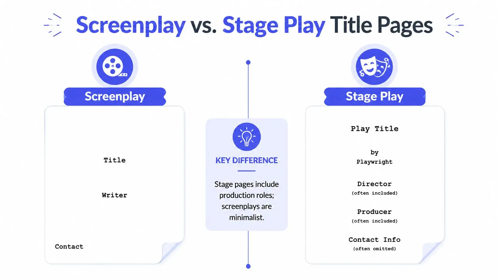
Stage play title pages don't follow the same minimalist submission logic as screenplays, even though writers often assume they should. Theatre scripts live in a different ecosystem, where the front matter can serve rehearsal, production, and licensing needs rather than pure reader triage. That difference changes what belongs on the page and what doesn't.
Screenplay first page versus play front matter
A screenplay title page usually stays stripped down, because the reader is expected to move from page one into the script fast. A stage play title page, by contrast, often behaves more like a production document. You'll commonly see the play title, the playwright's name, and sometimes additional production information that helps place the script in a theatre workflow.
In practical terms, the stage play page may include roles or credits that would look cluttered on a screenplay submission. That's normal. Theatre readers often expect a broader front matter structure, while screenplay readers expect a leaner first page.
The page should fit the job it's doing, not the format you happen to like.
What usually shifts in theatre formatting
Theatrical scripts often present the title prominently, sometimes underlined or set in small caps, followed by the author's name. In some contexts, you may also see act or scene structure referenced nearby, especially in production-ready materials. Contact details can appear elsewhere, or be omitted from the title page entirely if the script package already contains cast or licensing information.
Writers can get tangled up if they move between media. A screenwriter who copies a play-style front matter approach into a submission PDF can look over-formatted. A playwright who uses screenplay minimalism in a theatre packet may look unfinished. The safest move is to match the tradition of the format you're sending, not the one you're most used to writing.
For digital manuscript workflows, that logic also shows up in Storyloft's general manuscript formatting guide, where front matter is treated as part of the document sequence, not a decorative layer. Different medium, same principle, the first page should help the reader orient themselves quickly.
Building the Layout Step by Step
The fastest way to build the page is to start with the document settings, not with the title. Use the formatting conventions your submission target expects, then place the words into that structure. If you skip the setup and try to eyeball the page, you'll end up adjusting by feel instead of by standard.
Start with the document itself
Set the font to Courier 12-point if you're preparing a screenplay title page. Keep it single-spaced, and make sure the page is unnumbered. In most screenplay software, the title page lives outside the body of the script, so you can edit it separately without disturbing scene numbering or pagination.
The title should sit roughly one-third down the page. That means the eye lands on it after a small amount of white space, which creates a calm first impression instead of a crowded one. Center the title, then place the writer credit beneath it, also centered. If there's a representative or production credit in your workflow, keep it aligned in the same central column rather than floating it somewhere decorative.
Use the corners for the supporting details
Contact details belong low on the page, usually in the lower left or lower right corner. If you include a date, place it in the opposite corner so the two elements balance each other visually. That arrangement keeps the middle of the page clear, which helps the title remain the focal point.
A clean page usually reads like this:
- Centered title: placed one-third down the page.
- Centered writer credit: directly beneath the title.
- Optional adaptation credit: only when source material exists.
- Corner contact block: low on the page, with room to breathe.
The mistake to avoid is trying to make the title page explain the script. It doesn't need to. It needs to identify the script and tell the reader how to reach you if they want the next draft or a meeting.
When writers use software to manage multiple versions, the front matter can get messy fast. Tools that keep revision history visible, such as the version-tracking features in Storyloft's book history and restore tools, are useful precisely because they separate document memory from title-page presentation.
Keep the page looking intentional
A cluttered page usually comes from adding too many signals at once. A neat page doesn't shout professionalism, it shows it. If the title is clear, the spacing is deliberate, and the contact path is easy to find, the page already does enough.
The Draft Date Question
The draft date causes more confusion than almost any other title-page detail. Some guides say leave it off because it can date your script. Others recommend including a draft date or revision marker so collaborators know which version they're reading. Both instincts make sense, but they're aimed at different situations.
When to omit the date
For an agent submission, festival read, or other first-contact circulation, many mainstream guides lean toward a cleaner page without a date. The logic is simple, a date can create unnecessary version anxiety, especially if the reader doesn't know whether the file is current, revised, or historical. If the script is going out cold, less metadata usually means less confusion.
That approach fits the submission-first mindset that keeps the title page focused on the script's identity rather than its revision history. It also matches the long-standing habit of using the cover page as a neutral front door, not a logbook.
When the date helps
In collaborative work, production workflows, or internal review, a date or revision number can be useful. If a director, producer, or producer's assistant is comparing drafts, a clear date helps them track which version is active. In those settings, the date isn't clutter, it's navigation.
Practical rule: if the file is leaving your circle for first read, keep the title page lean. If the file is being tracked inside a production process, version metadata can be useful.
That distinction is the part most beginner guides skip. They treat the date as either always right or always wrong, when the better answer is use-case specific.
A sensible default
If you're unsure, choose the cleaner submission version for external reads and reserve the date for internal or production-facing drafts. That keeps the page from sending mixed signals. A simple rule like that prevents the common mistake of treating one title page format as universal.
What to Leave Off the Title Page
Knowing what to remove is often harder than knowing what to add. Writers love their scripts, so they want every useful detail visible. Readers, however, usually want the page to stay clean enough that they can confirm the essentials without stopping.
The clutter that slows a reader down
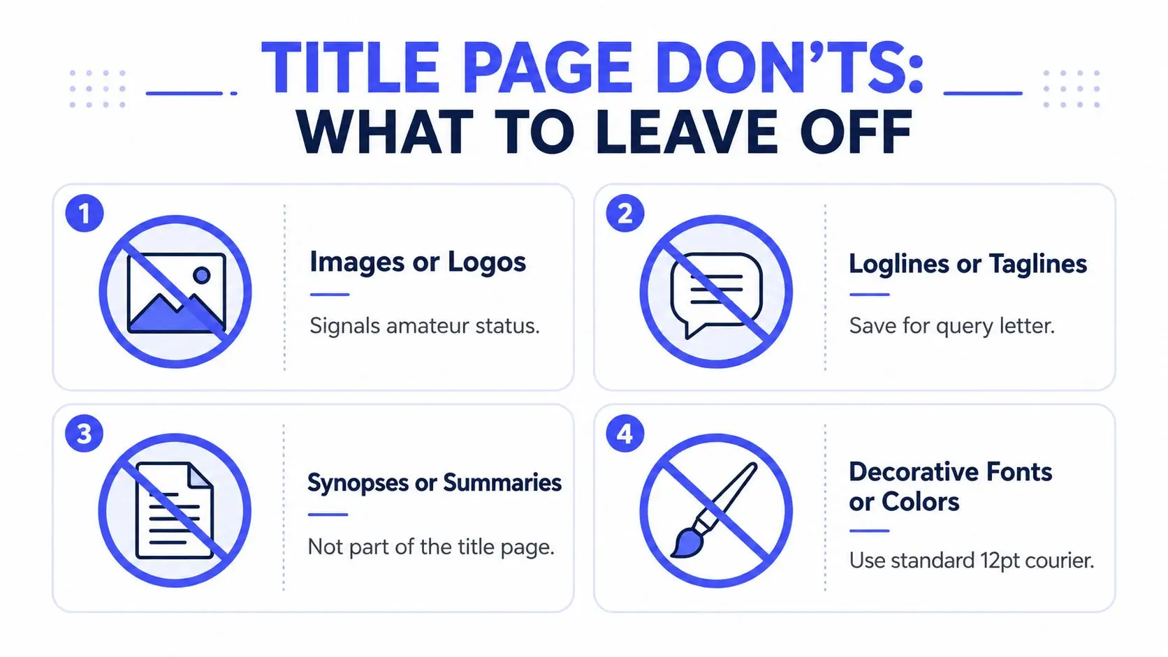
Images and logos are the biggest visual risk because they turn a functional page into a branded surface. Some tools and workflows may allow them, but that doesn't mean they help a submission read better. The same goes for loglines, taglines, and synopses, which belong elsewhere if you need them at all.
The amateur signal usually comes from trying to answer too many questions on page one. A title page isn't the place to sell the premise, summarize the plot, or present a polished marketing package. It exists to identify the script. Anything beyond that risks creating noise.
The metadata that usually creates friction
Writers often add WGA registration numbers, copyright notices, or draft clutter because those details feel protective. They usually aren't necessary on the title page, and some screenwriting authorities specifically advise against them. The same caution applies to decorative fonts, color treatments, and elaborate formatting. They can make the page look finished in a graphic-design sense while making it less legible as a script submission.
A note on the contradiction in the ecosystem, some guides still discuss images or branding on title pages, especially in software contexts, while other guides strongly reject them. In a digital-first submission workflow, the stricter standard is usually the safer one. A PDF that travels through email, cloud folders, or contest portals should be easy to read on screen and print cleanly if needed.
Leave these out unless a specific workflow asks for them
- Images or logos: they pull attention away from the script identity.
- Loglines or taglines: they belong in pitch materials, not on the cover page.
- Synopses or summaries: they make the title page do another document's job.
- Decorative fonts or colors: they break the standardized reading experience.
If you need a structured place for promotional material, use a query letter, a pitch deck, or a separate submission packet. That keeps the title page faithful to the format readers already know.
Templates, Exports, and Submission Tips
A good template solves most title-page problems before they start. It gives you the correct spacing, the right hierarchy, and a clean export path so you aren't rebuilding the same page for every submission. For writers who move between screenplay, theatre, and manuscript formats, that consistency matters more than clever design.
Use the export format that preserves the page
For screenplay submissions, PDF is usually the safest delivery format because it preserves spacing, font, and alignment across devices. Before you send anything, open the file on more than one screen and, if possible, print a copy. Some title pages look perfect in a desktop editor and awkward once the PDF viewer reflows the display or compresses the margins.
A practical submission habit is to check the page in three states, inside your writing software, in the PDF viewer, and on paper. If the title still sits one-third down the page and the contact details remain anchored in the corner, you're in good shape.
Match the page to the job
Different workflows deserve different versions of the same page. An agent query should usually stay minimal. A festival read may want the same lean setup. A production draft may call for version markers or a date if the team needs to track revisions. That's why one fixed template can't solve every case by itself.
For writers who also prepare marketing materials, the contrast is useful. A polished promotional asset like the influencer media kit template is designed to present information and branding together, while a script title page is designed to keep branding out and identification in. Different documents, different jobs.
Final submission habits that hold up
- Check the essentials first: title, writer credit, contact details.
- Keep the page unnumbered: the title page isn't part of the script body.
- Test the PDF visually: screen view and print view can differ.
- Strip out extra noise: no loglines, summaries, or decorative clutter.
- Use the right front matter for the job: screenplay, stage play, or internal draft.
If you want one place to draft, format, and keep long-form writing organized, Storyloft gives you manuscript tools, front-matter formatting, and export workflows in a single platform. It's a practical option when you need a clean title page, a consistent document structure, and a smoother path from draft to submission.