Children’s Book Illustration: A Practical Guide for Authors
You've finished the story. The characters feel alive in your head. Then you open a blank file and realize the question isn't just what happens next, it's what the book should look like, who gets to draw it, and how many production decisions are hiding inside that choice.
For first-time authors, children's book illustration can feel like a creative extra. In practice, it shapes pacing, format, print files, budget, and sometimes even the category your manuscript belongs in. It also sits inside a much bigger publishing market, where illustrated books now function as a serious commercial segment, not a side specialty, with the global picture book market estimated at $9.2 billion in 2023 and projected to reach $13.1 billion by 2028 (World Metrics).
Table of Contents
- What Authors Really Mean When They Talk About Children's Book Illustration
- The Major Types of Illustrated Children's Books
- Illustration Styles and How to Choose One That Fits Your Story
- Camera Angles, Perspective, and Visual Pacing Across a Picture Book
- File Specs, Print Standards, and What to Hand Off to a Printer
- Hiring an Illustrator Versus DIY With AI-Assisted Tools
- Budgeting, Pricing, and the Contract Clauses You Should Never Skip
- Your Next Steps and Common Questions About Children's Book Illustration
What Authors Really Mean When They Talk About Children's Book Illustration
You usually feel this first in a simple, expensive way. You've written a manuscript you love, maybe 1,200 words, maybe more, and then someone says it has to fit a picture book structure. That's the moment illustration stops being “art later” and becomes part of the book's architecture.
Illustration is not the same as cover design
A cover has one job, get the right reader to pick up the book. Children's book illustration has a bigger job, it carries story, emotion, pacing, and often character clarity across every spread. If the cover is a promise, the interior art is the performance.
That's why authors get tripped up when they treat illustration as decoration. The illustrator decides how a room looks, where the characters stand, what the reader notices first, and how a scene changes from page to page. You still own the words, but the visual rhythm belongs to the art.
Practical rule: if you can remove the art and the book still works exactly the same, you probably haven't written a picture book yet.
A useful gut check is to compare your manuscript to formats built for pure visual storytelling, including resources like children books for faceless videos from Storyshort, where the visual layer carries a lot of the meaning. That kind of comparison helps writers see how much the art is doing, even in a printed book.
The moment your manuscript becomes a book
A writer often thinks in scenes. A picture book illustrator thinks in spreads. That shift matters because a spread has more than one picture problem to solve. It has to hold text, leave room for the turning page, and keep the reader emotionally moving forward.
If your manuscript feels a little “long” on the page, that's often because the story was drafted as prose first and not as a page-turning sequence. Illustrators and editors will look for places where a single sentence can be paired with a visual reveal, or where two small beats can become one spread.
This is also where age category gets negotiated in practical terms. A text-heavy manuscript with fewer illustration cues can drift away from picture book territory and start behaving like an early reader or a chapter book. The art doesn't just support the story, it helps determine what shelf the story belongs on.
The Major Types of Illustrated Children's Books
If you're not sure what kind of book you're making, start here. The format determines how much art you need, how often it appears, and how much freedom the illustrator has on each page.
Picture books carry the most visual load
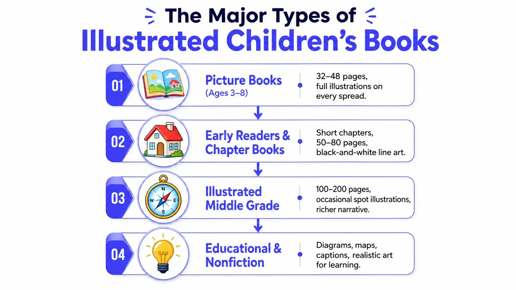
Picture books are the most illustration-dependent format. They're usually built for a spread-by-spread read, with the art doing most of the emotional and narrative work. The standard production shape is often a 32-page interior, and those pages are planned around pacing, page turns, and full-bleed art.
That makes the illustrator almost a co-storyteller. A single moment can be stretched across a spread, compressed into a spot illustration, or given extra breathing room if the scene needs suspense. If your manuscript relies on visual jokes, quiet reactions, or strong character expressions, picture-book structure may fit naturally.
Early readers and chapter books use art differently
Early readers and chapter books still use illustration, but the job changes. The art often supports comprehension, breaks up text, and keeps emerging readers from feeling buried in prose. You'll usually see black-and-white line art, spot illustrations, or small scene breaks rather than every spread fully painted.
This format is a good fit when the story needs more words than a picture book allows, but still benefits from visual guidance. For authors, that often means less pressure on every image to carry the whole emotional load. For illustrators, it means simpler compositions and more focus on clarity.
Middle grade and educational books widen the brief
Illustrated middle grade books use art more sparingly, but the illustrations can still matter a lot. A few strong images can set tone, establish character, or anchor chapter openings. Educational and nonfiction titles often go in a different direction entirely, using diagrams, maps, labels, and realistic art to teach rather than just to charm.
If you're unsure where your manuscript fits, ask a simple question. Does the art need to tell the story, support the text, or explain information? That answer usually points to the right format faster than word count does.
A printer-focused resource like Marquis Book Printing children's books can also help authors see how format choices affect the final physical book, because layout and print decisions show up long before the book reaches readers.
Illustration Styles and How to Choose One That Fits Your Story
Style gets discussed like taste, but authors need to treat it like a production decision too. The right style affects printing, revision speed, budget, and whether your book feels playful, tender, modern, or highly instructional.
Match the mood before you match the medium
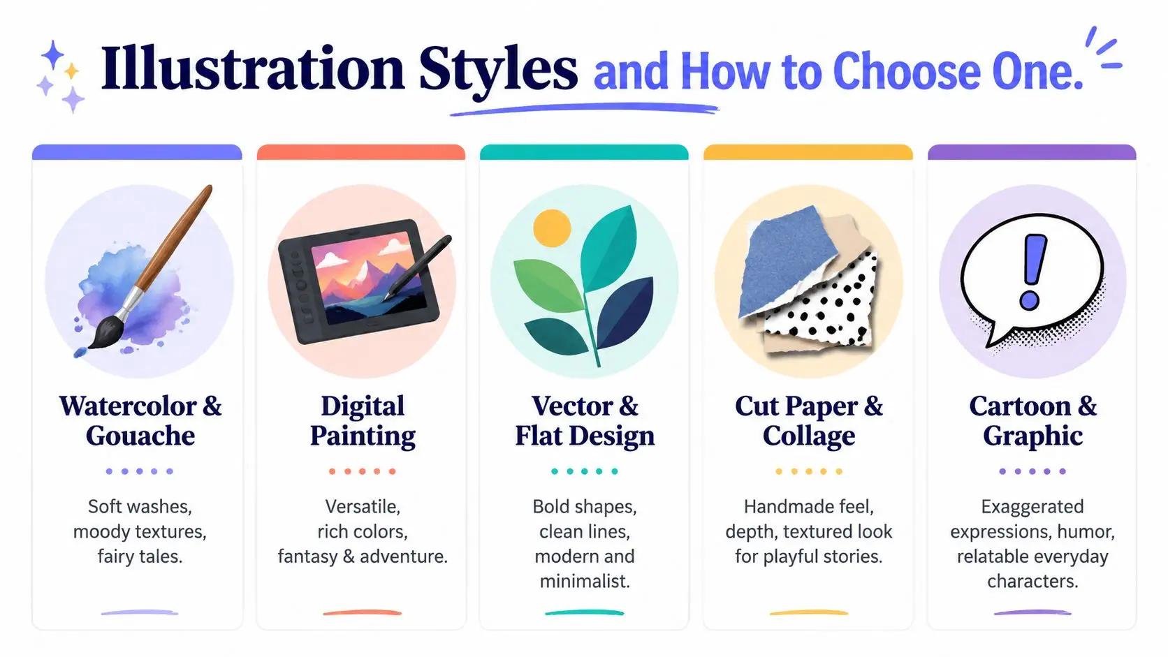
Watercolor and gouache tend to suit gentle, emotional books because the textures feel soft and handmade. Digital painting gives illustrators more flexibility for fantasy, adventure, and richer color control. Vector and flat design work well when you need bold shapes, clean edges, and readable images for concept-driven books or activity pages.
Cut paper and collage can add a tactile, slightly crafted feel that works beautifully when the story needs personality without visual clutter. Cartoon and graphic styles lean into expression and humor, which makes them a strong fit for funny everyday stories or exaggerated character moments. Photorealistic art is more specialized, and it usually makes sense when realism itself is part of the book's purpose.
The easiest mistake is choosing a style because you like it in isolation. A style that looks gorgeous on Instagram can become a burden on a book if it slows revisions or makes the text hard to place. The best question is not “Do I like this?” It's “Does this visual language help this story breathe?”
A style should solve a story problem, not create a new one.
Think about production before you fall in love with a look
Some styles naturally demand more repainting and more detailed approvals. Others are easier to standardize across a whole book, especially when a series needs repeating characters and consistent backgrounds. If you know your budget is tight, style needs to be chosen with that constraint in mind.
That's where hybrid workflows can make sense. An illustrator may sketch digitally, paint with textured brushes, or combine collage elements with drawn characters to create a look that feels handmade without requiring every page to be built from scratch. If you're testing visual direction, an internal character tool like this Storyloft character design template can help you organize traits before you ever commission art.
The old question, “What's your style?” is really three questions. What does the story need, what can the printer handle, and what can you afford to revise? If those three answers line up, the style is probably right.
Camera Angles, Perspective, and Visual Pacing Across a Picture Book
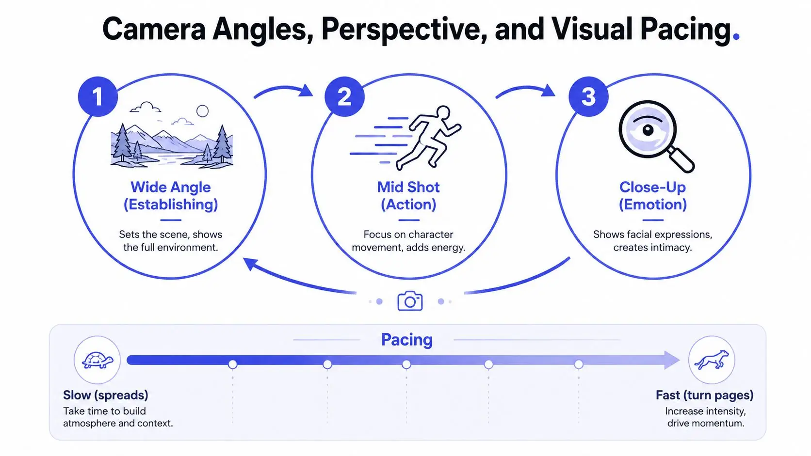
A good picture book doesn't just change scenes, it changes distance. That distance controls tension, comedy, calm, and surprise, and readers feel it even if they couldn't name it.
Start with one anchor view
A strong workflow usually begins with a consistent front view of the main character. That anchor makes it easier to keep the character recognizable across pages, especially if you're working with a series or a long sequence of scenes. From there, you can move into three-quarter views, close-ups, overheads, and low-angle shots without losing continuity.
The point is not to vary the camera just for novelty. The point is to vary it when the story changes. A wide shot can introduce the setting, a mid shot can show action, and a close-up can carry emotion or surprise.
Too many angles can weaken the read
A 24-page book doesn't need endless camera gymnastics. In practice, a small set of recurring angles usually feels clearer than a page-turning tour of every possible viewpoint. That's especially true when readers are young, because they need to recognize character movement quickly.
One practical way to read a dummy is to ask what each spread is doing emotionally. If three spreads in a row use the same distance and the same eye level, the book may start to feel static. A revision note should be specific, something like, “Move this moment closer,” or “Make the reveal overhead so the toy fills the page,” rather than just “Make it more dynamic.”
Traditional picture-book work also leaves room for non-photographic perspective, including flat or stylized viewpoints influenced by scroll painting or expressionist approaches. That can be a powerful choice when emotional clarity matters more than literal realism. The trick is to make the viewpoint feel intentional, not accidental.
A layout guide like book layout design secrets and what makes readers keep turning pages can help you think like an art director while you review a dummy. When you know what a spread is meant to do, you can judge whether the angle helps the page turn.
File Specs, Print Standards, and What to Hand Off to a Printer
A lot of beautiful art gets damaged at the handoff stage. The illustrator may have the right style and the right scenes, but if the files are not set up correctly, the printed book can come out blurry, clipped, or misaligned.
The production baseline you need to ask for
For print children's books, ask for 300 DPI/PPI at final trim size with 0.125-inch bleed on all sides for full-bleed artwork. That matters because low-resolution art has to be stretched later, and stretched art loses crispness. It also matters because if art stops at the trim line, a tiny shift in cutting can leave white edges.
The math is concrete. An 8×10 inch page becomes 8.25×10.25 inches with bleed, which equals 2400×3000 pixels at 300 DPI before you account for safe areas, text, or page furniture (US Illustrations). If you do not check that canvas size early, the art may look fine on screen and still fail in print.
Set the canvas for the final trim plus bleed from the start, not after the art is finished.
What the handoff should include
| Specification | Standard Value | Why It Matters |
|---|---|---|
| Resolution | 300 DPI/PPI at final trim size | Keeps print art sharp |
| Bleed | 0.125 inch on all sides | Prevents white edges after trimming |
| Canvas example | 8.25×10.25 inches for an 8×10 inch page | Shows how bleed changes the working file |
| Pixel example | 2400×3000 pixels at 300 DPI | Gives a usable production target |
File formats matter too. For print, illustrators usually deliver TIFF or layered PSD files so the printer or designer can preserve quality and keep editable elements intact. For digital uses, PNG is often more practical. Color also matters, because print files need to be prepared for CMYK output rather than screen-first RGB viewing.
A printer does not care how lovely the sketch looked in progress. It cares whether the file arrives ready for trim, bleed, color conversion, and clean output. If you want a fuller walkthrough of how file setup affects the final book, print-ready book formatting is the part to review before anyone sends pages to production.
If you are checking deliverables, use the same care you would use when reviewing packaging or product art. A resource like bespoke box artwork UK is a useful reminder that print specs are a production issue from the start, not an afterthought. The same logic applies to books, the art has to survive the machine.
Hiring an Illustrator Versus DIY With AI-Assisted Tools
This is the decision most first-time authors circle for weeks. You want the book to look professional, but you also want to stay on budget, keep control, and avoid getting stuck in a long back-and-forth that never resolves.
Human illustrator, AI-assisted workflow, or hybrid path
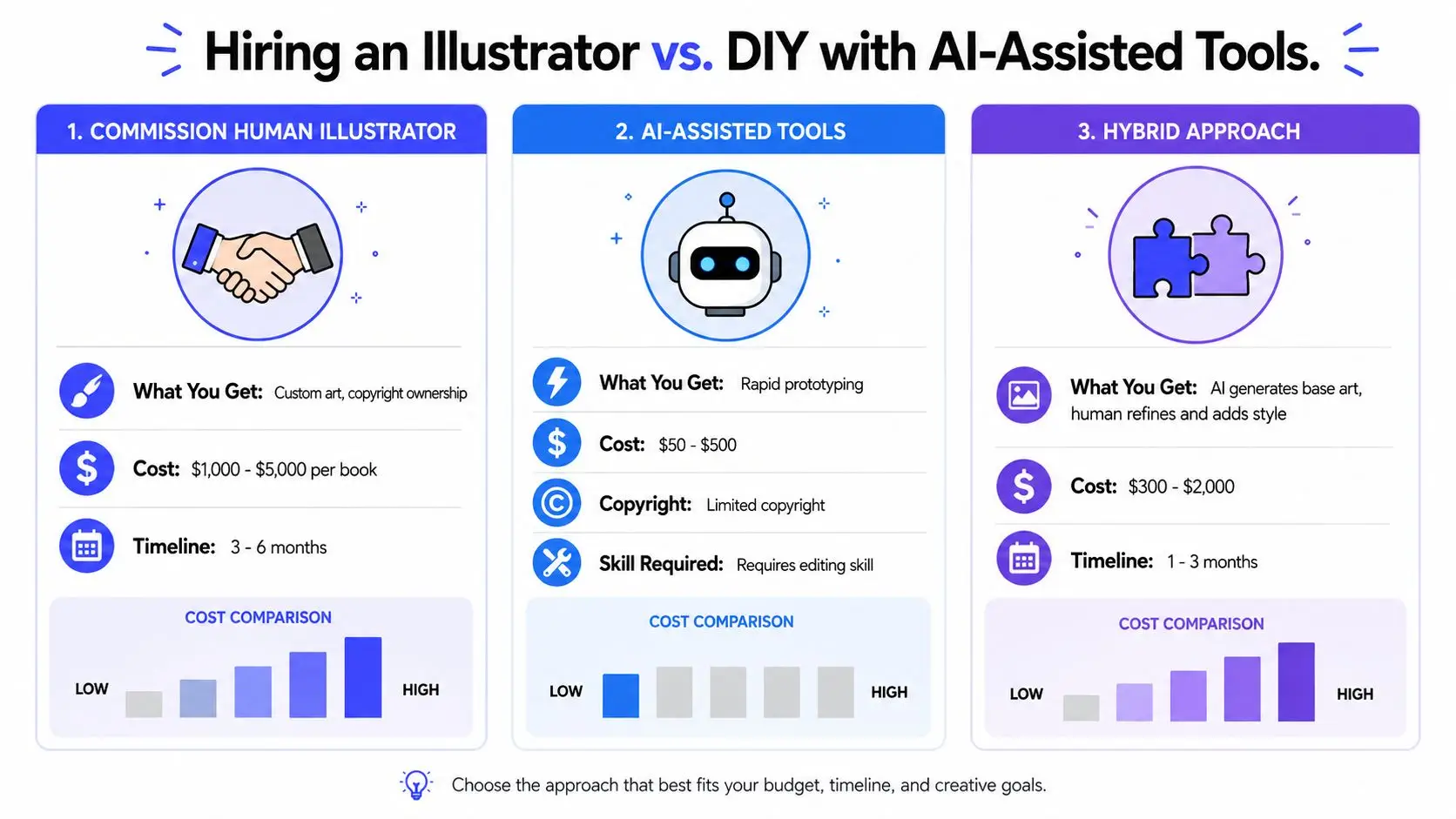
A commissioned illustrator brings trained judgment, emotional nuance, and print-ready craft. The biggest advantage is control over the final book language, not just the image itself. Human artists also understand the pressure points of sequential storytelling, especially when a scene needs to shift perspective or carry a quiet emotional beat.
AI-assisted tools shine when you need speed, rough exploration, or help clarifying a concept before spending money on a full commission. A hybrid process can work if you want a base image generated quickly and then refined by a human who knows how to correct anatomy, fix composition, and prepare proper files. That route can suit authors who need to test ideas without committing to a full art budget first.
An all-in-one writing platform can sit somewhere in the middle. Storyloft, for example, includes an AI illustration suite with text-to-image generation, a scene creator from selected passages, and style controls, along with character management for reusing visual traits across images. That makes it one option for authors who want to keep drafting, visual planning, and formatting in one place.
Choose based on the thing you can't compromise on
If consistency across pages matters most, hire carefully and ask for character sheets, reference sketches, and a clear revision process. If turnaround speed matters most, AI-assisted drafting can help you get to a concept faster. If ownership and emotional interpretation matter most, a trained illustrator usually earns the extra cost by preventing expensive fixes later.
The decision rule is simple. If you can clearly describe the visual result and you mainly need execution, hire a human illustrator. If you're still exploring the look, test with AI-assisted tools first. If you need a middle path, use a hybrid workflow and treat it like a production stage, not a final shortcut.
For authors comparing tools, the 9 best children's book AI creators to try in 2026 can help you understand the broader options before you commit to a direction.
Budgeting, Pricing, and the Contract Clauses You Should Never Skip
Money gets awkward fast when authors assume art pricing should behave like word pricing. It doesn't. Illustration work includes concept development, character consistency, revisions, and file preparation, all of which take time before the book ever goes to print.
What drives the price up
Illustration cost usually rises with page count, full-color complexity, number of characters, background detail, deadline pressure, and the scope of rights you want to buy. A more complex book asks the illustrator to solve more visual problems, and the contract should reflect that. If you're asking for exclusivity, full usage rights, or rapid turnaround, expect that to affect the quote.
Because pricing varies by project, the most useful thing you can do is define the work clearly before you ask for a number. Count the pages, identify which ones are full spreads, note whether you need spot illustrations, and decide how many revision rounds you can realistically review. The clearer the brief, the cleaner the quote.
Clauses that protect both sides
A good contract should spell out scope, revision limits, usage rights, credit, and what happens if the project stops midstream. It should also define who owns what, especially if an AI-assisted step is part of the process. If the illustrator uses reference boards, character sheets, or layered files, those deliverables need to be described clearly.
Ask for the deliverable list in writing before money changes hands.
Red flags are easy to spot once you know them. Vague promises, no revision structure, unclear ownership language, and “everything included” pricing can all lead to disputes later. A solid contract protects the author from surprise costs and protects the illustrator from endless unpaid changes.
Your Next Steps and Common Questions About Children's Book Illustration
Start with format, not style. Then shortlist the illustration look, decide whether a human, AI-assisted, or hybrid workflow fits your budget, draft one sample spread, verify file specs, and only then sign anything or generate final art.
Do I need an illustrator before querying agents? Usually no, unless the submission guidelines ask for fully illustrated materials or you're pitching a format that depends on visuals.
How do I protect my story when I share it? Share only with people who need to see it, and keep your drafts organized so you can track versions.
Can I keep character consistency in a series? Yes, if you build character references early and keep the visual rules stable across books.
The creative part gets easier when the production part stops being a mystery. If you want a single place to draft, plan visuals, test illustration ideas, and format for export, Storyloft brings those steps into one workflow. It won't choose your story for you, but it can help you move from manuscript to illustrated book without juggling a dozen separate tools.