The Best Cover Design Template for Your Book in 2026

You typed “The End,” closed the manuscript, and felt that brief rush of relief. Then the next question landed: what is this book supposed to look like on the front?
That moment trips up a lot of authors. Writing a book and packaging a book use different skills, and cover design can feel like a wall between your finished draft and an actual published title. You want something professional, but you probably don't want to learn advanced design software from scratch or pay for a fully custom concept before you even know what format you'll publish in.
That's where a cover design template becomes useful. Not as a shortcut that makes your book look generic, but as a structured starting point that handles the parts new authors often miss: layout, hierarchy, readability, trim-safe spacing, and export requirements. Used well, a template lets you move from rough idea to publishable cover inside one workflow instead of bouncing between random tools, mismatched file settings, and last-minute fixes.
Table of Contents
- Your Book Is Written Now What
- What Is a Book Cover Design Template
- Key Technical Specs You Cannot Ignore
- Choosing the Right Template for Your Genre
- How to Customize Your Template Like a Pro
- Create and Test Your Cover with Storyloft
- Frequently Asked Questions About Cover Templates
Your Book Is Written Now What
Finishing a manuscript is a huge milestone. It also creates a new kind of pressure, because the cover is now doing a job your draft can't do by itself. It has to catch attention, signal genre, look credible at a glance, and work across storefronts, thumbnails, and possibly print.
That pressure is more intense now because self-publishing has become crowded. The self-publishing boom drove a 40% increase in new book titles globally between 2010 and 2020, and there are over 2 million self-published books released annually in the US. On platforms offering book cover templates, 70% of book cover users are first-time authors lacking professional design budgets (Canva book cover template data).
A template helps because it narrows the problem. Instead of staring at a blank canvas and guessing where the title should go, what font pairs well, or how large the author name needs to be, you begin with a design structure that already has visual logic built in. You still make the book yours. You just don't have to invent the underlying system.
Practical rule: A good cover doesn't start with decoration. It starts with clear hierarchy. Title first, mood second, details third.
That matters if you're publishing in more than one format. Ebook covers reward clarity at tiny sizes. Print covers punish small technical mistakes. A fragmented process often means you design in one app, resize in another, export somewhere else, then discover your spine is off or your text sits too close to the trim. Authors who want a smoother path usually benefit from learning the workflow before picking visuals.
If you're still mapping the full publishing path, this guide on how to publish a book helps place cover creation in the bigger sequence from manuscript to release.
What Is a Book Cover Design Template
A book cover design template is a reusable cover layout you customize with your own title, subtitle, author name, images, and color decisions. It gives you a professional framework without locking you into a single final look.
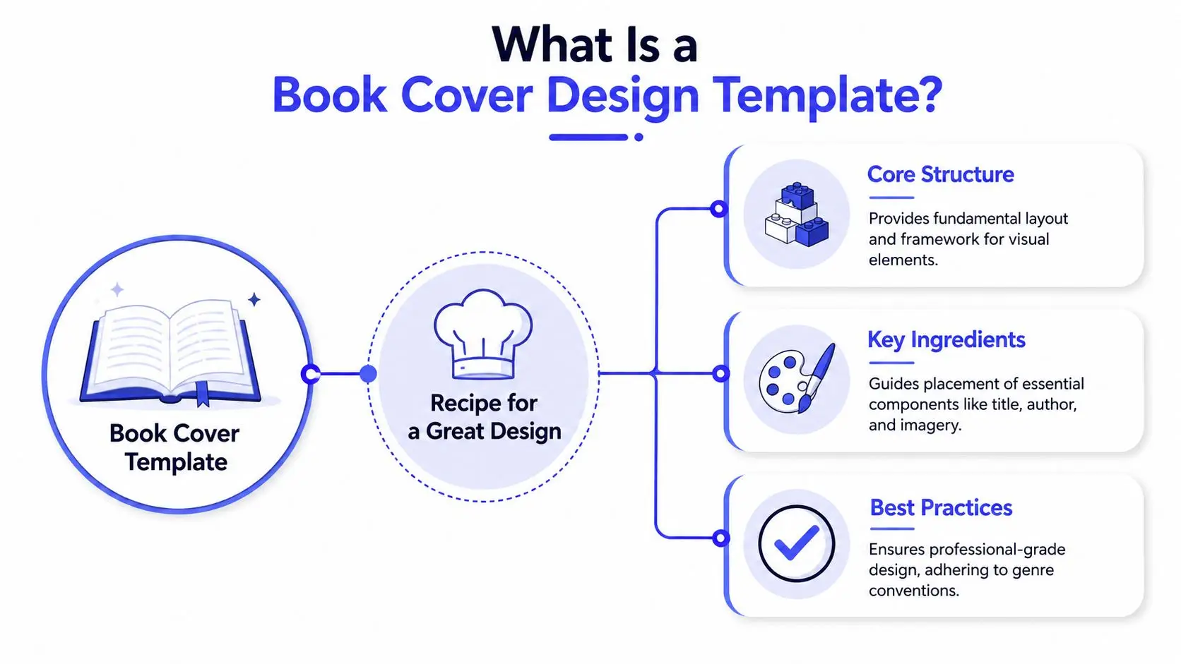
A template is a recipe, not a finished meal
The easiest way to think about it is this: a template is like a recipe from a skilled chef. The recipe tells you the structure of the dish, the balance of flavors, and the order that makes everything work. You still choose the exact ingredients and presentation.
That's different from a pre-made cover. A pre-made cover is closer to buying a finished cake with your name added on top. A template is the baking method, pan size, and ingredient ratios. You still cook.
This distinction matters because many authors worry templates make books look identical. They don't, unless you treat them like stickers. The useful part of a template isn't the placeholder image. It's the hidden design judgment underneath it: spacing, contrast, title placement, font relationships, and the way the eye moves across the cover.
A strong template removes random choices so your important choices stand out more.
If you want to compare layouts and see how professionally structured covers are built, a dedicated book cover design workspace makes those underlying patterns easier to spot than a blank editor does.
What a strong template usually includes
Not every template is worth using. Some are decorative but flimsy. Others are rigid and hard to adapt. The ones that help most usually include a few core pieces:
- A clear visual hierarchy. The title has a defined role. The subtitle supports it. The author name doesn't compete unless the name itself is the selling point.
- Genre-aware typography. The fonts already point in a direction. Clean sans serif for business. Elegant script or serif for romance. Heavy, high-contrast type for thriller.
- Image logic. The template has a focal area for a photo, illustration, shape, or texture. It doesn't ask you to cram visuals into leftover space.
- Balanced spacing. Good templates leave room to breathe. New designers often confuse “full” with “professional,” but overcrowding usually makes covers look cheaper.
- Production awareness. Better templates are built with actual publishing needs in mind, not only social media graphics.
A cover template is a scaffold. It supports the structure while you supply the voice. That's why it works so well for authors who want a polished result without needing a design degree.
Key Technical Specs You Cannot Ignore
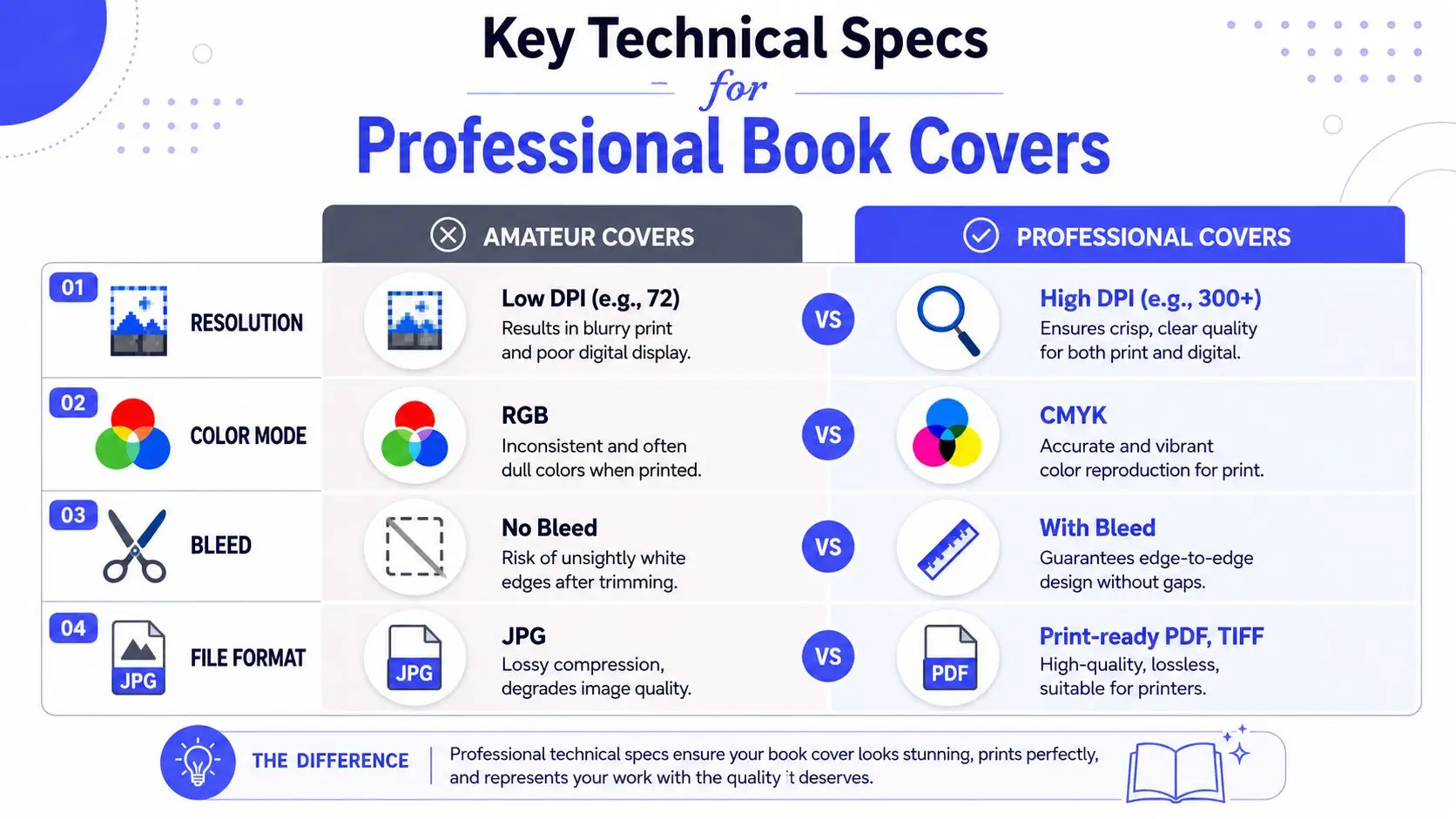
A cover can look polished in your editor, then turn fuzzy as a thumbnail or shift color in print. That disconnect usually comes from setup choices made long before export.
Ebook specs and print specs follow different rules
Digital covers are built to display on screens at many sizes, from full product pages down to tiny retailer thumbnails. Print covers are built for a physical object that gets trimmed, folded, and reproduced in ink. The artwork may look similar, but the file requirements change with the job.
For ebook use, start with a large working canvas so your cover stays crisp when stores resize it. A professional template should give you enough pixel space to place type cleanly, crop images without damage, and export a sharp final file. The same logic applies in video. A stronger source file gives platforms more room to scale cleanly, which is also why creators optimize your YouTube video quality before publishing.
Print adds another layer. You have to account for color mode, trim tolerance, and the extra image area that extends past the final cut. If you design the front cover in isolation and deal with those details at the end, small mistakes can spread across the whole package. That is one reason an integrated workflow helps. When your cover, trim size, and manuscript settings live in one place, you catch mismatches earlier instead of patching them after export.
The three print terms that confuse almost everyone
These terms sound technical, but they become simple once you connect them to the finished book in your hands.
| Term | Plain-English meaning | Why it matters |
|---|---|---|
| Bleed | Extra image area beyond the final cut line | Prevents white slivers at the edges |
| Trim line | The line where the printer cuts the book | Defines the final visible size |
| Safety zone | Inner margin for text and live elements | Keeps text, logos, and ISBNs from getting clipped |
A picture frame is a useful comparison here. The trim line works like the visible edge of the frame. The bleed is the part tucked behind it. The safety zone is where you keep anything you cannot afford to lose, such as the title or author name.
Color is another common problem. Screens use RGB light. Printers use CMYK ink. Bright blues, greens, and pinks often look richer on screen than they do on paper, so a print template should be prepared with print output in mind from the start.
A simple pre-export checklist
You do not need a design degree to handle this part. You need a repeatable check.
- Resolution check. Make sure the working file is large enough before adding final typography. Enlarging a small file later usually softens edges and weakens detail.
- Color mode check. If you plan to print, confirm your template and exported file match your printer's color requirements.
- Edge check. Extend backgrounds, textures, and full-bleed images past the trim line.
- Safety check. Pull titles, subtitles, author names, and barcodes inward so small trim shifts do not clip them.
- Format check. Export in the file type your printer or distributor requests.
Treat these specs like the measurements in a sewing pattern. If the measurements are off, even beautiful fabric will not fit correctly.
If you want a practical reference while building, keep this book cover dimensions guide for ebook and print formats open as you work. It makes it much easier to line up your template, export settings, and manuscript format in one coordinated process.
Choosing the Right Template for Your Genre
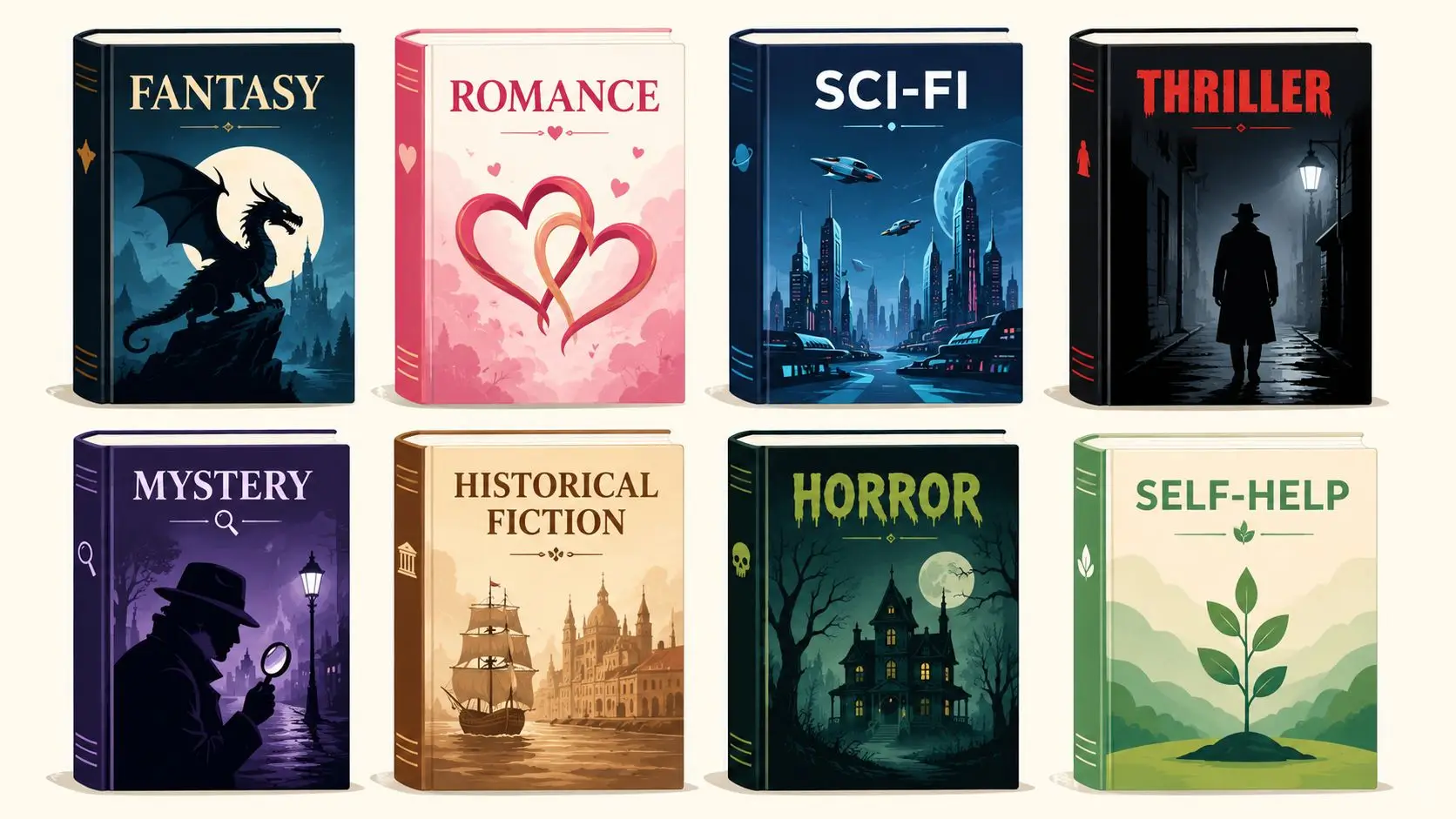
A pretty template isn't enough. If your business book looks like epic fantasy, or your thriller reads as romance, the cover will attract the wrong reader before anyone reads the blurb.
Genre signals matter more than personal taste
Readers scan covers fast. They don't stop to decode your private symbolism. They look for familiar visual cues that tell them what kind of reading experience they're about to get.
A thriller often uses bold type, sharp contrast, and tense imagery. A romance cover usually leans on warmth, intimacy, softer palettes, or elegant type. Science fiction tends to favor sleek forms, atmospheric space, or tech-inflected design language. Business books usually work best when they look clean, direct, and credible rather than ornate.
That doesn't mean every book in a genre must look the same. It means the cover should speak the language of that shelf. You can bend conventions after you understand them. Ignoring them from the start usually makes the book harder to place.
A quick way to calibrate your eye is to compare the top books in your category and ask:
- What dominates first. Is it title-driven, image-driven, or concept-driven?
- How formal is the typography. Serif, sans serif, script, condensed, distressed?
- What emotional temperature shows up. Warm, cold, urgent, mysterious, practical?
- How busy is the layout. Sparse and modern, or layered and cinematic?
How to test a cover before you commit
Genre fit is only half the decision. The cover also has to survive reduction. Industry data shows 70% of ebook purchases happen via thumbnail view, and 40% of DIY covers fail the blur test, meaning the main focal point disappears when the image is blurred or shrunk (thumbnail and blur test data).
That's why I treat two checks as essential:
The thumbnail test
Shrink the cover until it's tiny on screen. If the title becomes mush or the focal image turns into visual noise, the design needs simplification.The blur test
Blur the image slightly, or squint at it from across the room. You should still be able to identify the dominant shape or emphasis.
Here's a quick visual walkthrough of genre and cover thinking in action:
If a cover only works at full size, it doesn't really work online.
How to Customize Your Template Like a Pro
You open a cover template, swap in your title, add a new image, and ten minutes later the design somehow looks less professional than it did at the start. That usually happens for a simple reason. A template is not just a pretty arrangement of boxes. It is a set of visual decisions that already solve balance, hierarchy, and readability.
Your job is to edit it like you would edit a manuscript. Keep the structure that works. Replace the generic parts with details that belong to your book.
Start with the parts readers notice first
Begin with the content that carries the message of the cover:
- Title and subtitle. Put in the actual text first. Then test line breaks before shrinking the font. A cleaner break often fixes crowding faster than making everything smaller.
- Author name. Give it the right level of attention. Established names can carry more weight. Newer authors usually get a stronger result when the title leads.
- Main image or background. Swap the placeholder for imagery that matches your book's tone and promise. Keep the focal area in a similar position unless you have a clear reason to move it.
- Color palette. Change color with restraint. A small shift can make the cover feel original without damaging contrast.
For sharper source visuals and cleaner edits, it can help to review broader MyImageUpscaler design insights while refining imagery, contrast, and composition choices.
Understand what should stay stable
Templates work like house blueprints. You can repaint the walls and change the furniture, but moving load-bearing walls creates problems fast. In cover design, those load-bearing parts are spacing, alignment, and contrast.
That is where many authors get into trouble. They treat every element as equally flexible, even though some parts are doing quiet technical work in the background.
Watch for these common mistakes:
- Adding too many fonts. Two font families are usually enough. More than that often makes the cover feel unplanned.
- Re-centering everything. Many strong templates use uneven placement to create movement. Centering all text can make the design feel flat.
- Stacking on effects. Heavy shadows, outlines, glows, and textures often reduce clarity instead of improving it.
- Using weak image files. A polished layout cannot hide a blurry or stretched image.
A good test is simple. If an edit adds personality and keeps the cover easy to read, keep it. If it adds decoration but weakens focus, remove it.
Customize in an order that protects the design
A steady workflow helps you avoid the usual template mistakes:
- Replace the text
- Adjust line breaks and spacing
- Swap imagery
- Tune colors
- Check alignment one more time
- Export a draft and review it at full size and small size
That order matters because each decision affects the next one. Changing colors before text hierarchy is settled can send you in circles. Replacing the image before you know where the title sits can create unnecessary cropping problems.
If you want a practical walkthrough of that process inside one connected tool, Storyloft has a useful guide on making a professional book cover for ebook and print.
Keep the workflow connected
Customizing a template gets easier when your cover, manuscript, and export settings stay in sync. In a fragmented process, authors often write in one app, design in another, and discover late that trim settings, spine width, or text placement need to change. An integrated workflow reduces those last-minute fixes because the cover is being shaped alongside the book it belongs to.
That is the professional habit here. Strong customization is not about making bigger changes. It is about making the right changes, in the right order, while protecting the design logic the template already gives you.
Create and Test Your Cover with Storyloft
Many cover problems don't come from the design itself. They come from the handoff between tools. You write in one place, create a cover in another, calculate print dimensions somewhere else, then export a file you can't properly test until late in the process.
What an integrated workflow looks like
An integrated workflow keeps the manuscript, cover, and output settings tied together. In practice, that means you can draft the book, open the cover tool, choose a genre-appropriate layout, bring in imagery from the manuscript itself, and prepare versions for ebook and print without rebuilding the file from zero each time.
That setup is especially helpful for print details that generic templates often mishandle. 60% of indie authors report spine alignment errors on print-on-demand books, and generic templates create a 25% error rate in print-ready alignment when they don't account for page count and paper density (spine alignment data).
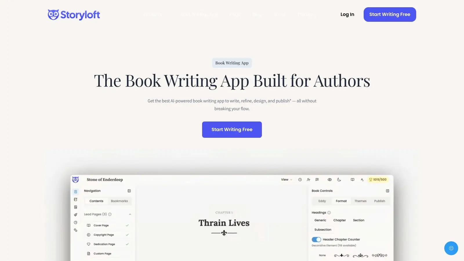
Storyloft is one example of this kind of manuscript-connected workflow. Its cover tools include template-based layouts, print and ebook presets, ISBN barcode generation, and the ability to sync a cover with the active manuscript for testing in output formats. If you want the step-by-step process, this guide shows how to make a professional book cover in Storyloft for ebook and print.
Why syncing the cover with the manuscript matters
When the cover lives beside the manuscript, testing gets easier and more realistic. You're not just asking whether the front image looks nice in isolation. You're checking whether the whole package works as a book object.
That changes the workflow in useful ways:
- You can preview context. A cover can be tested against the actual manuscript output instead of as a disconnected image.
- You can catch print issues earlier. Spine width, barcode placement, and trim-safe spacing become easier to validate before final export.
- You can iterate faster. Swapping a title treatment or alternate layout doesn't require rebuilding your publishing files from scratch.
That integrated loop closes a gap many first-time authors don't realize exists until the last minute.
Frequently Asked Questions About Cover Templates
Can I use the same cover file for ebook and print
Usually, no. The front design concept can stay consistent, but the production file changes. Print needs a back cover, spine, bleed, safety margins, and printer-specific dimensions.
Are free templates good enough
Sometimes. A free template can work if the layout is clean, the typography fits your genre, and the file is built for real publishing specs. The problem isn't price by itself. It's missing structure.
Should I change the fonts in a template
Only if you have a clear reason. Fonts carry genre signals, tone, and readability. If you swap them casually, you can make the cover feel less professional even when the change looks small.
How do I know if my cover is too busy
Run the thumbnail test and blur test. If the title vanishes, the focal point gets lost, or every element competes at once, simplify.
Do templates make books look generic
They can, if you only replace placeholder text. They don't have to. Thoughtful image choice, fitting typography, and restrained color changes usually create enough distinction.
If you want to write, design, test, and prepare your book in one place, Storyloft gives authors a single workflow for manuscript drafting, cover creation, formatting, and export across ebook and print.