How to Illustrate a Book: 2026 Step-by-Step Guide
You've finished the manuscript, chosen a visual direction, and perhaps even generated a few promising character sketches. Then the practical questions arrive. How many illustrations does the book need? Where does the text sit on the page? Will the character still look the same after several rounds of revisions? Will the final files print cleanly, or will a missing bleed force the project back into production?
The answer to how to illustrate a book isn't a single drawing technique. It's a coordinated production process. A successful project moves from locked text to visual planning, reference gathering, character development, thumbnails, approved roughs, finished artwork, and correctly prepared files. Treating those stages as separate handoffs keeps creative decisions manageable and prevents expensive rework.
Table of Contents
- The Illustration Workflow at a Glance
- Choosing an Illustration Style That Fits the Book
- Designing Characters and Scenes for Visual Continuity
- Thumbnails, Layouts, and Page-Turn Pacing
- Production Techniques from Traditional to AI-Assisted
- Export Specs for Print and Ebook
- Collaborating with an Illustrator Without Micromanaging
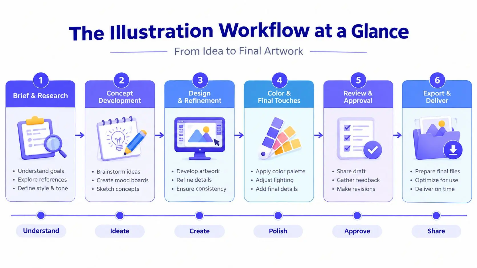
The Illustration Workflow at a Glance
Book illustration works best as a staged pipeline, not as a single creative burst. Each phase produces something the next phase needs, which means a problem caught in thumbnails is inexpensive to solve, while the same problem discovered after final color can affect several pages.
A useful pipeline has eight stages:
- Manuscript lock, including page count, trim size, text placement needs, and illustration brief.
- Visual research, including reference gathering, cultural research, textures, lighting, settings, and object studies.
- Style selection, where the team chooses a visual language that suits the audience, subject, and production method.
- Character and environment design, which establishes repeatable visual rules.
- Thumbnailing, where compositions and page turns are tested quickly.
- Rough comps and approvals, where the page structure, expressions, text placement, and continuity are refined.
- Final artwork, including color flats, value studies, rendering, and corrections.
- Export and production handoff, where the designer or production editor prepares print and ebook files.
A 32-page picture book commonly takes three to six months from start to finish, according to independent illustration workflow guidance from US Illustrations. The schedule expands when the manuscript changes late, when the illustrator is waiting for feedback, or when the team approves finals before solving composition. Nonfiction with occasional spot art can move more quickly because it usually has fewer full-page scenes, but the same handoff discipline still applies.
Production rule: The manuscript owner locks the text, the illustrator protects visual continuity, and the designer or production editor owns the final export.
Start with a page and margin audit
Before researching visual references, inspect the physical architecture of the book. Confirm the trim size, gutter, orientation, bleed requirements, page count, and whether the artwork will be a full-bleed spread, a framed image, a spot illustration, or a chapter opener.
For a children's picture book, mark every spread that carries a visual beat. Note where the protagonist enters, where the emotional turn occurs, and where a page turn should conceal or reveal information. A silent spread may contain no words but still carry the story's central action.
For a nonfiction chapter, examine the prose differently. Flag definitions that would benefit from diagrams, recurring concepts that need visual shorthand, and dense passages where a spot illustration could create breathing room. Don't add images to fill space. Every illustration should clarify, orient, create emphasis, or establish tone.
A mood board helps you make these decisions before drawing. Gather color, texture, period references, architecture, clothing, lighting, and character cues in one place. Production designer Annie Atkins has described this kind of reference gathering as “cheating visually” before the work begins, because the research lets you solve many visual questions before committing to a finished image.
Lock the manuscript before serious sketching
A late sentence change can alter a character's action, expression, prop, or position on the page. Once the illustrator has built a composition around approved text, that change can trigger a redraw rather than a simple copy edit.
Independent workflow guidance recommends locking the manuscript before serious drafting, and professional picture-book projects often use one to two sketch-review rounds followed by one final color round. Those rounds work only when the team respects the approval gates. If every approved stage remains open indefinitely, the project has no dependable finish line.
For the picture book, deliverables might be a paginated manuscript, a scene list, a reference board, and a thumbnail plan. For the nonfiction title, they might be a chapter map, an illustration inventory, diagram requirements, and a list of recurring visual motifs. The format differs, but the principle stays the same: define what must be decided before the illustrator begins the next stage.
Technical planning belongs here, not after the final art. Book illustration production guidance recommends preparing raster artwork at 300 DPI at final trim size, using substantially higher sampling for detailed black-and-white line work, and allowing 0.125 inches, or 3 mm, of bleed for full-bleed pages. The exact printer specification still takes priority, but the illustrator should know the target before creating the canvas.
Choosing an Illustration Style That Fits the Book
Style is a production decision as much as an aesthetic one. A visually rich approach may suit a picture book but create a slower revision cycle. A restrained diagrammatic system may work beautifully for nonfiction but feel emotionally flat in a character-led story.
| Illustration Style | Best For | Avg. Cost/Page | Timeline | Reader Age |
|---|---|---|---|---|
| Picture book | Narrative spreads and expressive storytelling | Higher | Slower | Early readers and children |
| Comic or graphic | Sequential action and dialogue | Moderate to higher | Moderate | Middle-grade and YA |
| Technical or diagrammatic | Explanations, processes, and reference material | Moderate | Moderate | Children through adults |
| Minimalist or editorial | Nonfiction, essays, and conceptual material | Lower to moderate | Faster | Older children and adults |
| Mixed-media | Tactile, distinctive, or collage-led books | Higher | Slower | Varies by subject |
Picture-book illustration rewards custom decisions in every spread. Watercolor, gouache, colored pencil, and collage can create warmth and depth, but each original spread takes planning and careful reproduction.
Comic and graphic approaches give readers strong sequencing through panels, gutters, and recurring figures. They're effective for action and dialogue, but the illustrator must maintain convincing anatomy, expressions, perspective, and panel rhythm.
Technical illustration prioritizes accuracy and repeatability. It's often the right choice when readers need to understand an object, system, map, or process rather than interpret an atmosphere.
Minimalist and editorial styles use fewer shapes, controlled palettes, and typography as part of the visual system. They can make dense nonfiction easier to move through, provided the simplification doesn't remove necessary meaning.
Mixed media offers tactile appeal, but scans, transparencies, paper edges, and layered textures create additional reproduction decisions. If you're also working through pagination, permissions, and print preparation, a practical guide to how to publish a children's book can help connect the creative plan to the wider publishing workflow.
Choose the style before commissioning thumbnails. Match it to the reader's age, the density of the subject, the emotional range of the manuscript, and the available production resources. A style that looks impressive in a portfolio can still be wrong for a book if it makes text placement, continuity, or reproduction unnecessarily difficult.
Designing Characters and Scenes for Visual Continuity
A character sheet is not optional for a book with recurring figures. It's the reference that prevents small inconsistencies from becoming expensive corrections. Build it before final scenes, even if you're the only person working on the project.
Include:
- Face and body views, showing front, profile, and three-quarter angles.
- Expression studies, covering the emotional states the manuscript requires.
- Clothing and prop references, including fasteners, patterns, shoes, bags, tools, or other repeatable details.
- Scale relationships, comparing the character with furniture, animals, vehicles, and important objects.
- Palette notes, identifying the colors that should remain stable and those that may change with lighting.
A scene bible serves the same purpose for locations. Record the architecture, recurring objects, camera angles, time of day, weather, and lighting logic. A bedroom shouldn't change wall color or window position unless the story gives the reader a reason. For a nonfiction book, the equivalent might be consistent icon shapes, line weights, labels, and diagram conventions.
Test the palette under the lighting conditions that appear in the manuscript. Daylight interiors, nighttime scenes, and rain can shift the perceived color of the same coat or room. Swatches let you check those changes before rendering a full spread.
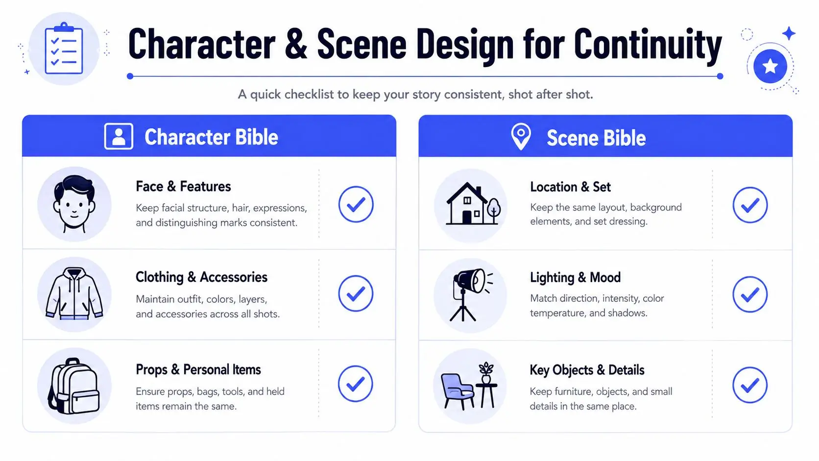
A character design template can help organize these references, especially when authors, illustrators, and designers need to consult the same visual rules.
AI tools can assist with pose references, lighting tests, and exploratory composition, but they're unreliable as final character systems. Midjourney character references, Stable Diffusion IP-Adapter workflows, and Runway Act-One can produce useful starting material, yet generated figures may drift in facial structure, costume details, proportions, and props between images. A tool that creates one attractive portrait hasn't solved continuity across an entire book.
Use generated material as reference or ideation unless the project's rights, disclosure, and consistency requirements have been reviewed. Human-controlled design still has to define the character that appears on the page.
Thumbnails, Layouts, and Page-Turn Pacing
Thumbnails are where illustration becomes editorial problem-solving. They're intentionally small and rough because the purpose is to test composition, not display drawing skill.
Create a thumbnail for every spread before committing to final art. For a children's picture book, map the full sequence so you can see the visual rhythm across all 16 spreads. For a nonfiction title, place recurring spot illustrations and chapter graphics into the text so you can identify repetition, crowded pages, and long stretches without visual support.
At thumbnail size, ask four questions:
- Can the silhouette be read quickly? If the main action disappears into the background, the composition needs work.
- Is the value contrast clear? A grayscale check often exposes weak focal points.
- Does the eye know where to go? Use scale, direction, contrast, and placement to guide attention.
- Does the spread advance the book? Repeating the same information in a new arrangement rarely strengthens the sequence.
Centered compositions can create stillness, ceremony, or direct emotional focus. The rule of thirds often creates more movement, especially when a character is looking or traveling toward open space. Neither approach is automatically correct. The manuscript's emotional beat should determine the arrangement.
Keep faces, critical labels, and important actions away from the gutter. A beautiful composition can fail if the binding cuts through an expression or separates a diagram from its explanation.
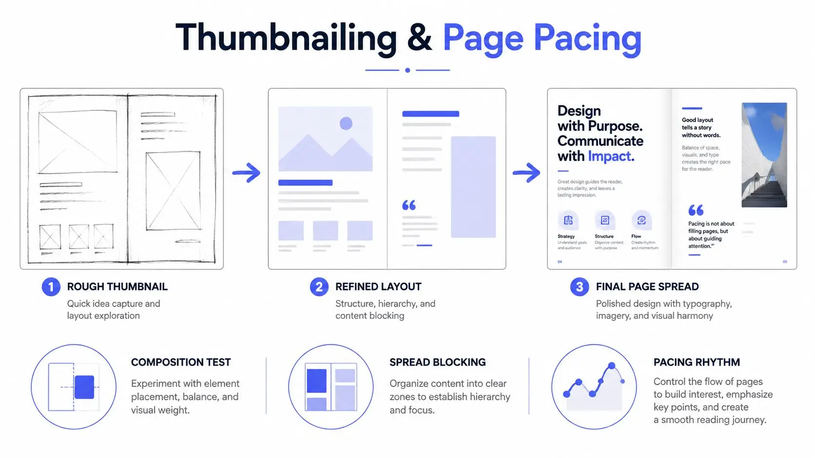
In a picture book, the page turn can hide a character's decision, delay a reveal, or create contrast between a quiet spread and a busy one. A nonfiction page turn can perform a similar function by separating a question from its answer or an overview from its detail.
Watch the practical demonstration below for another view of the progression from rough layout to finished page structure.
Get approval on thumbnails and rough comps before rendering. Independent workflow guidance identifies overworking final art before composition as a common source of rework, because polished detail can disguise a structural problem until it's expensive to change.
Production Techniques from Traditional to AI-Assisted
The production method determines how easily you can revise, how much control you retain, and what evidence you can provide about the final artwork.
| Method | Cost per Spread | Revision Speed | Control and Legal Risk |
|---|---|---|---|
| Traditional | Higher for labor-intensive originals | Slower | Strong tactile control, but physical corrections are difficult |
| Digital raster | Moderate | Fast | Strong layer and color control |
| Vector | Moderate | Fast for scalable shapes | Precise output, with a style that may feel less organic |
| AI-assisted | Variable | Fast for exploration | Output consistency, provenance, disclosure, and rights require review |
Traditional media such as pen and ink, watercolor, gouache, and collage produces physical texture that digital brushes may not fully reproduce. It also makes changes costly. Repainting a watercolor sky or rebuilding a glued collage can affect the entire image.
Digital raster workflows in Procreate or Photoshop, used with a Wacom tablet or Cintiq, are common because layers support non-destructive edits. You can adjust a character's position, test a new background, or correct color without destroying the underlying drawing.
Vector workflows in Illustrator or Affinity Designer suit diagrams, flat shapes, icons, and artwork that must scale across formats. They provide clean edges and repeatable elements, although some manuscripts need a more visibly handmade surface.
AI-assisted methods are useful for concept exploration, background texture, reference gathering, and early visual direction. They become more complicated when the generated image is intended as final book art. Review provenance, licensing, publisher requirements, disclosure expectations, and the ability to revise a specific detail without changing unrelated parts of the image. Guidance on AI-generated illustrations is useful when deciding where automated generation belongs in the pipeline.
Authors should also plan how the finished art will support promotion. A workflow for social media for indie authors can help identify which approved character details, process images, and page crops are safe to share without exposing unfinished or rights-sensitive material.
The most dependable method is often hybrid. An illustrator may use digital tools for layout and revision, traditional marks for texture, and carefully documented references for consistency. The method should serve the book, not become a technical showcase.
Export Specs for Print and Ebook
Export decisions need to be made before final artwork begins. Print and ebook editions don't use the same color space, resolution target, or file behavior, so one file rarely serves both without deliberate preparation.
| Specification | Print, CMYK | Ebook, RGB |
|---|---|---|
| Resolution | 300 PPI at final size | 150 PPI is often sufficient for screen output |
| Bleed | 0.125 inch, or 3 mm, on trim edges where required | Usually excluded unless the platform specifies otherwise |
| Color | CMYK, using the printer's requested profile | RGB |
| Handoff | Layered PSD or TIFF, plus press-ready PDF/X-1a when requested | High-resolution PNG or JPEG, fixed-layout EPUB or KF8 assets |
| Scalable artwork | Vector files where supported | SVG where the platform supports it |
The exact printer profile matters. Ask whether the production house requires SWOP, GRACoL, or another coated profile, then convert RGB artwork deliberately rather than leaving conversion to an unknown automated step. Saturated reds and cyans can shift noticeably during conversion, so inspect proofs instead of trusting the monitor.
Full-bleed artwork needs bleed on every applicable trim edge. Missing bleed creates unwanted white slivers after trimming. RGB files sent directly to an offset print workflow can also produce unexpected color changes.
Ebook files create a different problem. Delivering every image at print resolution can inflate the package and slow downloads. Prepare images for the intended screen output while preserving enough detail for the reading device and platform.
Raster artwork generated or assembled from small sources is often enlarged and sharpened for print. That can't restore detail that was never captured. Independent production guidance emphasizes preparing raster art at final size and warns that low-resolution artwork enlarged later may blur in print. For the handoff, a printer-specific PDF/X-1a settings reference is more useful than generic export advice.
If you're preparing the digital edition alongside print, ebook formatting guidance can help you keep the two output paths separate rather than forcing the print file into an ebook workflow.
Collaborating with an Illustrator Without Micromanaging
A good author brief gives the illustrator enough information to make intelligent visual decisions without prescribing every gesture. Include the genre, audience, trim size, page count, publication target, visual references, mood board, and required constraints. Flag licensed characters, brand colors, religious references, cultural sensitivities, accessibility concerns, and any visual detail that must remain accurate.
Set approval gates in the contract or project plan. A practical structure is:
- Thumbnail approval, covering pacing, composition, and page allocation.
- Final sketch approval, covering character continuity, expressions, text placement, and scene details.
- Color final approval, limited to genuine corrections rather than a new visual direction.
Put response deadlines in writing. A finished illustration can't move forward if feedback sits in an inbox, and an illustrator can't protect a delivery date when every approved stage remains open.
Feedback should identify the problem, not redraw the solution. Mark the page and use precise references such as “verso of the spread” or “page 12,” then separate must-fix issues from preferences. “The character needs to look toward the doorway because the text describes a sound there” gives useful editorial direction. “Move the arm this way and redraw the chair like this” may unintentionally take ownership of the illustrator's craft.
Avoid feedback creep. Once thumbnails are approved, don't reopen the entire pacing system during color review unless the change is essential. Late changes can affect the character, background, text position, and export settings at once.
When collaborators use different tools, agree on a shared interchange. A PDF can support page-level review, a ZIP can carry layered PSD or TIFF files, and a cloud folder can preserve version history. Keep filenames consistent and make comments traceable to page numbers.
An integrated workspace such as Storyloft can keep the manuscript, illustration brief, comments, and image references in one project timeline. That's one option among separate tools such as Procreate, Photoshop, Illustrator, Google Drive, and email, and the right choice depends on how much coordination the project requires.
The illustrated book market has deep historical roots. Albrecht Pfister's illustrated typographic books appeared in Bamberg in 1461, and Günther Zainer's woodcut-illustrated book followed in Augsburg in 1471, milestones documented in this history of illustrated book production. Modern demand remains substantial, particularly in children's publishing. One industry estimate places global illustrated children's book sales at about 1.8 billion books in 2024, with illustrated titles representing 38% of the children's publishing sector by volume; the same report states that more than 350 million children's books are sold annually in the United States and that 59% contain illustrated content, as reported by Data Insights Market.
Those figures explain why production discipline matters, but they don't replace editorial judgment. Inclusive character design, local and global cultural detail, bold simplification, and mixed-media approaches are prominent themes in recent illustration discussion, including children's book illustration trend coverage. The practical test is whether the chosen visuals remain legible, respectful, age-appropriate, and adaptable across print and digital editions.
Storyloft brings manuscript drafting, character creation, scene illustration, cover design, collaboration, and print and ebook formatting into one cloud-based workspace. If you want to manage the visual pipeline beside the text instead of tracking briefs and revision notes across separate tools, visit Storyloft and start organizing your book's illustration workflow.