How to Create a Book A Friendly Guide for Beginners

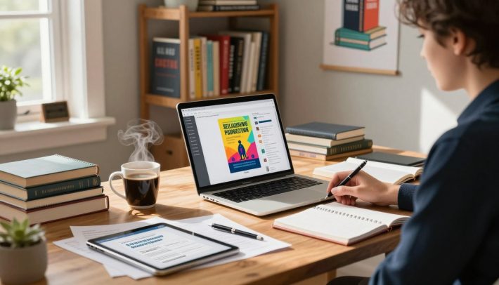
I remember typing the last sentence of my first manuscript at 2 a.m. My coffee was cold, and my cat was on my keyboard. I felt proud and thought, “Now what?”
For weeks, I wondered how to turn my 60,000 words into a book. Writing was hard, but making a physical book seemed even harder.
If you’re wondering how to create a book, you’re not alone. Finishing your manuscript is just the start. You need to format, design, and get ISBNs before anyone can read your book. It can seem overwhelming.
Platforms like Amazon KDP and IngramSpark make things easier. But, they still require effort. Think of your manuscript as a painting. Without the right frame, it goes unnoticed. Good design and formatting are like the frame.
I’ve learned a lot about self-publishing the hard way. This guide will help you avoid my mistakes. We’ll cover formatting, cover design, and more, in simple terms.
Key Takeaways
- Finishing your manuscript is exciting, but it’s just the starting point of the book creation process.
- Knowing how to create a book means mastering formatting, design, and file preparation — not just writing.
- Self-publishing advice from experienced authors can save you costly mistakes and wasted time.
- Your book’s presentation matters as much as the words inside it — readers do judge books by their covers.
- This book creation guide covers every step from raw manuscript to print-ready product.
- Free and affordable software options exist for every budget, so cost shouldn’t stop you.
Understanding the Journey from Manuscript to Published Book
Typing “The End” on your manuscript is a big deal. I felt so excited when I finished my first draft. But, I wish I knew that the journey doesn’t end there. Your manuscript needs to be turned into a book that readers can hold and enjoy.
The Incredible Feeling of Finishing Your Story
Finishing your draft is a huge accomplishment. You’ve worked hard for hours, weeks, or even years. Celebrate this achievement! A 2024 survey by Written Word Media shows that less than 3% of people finish their book. You’ve already won.
Why Writing Is Just the Beginning
A manuscript is like a painting without a frame. It has words, but needs presentation. Writing a book involves more than just writing. You’ll need to think about:
- Professional formatting and layout
- Eye-catching cover design
- Front and back matter (copyright pages, author bios, etc.)
- Print-ready file preparation
These elements turn your words into a polished book. It can stand alongside any traditionally published book on a shelf.
Setting Realistic Expectations for Self-Publishing
Platforms like Amazon KDP and IngramSpark make self-publishing easy. But, the production phase takes time. Rushing through design and formatting shows and readers notice.
“A professionally designed book tells the reader you respect their experience before they even read a single word.”
Take your time to learn how to make your book look and feel professional. The effort you put in now will be worth it when your book is released. Next, I’ll explain why finishing your manuscript first is crucial.
Completing Your Manuscript Before Anything Else
I get it. You’re excited about your book and want it to look like a real book now. But, picking fonts and playing with drop caps before you’re done is a trap. I’ve seen writers waste hours on fancy line breaks for a draft that still needed edits.
The most important thing in book writing is to finish your manuscript first. Write, edit, and polish every word before you format. If you can, hire a professional editor. A developmental editor can shape your story, and a copy editor will catch mistakes you miss.
“You can always edit a bad page. You can’t edit a blank page.” — Jodi Picoult
Your manuscript development process depends on your book type. Not every project is the same. Here’s what I recommend based on your book type:
| Book Type | What to Complete First | Extra Planning Needed |
|---|---|---|
| Novel or Memoir | Full text, all editing rounds | Chapter structure and pacing review |
| Cookbook | All recipes and headnotes | Storyboard for photo and text placement |
| Children’s Book | Final story text approved | Page-by-page illustration mapping |
| Photo Book | Captions and intro text | Image sequencing and layout sketches |
| Journal or Planner | All prompts and instructional text | Grid and section layout planning |
Graphic-heavy books like cookbooks and children’s books need complete text. You’ll want to storyboard each spread to see where words and images go together. This step saves you from redoing layouts later.
Once your writing is truly done, you’re ready for the next steps. These steps turn your document into a real book.
Essential Steps for How to Create a Book
Writing a book is exciting. But after you finish writing, you face a new challenge. You must make your text look professional and nice to hold.
Getting Your Words Print-Ready
Your manuscript and a print-ready file are different. Printers need a special PDF format. This PDF must have every element of your book, from start to finish.
One key tip is to see print preparation as a separate step. Don’t forget it.
“A book is not just what’s written. It’s what’s designed.” — Chip Kidd, renowned book designer
Understanding Professional Book Formatting
Formatting is more than just putting words on a page. It affects the book’s look and feel. When writing a book, focus on these important formatting parts:
- Consistent chapter headings and spacing
- Proper page breaks between sections
- Correct margins that account for binding (the “gutter”)
- Embedded fonts that display correctly across devices
Ignoring these details can make your writing look unprofessional. Quality matters, even if readers can’t explain why.
Creating a Reader-Friendly Layout
A good layout keeps readers interested from the start. Use readable font sizes (10–12 pt for body text), balanced line spacing, and comfy margins. Always print a test copy.
With your formatting set, the next step is picking the right software to make your design come to life.
Choosing the Right Book Creation Software
The software you choose will change your whole formatting experience. It affects how you design pages, arrange content, and export a clean PDF. Let’s explore the best options in this guide to find the perfect one for you.
Affinity Publisher for Affordable Design
Affinity Publisher by Serif is great for those watching their budget. It’s a one-time buy, not a monthly fee. The tools are easy to find, and designing pages feels natural. It’s a good choice if you’re new to making books without spending a lot.
Adobe InDesign for Professional Publishers
Adobe InDesign is top for graphic designers making many books. It has advanced layout tools and strong design control. Blurb has a plugin for InDesign with templates and easy upload to print. But, it costs a subscription and has a harder learning curve.
Free Options Like Scribus
Scribus is free and open-source. It covers the basics but feels clunkier than paid options. It’s good for simple projects when you’re on a tight budget.
Using Microsoft Word When Necessary
Microsoft Word can do simple book layouts. But, formatting headers and page numbers gets complicated. It’s not good for cover design. Use it only when you have no other choice.
Atticus for Quick Web-Based Publishing
Atticus has a Google Docs-like interface in your browser. It exports to PDF and EPUB and has many templates. It’s a quick and easy option for making a book fast.
| Software | Cost | Best For | Export Formats |
|---|---|---|---|
| Affinity Publisher | One-time purchase | Budget-friendly design | PDF, print-ready files |
| Adobe InDesign | Monthly subscription | Professional publishers | PDF, EPUB, print, digital |
| Scribus | Free | Simple projects | |
| Microsoft Word | Subscription or one-time | Basic text layouts | PDF, DOCX |
| Atticus | One-time purchase | Web-based ease | PDF, EPUB |
Understanding Book Formatting Fundamentals
Book formatting turns your manuscript into something readers can hold. It’s like the bridge between writing and publishing. Making your pages look clean and professional is key.

Formatting involves setting up margins, choosing fonts, and placing page numbers. It also means creating a layout that’s easy to read. Every software, like Adobe InDesign or Scribus, has its own learning curve. But, most export to PDF, which printers need.
My top tip is to match your tools to your skill level and budget. You don’t need expensive software for a great-looking book. What’s important is knowing about margins, bleed areas, and trim sizes.
Platforms like Lulu offer free templates for different page sizes. These templates have pre-set margins and bleed specs. Here’s a quick look at common trim sizes and their standard margin settings:
| Trim Size (inches) | Top Margin | Bottom Margin | Inside Margin (Gutter) | Outside Margin | Bleed |
|---|---|---|---|---|---|
| 5 x 8 | 0.75″ | 0.75″ | 0.875″ | 0.5″ | 0.125″ |
| 6 x 9 | 0.75″ | 0.75″ | 0.875″ | 0.625″ | 0.125″ |
| 8.5 x 11 | 1″ | 1″ | 1″ | 0.75″ | 0.125″ |
Getting these details right early saves you from rework later. Once you’ve chosen your software and template, you’re ready for the next steps.
Adding Front and Back Matter to Your Book
One of my favorite tips for publishing a book is to build your front and back matter before you start your page layout. This gives you a true sense of your total page count. Think of these pages as the bookends that frame your story and give it a polished, professional feel.
When you upload your manuscript, most platforms like Amazon KDP or IngramSpark require a single PDF. That file needs to include your front matter, your main content, and your back matter — all in one document. Getting these pieces right is a key part of the writing process for a book that readers take seriously.
Creating Your Title and Copyright Pages
Your title page is the first thing readers see after the cover. It should include your book’s title, subtitle, and your name. Right behind it sits the copyright page, which lists your publishing year, ISBN, and legal rights statement. Even if you’re making a gift book for friends or family, these pages take just minutes to create and add instant credibility.
Building a Professional Table of Contents
A clean table of contents helps readers navigate your book with ease. For nonfiction, it’s practically required. For fiction, chapter listings still add a nice touch. Most book creation software — like Adobe InDesign or Atticus — can generate one automatically from your chapter headings.
Including Author Bio and Additional Content
Your back matter is prime real estate. Here’s what I recommend including:
- A short, engaging author bio
- A list of your other published works
- Acknowledgments or a dedication page
- A call to action for reviews or your mailing list
These elements round out the writing process for a book and set you up for long-term reader engagement. With your front and back matter in place, you’re ready to dive into mastering your page layout and design elements.
Mastering Page Layout and Design Elements
Page layout makes your manuscript feel like a real book. It brings together your words, design choices, and the reader’s experience. Let’s explore the key steps in page setup.
Setting Up Headers and Footers
Headers are between the top edge and your main text. I put the author’s name on the left and chapter title on the right. This helps readers quickly find their place.
Footers are at the bottom. Most use them for page numbers. Keep these areas simple and clean.
Understanding Margins and Gutters
Margins are the blank space around your text. They prevent cutting off during printing. The gutter is extra space for page binding.
For books over 200 pages, use at least 0.75 inches for the gutter. Use design software for page breaks, not the return key.
Choosing the Right Book Size and Trim
Choosing your trim size is a key decision. Here are common sizes for different genres:
| Trim Size (inches) | Best For | Inner Margin (Gutter) | Outer Margin |
|---|---|---|---|
| 5 x 8 | Fiction, Novels | 0.75″ | 0.5″ |
| 6 x 9 | Nonfiction, Memoirs | 0.875″ | 0.5″ |
| 8.5 x 11 | Textbooks, Cookbooks | 1″ | 0.75″ |
| 5.5 x 8.5 | Self-Help, Guides | 0.75″ | 0.5″ |
These steps are crucial for a polished book. Getting them right now saves you trouble later.
Working with Text Styles and Typography
When I first started learning how to create a book, I didn’t realize how important text styles were. I thought just picking a nice font was enough. But, text styles are preset formatting rules that keep your document looking the same from start to finish.
Think of text styles as recipes for your text. You set them up once, and they apply the same look every time. This is a big help during manuscript development because it saves you from manually formatting hundreds of pages.
I suggest creating at least two core styles before you start adding text to your page templates:
- Heading Style – Used for chapter titles and section breaks. This style can feature a decorative or genre-specific font that reflects your book’s personality.
- Body Style – The workhorse of your book. It uses a clean, easy-to-read font designed for long reading sessions.
Setting up these styles early lets you see how your pages will look. You can adjust spacing, size, and weight before you commit to a full layout.
| Style Type | Purpose | Recommended Font Example | Typical Size |
|---|---|---|---|
| Heading | Chapter titles and section names | Playfair Display | 18–24pt |
| Body | Main book text | Garamond | 10–12pt |
| Block Quote | Highlighted passages or excerpts | Georgia Italic | 10–11pt |
| Caption | Image or illustration descriptions | Lato | 8–9pt |
Learning about text styles now will make choosing fonts easier and more intentional.
Selecting Fonts and Creating Visual Hierarchy
Fonts are key to how readers feel about your book. The right fonts guide the eye, set the mood, and keep readers interested. In my experience, choosing fonts is crucial but often overlooked. Let me share the important decisions I make.
Body Text Font Selection
Your body text font is what readers see most. I choose serif fonts like Garamond for print books. These fonts help the eye move smoothly from word to word. For digital books, clean sans-serif fonts like Source Sans Pro work best.
“Typography is the craft of endowing human language with a durable visual form.” — Robert Bringhurst, The Elements of Typographic Style
Heading Styles for Chapters and Sections
Chapter titles need their own special font. I pick a font that contrasts with the body text but still looks good together. A bold sans-serif for headings and a serif for body text creates a clear hierarchy. The best tip I got was to use only two or three fonts per book.
Text Size, Weight, and Spacing Considerations
Getting text size, weight, and spacing right is crucial for easy reading. Here’s a quick guide I use:
| Element | Recommended Size | Weight | Line Spacing |
|---|---|---|---|
| Body Text | 10–12 pt | Regular | 120%–145% of font size |
| Chapter Titles | 18–24 pt | Bold or Semi-Bold | 100%–120% of font size |
| Subheadings | 12–14 pt | Bold | 120%–130% of font size |
| Footnotes | 8–9 pt | Regular | 110%–120% of font size |
I usually stick to black text for most books. But for colorful books, like cookbooks, use colors in headings. Justified text looks professional, but you might need to hyphenate words to avoid gaps.
Spacing is as important as size. Make sure to have enough white space before and after paragraphs. Also, pay attention to letter and line spacing. These details make your layout look professional. Remember, these tips are key as you work with images and graphics next.
Designing Books with Images and Graphics
Some books use pictures as much as words. Photo books, cookbooks, and graphic novels need careful image and placement attention. Understanding how images work in print is key. Here’s what I’ve learned about designing pages with lots of images.

Resolution Requirements for Print
Every image in your book must be at least 300 DPI. Lower DPI images will look bad when printed. This is a must.
Screen images are usually 72 DPI. They look okay on screens but not on paper. Always use or create images at print-quality resolution from the start.
“A beautiful layout means nothing if the images print blurry. Resolution is the foundation of every visual book.”
Layout Tools for Photo Books and Cookbooks
You need software that lets you control image placement well. Here are my top picks:
| Software | Best For | Cost |
|---|---|---|
| Adobe InDesign | Professional photo books and magazines | $22.99/month |
| Affinity Publisher | Affordable cookbook and journal design | $69.99 one-time |
| Blurb BookWright | Photo books, wall art, and notebooks | Free |
| Canva | Quick visual layouts for beginners | Free / $12.99/month |
Blurb’s tools support many formats, like magazines and journals. It’s great for projects driven by visuals.
Balancing Text and Visual Elements
Great visual books let photos and text have space. Too many elements on one page is overwhelming. Here’s how I balance text and images:
- Leave plenty of white space around each photo
- Keep captions short and in the same spot
- Use a grid to align images and text
- Limit each page to one or two main images
Writing a book with lots of visuals needs extra planning. Getting the balance right makes the book look polished and professional. Readers will love holding it.
Understanding ISBNs and Copyright Requirements
One of the most overlooked tips for publishing a book is getting your ISBN and copyright details right. An ISBN — short for International Standard Book Number — is a unique 13-digit code that identifies your book. Retailers like Amazon, Barnes & Noble, and independent bookstores use this number to list and track your title.
If you’re authoring a book and plan to sell it through retail channels, you need an ISBN. Some platforms like Lulu offer free ISBNs when you publish through their service. You can purchase your own through Bowker, which is the only official ISBN agency in the United States. Owning your ISBN gives you more control over how your book appears in databases.
“Your ISBN is your book’s passport to the marketplace. Without it, your title is invisible to most retailers.”
| ISBN Option | Cost | Publisher Listed As | Best For |
|---|---|---|---|
| Free ISBN from Lulu | $0 | Lulu Press | Budget-friendly self-publishing |
| Single ISBN from Bowker | $125 | Your name or imprint | One-time authors |
| 10 ISBNs from Bowker | $295 | Your name or imprint | Authors planning multiple books |
| 100 ISBNs from Bowker | $575 | Your name or imprint | Small publishing companies |
Don’t skip your copyright page, even if you’re authoring a book meant as a personal gift. This page establishes your legal ownership and protects your work. A standard copyright page includes the year of publication, your name, and a rights statement. It’s one of the simplest yet most important pages in your entire book.
Among the best tips for publishing a book is to handle these details early. Getting your ISBN assigned and your copyright page drafted before moving to cover design keeps your workflow smooth and stress-free.
Creating Professional Book Covers That Sell
Your book cover is the most important sales tool. It’s the first thing people see. Make sure to give it lots of attention and creativity. Remember, don’t rush this step.
Making a Strong First Impression
Readers decide in under three seconds. A good cover shows the genre, tone, and quality. If your manuscript is well-made, your cover should be too.
Think about hiring a professional designer if you can. A great cover can make a big difference.
“People do judge a book by its cover. We may have learned not to, but we do it every single day.” — Chip Kidd, renowned book cover designer
Cover Design Software Options
You don’t need to spend a lot to make a good cover. There are many tools to help you.
| Software | Best For | Price Range | Skill Level |
|---|---|---|---|
| Adobe Photoshop | Full creative control and custom artwork | $22.99/month | Intermediate to Advanced |
| Canva Pro | Template-based cover design | $12.99/month | Beginner |
| BookWright by Blurb | Customizable templates for print books | Free | Beginner |
| Affinity Photo | One-time purchase alternative to Photoshop | $69.99 one-time | Intermediate |
Optimizing for Print and Digital Formats
Your cover must work for both print and digital. Print covers need high-resolution files. Ebook covers need RGB color and specific pixel dimensions.
Create your cover in the highest quality first. Then, make scaled versions for digital. This keeps your work organized as you prepare your print-ready PDF.
Preparing Your Print-Ready PDF File
You’ve designed your pages, picked your fonts, and crafted a stunning cover. Now, it’s time to export your work as a print-ready PDF. A poorly exported file can ruin all your hard work. Let me guide you through the key settings you need to get right.
Checking Resolution and File Settings
Your PDF must keep the quality of every image in your book. Export at 300 DPI for all print projects. Avoid any automatic compression that downgrades your high-resolution images during export.
Most print-on-demand services like Amazon KDP and IngramSpark require PDF/X-1a or PDF/X-3 formats. Double-check your export preset matches these standards before clicking that export button.
Embedding Fonts Properly
This part of any book creation guide is easy to overlook. When you embed fonts, your special chapter title typefaces and decorative elements print correctly. In programs like Adobe InDesign or Affinity Publisher, look for the “Embed All Fonts” option during PDF export.
Skipping this step can cause your beautiful serif headings to default to something generic and unrecognizable.
Flattening Layers and Compressing File Size
Books with lots of images can balloon to enormous file sizes. I’ve seen image-heavy projects reach nearly 38 gigabytes — far too large for any upload system to handle. To prevent this, flatten all your layers (text boxes, graphics, and backgrounds) into single layers per page.
Use smart compression that reduces file size without sacrificing print quality.
| Export Setting | Recommended Value | Why It Matters |
|---|---|---|
| Resolution (DPI) | 300 DPI | Ensures sharp, crisp printed images |
| PDF Format | PDF/X-1a or PDF/X-3 | Meets printer compatibility standards |
| Font Embedding | Embed All Fonts | Prevents font substitution errors |
| Layer Flattening | Flatten All Layers | Reduces file size and avoids rendering issues |
| Max Upload Size (KDP) | 650 MB | Files exceeding this will timeout or fail |
Getting your print-ready PDF right is one of the most practical parts of understanding how to create a book. Once your file passes these checks, you’re ready to move on to publishing and distribution options.
Publishing and Distribution Options
Once your print-ready PDF is ready, it’s time to decide where and how to publish. This is a thrilling step to share your book with readers. Let’s explore the main options so you can choose wisely.
- Self-publish on your own — You keep all profits, control design, and distribution.
- Use a service company — You pay fees upfront, but they handle production and give you 100% of net sales.
- Go with a hybrid publisher — Fees can be high, but royalties might be better than traditional deals.
Platforms like Lulu offer a free account and a detailed guide on book creation. Blurb has free tools with no purchase needed until you print. For wider reach, self-publishing advice suggests using Amazon KDP, IngramSpark, and Draft2Digital.
“Your Amazon page optimization — marketing description, cover, author bio, reviews — is critical for driving sales.”
| Platform | Best For | Ebook Royalty | Print Option | Time to Market |
|---|---|---|---|---|
| Amazon KDP | Amazon-focused sales | 35%–70% | Print-on-Demand | ~48 hours |
| IngramSpark | Bookstore and library reach | Varies | Print-on-Demand | ~2 weeks |
| Draft2Digital | Multi-retailer distribution | Up to 70% | Via partners | Varies |
| Lulu | Free tools and PDF guidance | Up to 90% | Print-on-Demand | 3–5 days |
| Blurb | Photo books and visual projects | N/A | POD and offset | 5–7 days |
Choosing the right distribution mix is key to selling your book. My advice is to use multiple platforms to reach more readers without being exclusive. Before publishing, make sure to do the final quality checks I mentioned.
Final Quality Checks Before Publishing
You’ve finished writing your book and it’s almost ready. Before you publish, let’s do some important checks. These steps can make your book look great or full of mistakes.
Reviewing Your Complete Manuscript
Always read your manuscript one more time before publishing. Look for typos, bad sentences, and formatting errors. Check that chapter breaks and page numbers are right.
Make sure your title page, copyright page, and author bio are in the right order. Reading your book on a device or printed out is better than on your computer.
Verifying All Technical Specifications
Every print-on-demand service has its own rules. Here’s a quick guide for common specs:
| Specification | Recommended Setting |
|---|---|
| Image Resolution | 300 DPI minimum |
| Color Mode (Interior) | Grayscale or CMYK |
| Bleed Area | 0.125 inches on each side |
| Font Embedding | All fonts fully embedded |
| Max File Size | Under 650 MB (Amazon KDP) |
Make sure all images and graphics fit within safe margins. Nothing should get cut off during trimming.
Testing Your PDF for Print Readiness
Your book’s final step is a print-ready PDF. Use Adobe Acrobat’s Preflight tool or a free tool like PDF24 to check for problems. Make sure:
- All fonts are embedded—not just referenced
- Layers are flattened so nothing shifts during printing
- File size stays reasonable without sacrificing image quality
- Page dimensions match your chosen trim size
Taking these extra minutes now saves you from costly reprints later. With these checks done, you’re ready to share your book with readers.
Conclusion
I hope this guide has shown you that writing a book is easier than you think. From the first idea to holding your book, every step is important. It starts with writing your manuscript and goes through design and printing.
Whether you’re writing a fantasy series or a family memoir, you have the tools. Sites like Lulu offer templates and guides for everyone. Software like Affinity Publisher and Adobe InDesign help you make your book look professional.
The tips I shared, from choosing fonts to making PDFs, are key to a great book. Take your time with each step. A good story and clean design make a self-published book a success. I’m excited to see what you’ll create!