How to Create a Book Cover That Sells in 2026
You've finished the manuscript, the title is settled, and now you're staring at an empty cover canvas wondering where to begin. The temptation is to choose a dramatic image, add the title in a favorite font, and move on to publishing. That approach often produces a cover that looks acceptable at full size but disappears in a crowded store page, signals the wrong genre, or fails when converted for print.
Learning how to create a book cover means treating the cover as part of the publishing system, not as decoration added at the end. The strongest workflow connects your manuscript, market research, imagery, typography, accessibility checks, and final production files. Storyloft brings those activities into one manuscript-centered environment, so you can move from story details to visual concepts without constantly copying assets between disconnected tools.
Table of Contents
- Why Your Book Cover Is Your Most Important Marketing Asset
- Researching Your Subcategory Before Opening Any Design Tool
- Setting Up Print and Ebook Specifications in Storyloft
- Generating and Refining AI-Assisted Cover Imagery
- Designing Accessible Covers That Still Perform in Thumbnails
- Exporting and Testing Your Cover Across Formats
- Pre-Launch Checklist and Common Cover Mistakes to Avoid
Why Your Book Cover Is Your Most Important Marketing Asset
A first-time author often reaches the cover stage with a finished manuscript and a dangerous assumption: the writing is complete, so the visual work should be quick. In practice, the cover becomes the first sales conversation. A reader sees it before the sample chapter, review, or author biography, and decides whether the book appears relevant enough to investigate.
That role has deep historical roots. After the printing revolution began in 1450, book covers gradually shifted from ornate protective bindings toward leather, and cloth covers were common by 1840. By the 1920s, illustrated dust jackets were being placed over cloth-covered hardbacks. The cover had become both packaging and promotion, a dual purpose that still defines publishing today. The history of book covers shows why modern authors need to think about protection, presentation, and persuasion together.
Design for the browsing moment
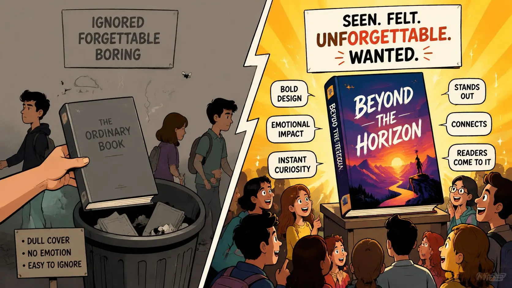
Online retail changed the physical bookshelf into a grid of small images. A cover may be seen large on a product page, then reduced dramatically in search results, recommendation panels, advertising creatives, or an e-reader library. A beautiful texture, subtle facial expression, or delicate border can vanish at that scale.
Your cover therefore needs a clear hierarchy:
- Genre signal: The reader should recognize whether the book is romance, fantasy, mystery, memoir, or nonfiction.
- Primary focal point: One image, symbol, or typographic treatment should carry the visual attention.
- Readable title: The title must remain identifiable without forcing the viewer to zoom.
- Author identity: The name should be visible without competing with the title unless the author already has substantial recognition.
Typography deserves deliberate treatment because type has to communicate mood and information simultaneously. If you're choosing fonts for a promotional campaign, the advertising typography guide offers useful context on readability, personality, and visual hierarchy. Those same principles apply to a book thumbnail, where decorative lettering can become visual noise.
Personal taste comes second
A cover can be attractive and still be wrong. A minimalist black-and-white design may suit literary fiction but confuse readers expecting a fast-paced thriller. A photographic couple may work in one romance subcategory and feel misleading in another. The question isn't whether you like the image in isolation. The question is whether the intended reader can identify the book's promise quickly and accurately.
That's why cover design starts with positioning. Your manuscript contains the raw material, but the cover selects which parts of that material readers should notice first: the emotional relationship, the setting, the central threat, the world, the transformation, or the practical outcome.
Researching Your Subcategory Before Opening Any Design Tool
The fastest way to create the wrong cover is to start designing before you know what your readers recognize. Genre labels are too broad to provide enough direction. A cover for historical romance can't rely on the same signals as paranormal romance, and a psychological suspense cover shouldn't borrow visual language from cozy mystery just because both contain a crime.
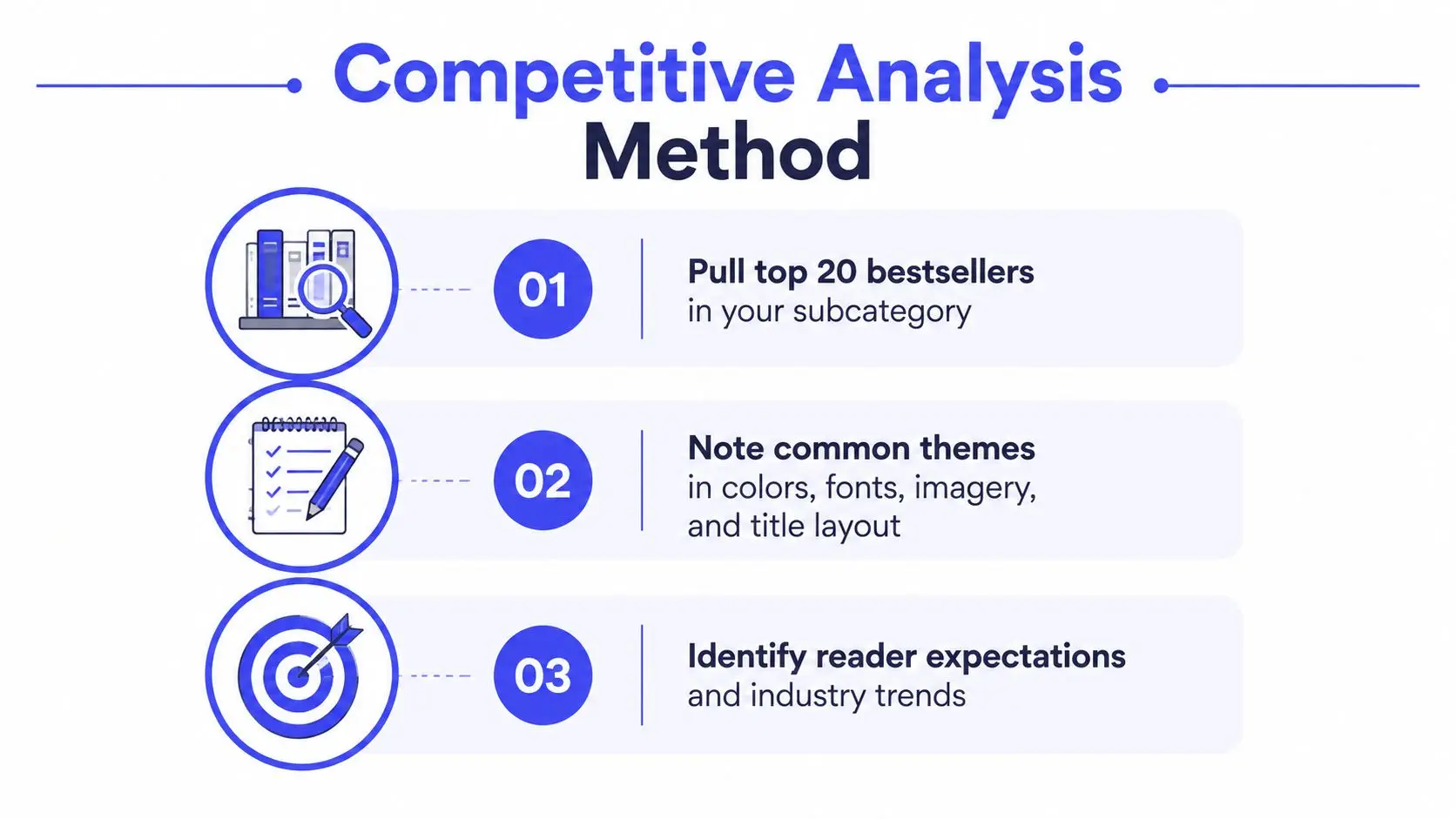
Start by browsing the top 20 books in your exact Amazon subcategory, as recommended in current cover trend guidance. This isn't an instruction to copy those covers. It's a way to identify the visual grammar readers already associate with that shelf. Book cover trends for 2026 emphasizes subcategory research because broad trend advice can hide important differences between niches.
Build a visual audit
Create a simple grid or document and record what you observe. Don't judge the covers yet. Describe them.
- Color: Note dominant hues, background brightness, saturation, and whether the palette feels warm, cold, muted, or high contrast.
- Typography: Record serif or sans serif choices, condensed or wide lettering, handwritten treatments, capitalization, and title scale.
- Imagery: Identify whether covers use portraits, couples, natural scenes, objects, symbols, illustration, or typography alone.
- Placement: Observe where the title, author name, subtitle, and series information appear.
- Density: Compare quiet compositions with layered scenes. Look for how much empty space surrounds the focal point.
Patterns matter because readers use them as shortcuts. A reader who wants a particular reading experience may not consciously describe the typography, but they recognize the overall signal and move toward covers that feel familiar.
Separate conventions from stale trends
A convention helps readers identify the shelf. A stale trend makes your book look dated or indistinguishable. Look for repeated elements that appear across many successful covers, then ask whether they communicate genre or merely reflect a temporary fashion.
Current trend coverage describes movement toward illustrated, typography-forward, and concept-driven covers in areas including romance, literary fiction, and upmarket categories. That doesn't mean every author should abandon photography. It means you should test whether your chosen image type gives your book a clear identity or makes it look interchangeable.
Write a one-page visual brief before generating concepts. Include:
- The exact subcategory and intended reader.
- The emotional promise of the story.
- Three visual signals the cover should share with its shelf.
- One element that will distinguish it from nearby titles.
- A short list of visuals to avoid because they imply the wrong premise.
This brief keeps AI generation, typography, and revisions pointed at the same commercial purpose. It also gives you a standard for rejecting attractive ideas that don't belong to the book.
Setting Up Print and Ebook Specifications in Storyloft
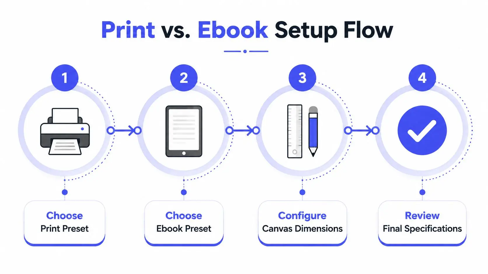
Print and ebook covers may share the same title, art direction, and brand, but they aren't the same file. An ebook cover is a single front-facing image optimized for a small screen. A print cover includes a front, back, and spine, plus production areas that won't appear in the final trimmed book.
Inside Storyloft's Book Cover Studio, begin by selecting the output that matches the job. Use the ebook preset when you're building a front cover for a digital listing. Use the print preset when the design needs a full wraparound layout. Storyloft's professional book cover workflow for ebook and print provides the product-specific path for setting up those formats.
Configure the print file before styling it
The common print-ready baseline is 300 dpi at final size, CMYK color mode, and 0.125 inches, or 3.2 mm, of bleed beyond the trim. Keep critical text at least 0.25 to 0.375 inches from the edges, depending on the printer's template. These specifications are documented in print-ready book cover guidance.
Bleed gives background color and artwork room to extend beyond the cutting line. Without it, a small trimming variation can expose a white sliver along the edge. Safe margins protect titles, author names, and back-cover copy from that same variation.
The spine requires particular care. Calculate its width from the actual page count and paper stock. Don't estimate it from the front cover width or assume a standard value. A slightly wrong spine can shift the title, misalign the artwork, or force the printer to reject the file.
Reserve the back-cover barcode area
Leave a clear zone for the ISBN barcode on the back. A barcode placed over a busy illustration or close to other text creates both a visual problem and a production risk. Storyloft's ISBN barcode generation and cover controls can reduce manual setup, but you still need to inspect the final composition rather than trusting a preset blindly.
For ebook output, simplify. The front should carry the title, subtitle when needed, and author name without trying to preserve every element from the print wrap. A back-cover blurb and spine title have no function in a digital thumbnail, so carrying them into the ebook file only creates clutter.
Generating and Refining AI-Assisted Cover Imagery
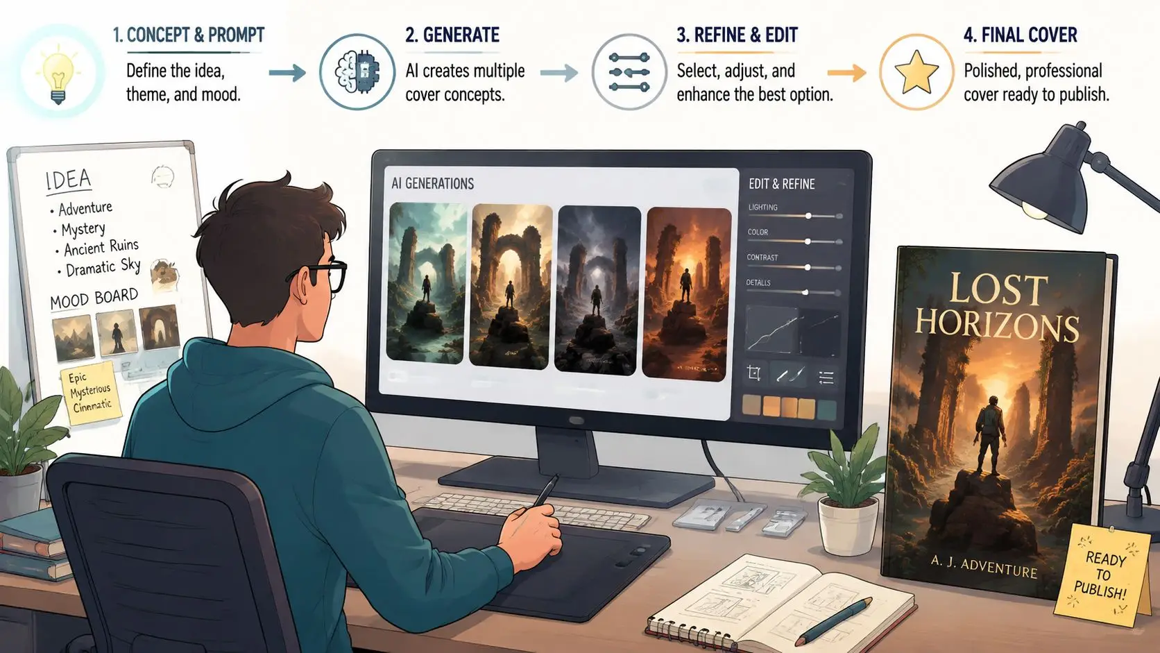
AI imagery works best as a rapid concept engine, not as an unattended art director. You still decide what the cover must communicate, which details belong to the story, and whether the result matches the visual expectations of the subcategory.
In Storyloft, begin with a descriptive prompt based on your visual brief. Specify the subject, setting, atmosphere, composition, viewpoint, lighting, and unused space for typography. “A mysterious forest” is too open-ended for a production cover. A stronger direction describes the intended focal point and tells the generator where the title needs breathing room.
Generate variations with a purpose
Use style controls to explore a defined visual direction, such as comic, children's, or technical illustration. Don't ask for random novelty. Generate alternatives that answer specific questions:
- Should the focal subject sit high, low, left, or right?
- Does a restrained palette communicate the tone better than saturated color?
- Would an illustration distinguish the book more effectively than a photograph?
- Does the background leave enough quiet space for the title?
Storyloft's AI-generated illustrations can also draw from selected manuscript passages through its scene creator. That manuscript connection matters because a cover built from a real scene or recurring symbol is less likely to drift into generic imagery.
Keep characters consistent
Series authors face a familiar problem. The protagonist looks different every time the image changes, so the cover, interior illustrations, and promotional graphics appear to feature unrelated people. Define the character's physical traits, clothing cues, age range, posture, and behavioral details in the Character Creator, then use that identity when producing variants.
Consistency doesn't mean every image needs the same pose. It means the reader should recognize the same character across different compositions. This is especially useful when you're testing several cover directions and need to compare layout rather than unconsciously comparing different character designs.
Treat typography as a separate design layer
AI tools often produce unreliable lettering. Generate the art without relying on the model to render the final title, then add the title and author name with controlled typography in the cover canvas. Use a strong foreground and background contrast, and preserve enough empty space that the text doesn't require a heavy outline or distracting effects.
If you're adapting visual concepts for promotional material, a practical guide to creating an advertorial can help you think about the difference between visual attention and readable messaging. A book cover has the same tension. An image can attract the eye, but typography must explain what the reader is looking at.
Designing Accessible Covers That Still Perform in Thumbnails
Accessibility isn't separate from commercial design. A cover with weak contrast, confusing color relationships, or overly decorative lettering becomes harder to identify for readers with low vision or color-vision differences. It may also become harder for everyone to read when reduced for online browsing.
Academic discussion of queer romance covers identifies WCAG-compliant color contrast, colorblind-safe palettes, and clear typography as meaningful design considerations. Research on accessibility in queer romance cover design is useful because it addresses a gap in mainstream cover guidance, which often focuses on genre fit and thumbnail impact without explaining inclusive execution.
Check contrast before polishing
Start with the title, not the background. Place the title over the image and inspect whether every letter remains distinct from the area behind it. If the background is too complex, change the image, simplify the area beneath the text, or reposition the title. A shadow or outline can help, but effects shouldn't be used to rescue an unreadable font and chaotic background.
Use a contrast checker that supports WCAG evaluation, then inspect the cover in grayscale. Grayscale removes hue as a crutch and reveals whether the hierarchy depends on brightness differences. Also test a colorblind simulation so you can see whether two supposedly distinct colors collapse into the same visual value.
Choose type for recognition
Decorative fonts can express genre, but they often lose their counters and spacing at small sizes. Favor letterforms with open shapes, clear weight differences, and enough spacing to survive reduction. Keep the title dominant, the subtitle subordinate, and the author name legible without letting secondary text compete with the main promise.
Accessibility can conflict with genre intensity. A horror cover may need harsh red and black, while a romance cover may rely on soft colors and script lettering. The solution isn't to flatten every design into a neutral template. It's to preserve the mood through composition, texture, and image choice while making the essential information readable.
The book cover design best practices resource can help you review hierarchy, typography, and format decisions together rather than treating accessibility as a final correction.
Exporting and Testing Your Cover Across Formats
A design file isn't finished when it looks good on your monitor. Test it in the conditions where readers and printers will encounter it. For ebook covers, reduce the image to roughly 100 to 150 pixels wide, or inspect it at about 25% zoom, and check whether the title, subtitle, and author name remain readable. These thumbnail checks are recommended in practical ebook and print cover guidance.
At small scale, ignore details and judge recognition. Can you identify the genre? Can you read the title without enlarging the image? Does the focal point still exist, or has it become a muddy block of color? If the answer is no, remove elements before adding effects.
Use synchronization to compare outputs
A manuscript-centered workflow reduces a common source of errors: manually swapping separate files every time you revise a cover. Storyloft's cover-to-manuscript synchronization lets you preview cover changes with the active manuscript across e-reader and PDF outputs. That makes it easier to compare alternatives while keeping the associated title, author information, and publication layout aligned.
Test more than one version when the decision is uncertain. Compare a typography-led option with an illustrated option, or a light palette with a darker one. Ask genre readers which cover makes the book's category and promise clearest, then evaluate their feedback alongside your own production checks.
Proof print files in two forms
Print covers need a digital proof and a physical proof. Digital inspection catches file dimensions, bleed, alignment, and missing elements. A printed proof reveals issues that screens hide, including thin lines, tiny text, color shifts, and contrast changes caused by paper and ink.
Keep a final validation sequence:
- Inspect the full wraparound layout.
- Check the spine against the calculated width.
- Confirm all critical text sits inside the safe area.
- Verify the barcode zone remains clear.
- Review the exported PDF at full size.
- Print a proof and inspect it under ordinary reading light.
If you're preparing supporting promotional graphics, the 2026 LinkedIn graphic dimensions guide is a useful reminder that each channel has its own canvas requirements. Don't assume a cover file can be reused unchanged for every social placement.
Pre-Launch Checklist and Common Cover Mistakes to Avoid
The final review should be procedural, not emotional. By this point, you've probably stared at the cover long enough to stop seeing obvious problems. A checklist forces you to inspect the file as a reader, a retailer, and a printer.
Professional cover production has become a substantial publishing service market. One industry report projects growth in the book cover design services market from $1.15 billion in 2025 to $1.27 billion in 2026, a 10.3% CAGR, and projects $1.89 billion by 2030 at a 10.5% CAGR. The market report connects that demand with self-publishing, online retail, and visual branding across print and digital formats.
Run the final checks in order
- Genre signal: Does the cover belong in the exact subcategory you researched?
- Thumbnail test: Is the title readable around 100 to 150 pixels wide?
- Focal point: Does one image, symbol, or typographic treatment lead the eye?
- Accessibility: Have you checked contrast, grayscale, colorblind safety, and clear type?
- Print setup: Is the file 300 dpi, CMYK, and extended with 0.125-inch bleed?
- Margins: Is essential text at least 0.25 to 0.375 inches from the trim edge?
- Spine: Was the width calculated from page count and paper stock?
- Barcode: Is the ISBN area reserved and unobstructed?
- Proofing: Have you reviewed both a digital proof and a physical print?
Common failures include thin decorative lines that disappear, small details that turn into noise, text placed too close to the trim, and a spine guessed instead of calculated. The book cover mistakes checklist is a useful final reference before you upload files or send them to press.
The best cover isn't the one with the most effects. It's the one that identifies the book, survives thumbnail reduction, respects the reader, and reaches production without preventable rework.
Storyloft combines manuscript-aware writing, AI illustration, character consistency, cover creation, synchronization, and print-ready export in one workspace. Visit Storyloft to build and test your next ebook or print cover alongside the manuscript it represents.