
Format of Book Writing: Complete Guide for 2026
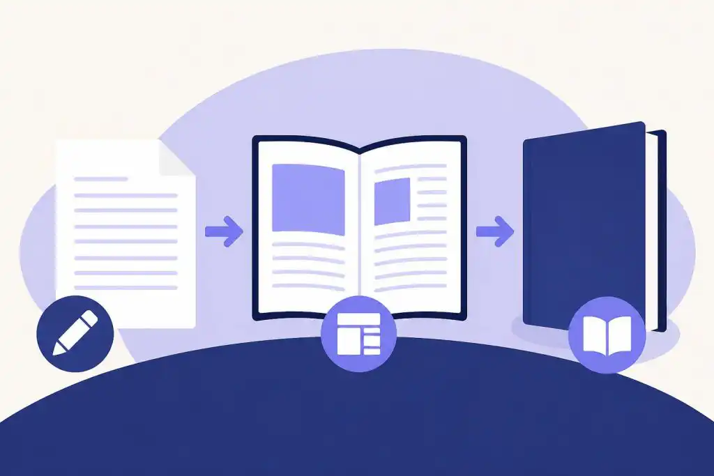
I'll never forget the sinking feeling when my first manuscript came back from a literary agent with a single-sentence rejection: "Please review standard formatting guidelines before resubmitting." I'd spent eighteen months crafting my novel, but I'd submitted it in 11-point Calibri with single spacing and no page numbers. That painful lesson taught me something every author eventually learns: the format of book writing matters just as much as the words themselves. Whether you're submitting to agents, self-publishing on Amazon, or preparing files for a traditional publisher, understanding proper formatting transforms your manuscript from amateur to professional in an instant.
Understanding the Format of Book Writing Fundamentals
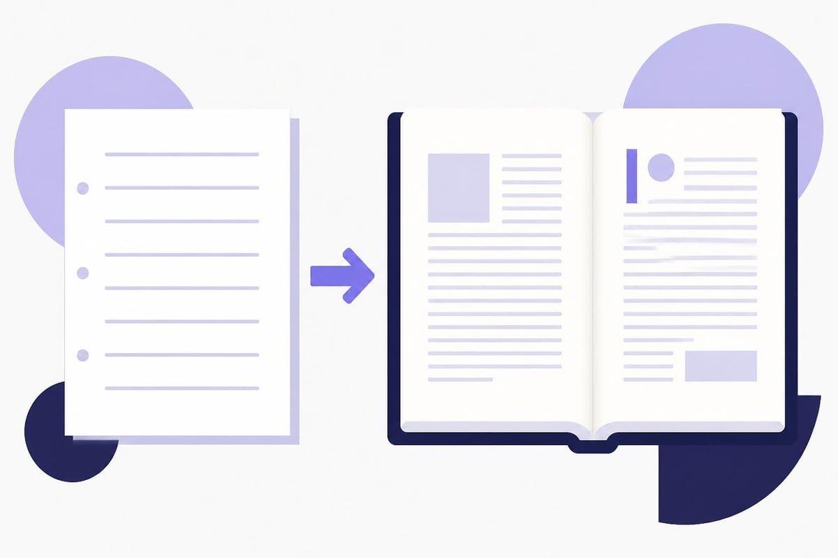
The format of book writing encompasses two distinct but equally important stages: manuscript format and published book format. Each serves a different purpose and follows different rules.
Manuscript format is the industry-standard layout you use when writing your book and submitting it to agents, editors, or publishers. This format prioritizes readability and ease of editing. According to standard manuscript formatting guidelines, manuscripts should use double spacing, one-inch margins on all sides, and a plain serif font like Times New Roman in 12-point size.
Published book format, on the other hand, is what readers see in the finished product. This includes interior layout, chapter headings, page numbers, headers, and all the design elements that make a book feel professional and polished.
Key differences include:
- Line spacing: Double for manuscripts, single for published books
- Font size: 12pt for manuscripts, typically 10-11pt for print books
- Margins: Uniform 1-inch for manuscripts, asymmetric with gutter margins for print
- Page headers: Author name and title for manuscripts, running headers with chapter titles for books
- Alignment: Left-aligned for manuscripts, often justified for published books
Understanding this distinction prevents the common mistake of submitting a beautifully formatted book layout to an agent who expects a standard manuscript, or vice versa.
Manuscript Format Standards Every Author Should Know
The format of book writing starts with your manuscript. Even if you plan to self-publish and never send your work to a traditional publisher, following manuscript standards during the writing process makes your work easier to edit, share with beta readers, and eventually convert to published format.
Essential Manuscript Elements
Your manuscript should include these components in this specific order:
- Title page with book title, author name, word count, and contact information
- Copyright page (optional for submissions, required for published books)
- Chapter pages starting approximately one-third down the page
- Text body with consistent formatting throughout
The Reedsy manuscript formatting guide emphasizes that consistency matters more than perfection. Choose your formatting approach and apply it throughout every chapter.
| Element | Manuscript Standard | Common Mistakes |
|---|---|---|
| Font | Times New Roman 12pt | Using decorative fonts, mixing fonts |
| Spacing | Double-spaced | Single spacing, 1.5 spacing |
| Margins | 1 inch all sides | Narrow margins to reduce page count |
| Indentation | 0.5 inch first line | Tab key inconsistency, no indentation |
| Chapter breaks | New page for each chapter | Continuing chapters on same page |
| Page numbers | Bottom or top right, starting after title page | Inconsistent placement, missing numbers |
Professional writers using tools designed for authors, like AI-powered writing software, often find these standards applied automatically, letting them focus on storytelling rather than formatting details.
Headers and Page Numbering
Your manuscript header should appear on every page except the title page. Place it in the upper left or right corner with your last name, the book title (or a shortened version), and the page number.
Example: Johnson / MIDNIGHT HARBOR / 247
Some authors prefer placing just the page number in the header and their contact information only on the title page. Both approaches are acceptable as long as you remain consistent.
Published Book Interior Formatting
Once your manuscript is complete, the format of book writing shifts to publication layout. This is where your book transforms from a working document into a reader-ready product.
Choosing Your Trim Size and Margins
Trim size refers to the physical dimensions of your printed book. Common fiction sizes include 5" × 8", 5.25" × 8", and 6" × 9". Nonfiction often uses 6" × 9" or 7" × 10" for more space to accommodate diagrams, tables, and images.
Your margins must account for the gutter (the inner margin where pages are bound). A typical margin setup might be:
- Inside margin: 0.75 to 1 inch (gutter)
- Outside margin: 0.5 to 0.75 inch
- Top margin: 0.75 inch
- Bottom margin: 0.75 to 1 inch
The detailed formatting guide from Editage explains that thicker books need wider gutters to remain readable when opened, while thinner books can use narrower gutters.
Typography and Font Choices
Published books typically use serif fonts for body text because they're easier to read in long-form print. Popular choices include:
- Garamond (classic, elegant)
- Caslon (traditional, literary)
- Minion Pro (modern, clean)
- Baskerville (formal, academic)
Font size for print books generally ranges from 10 to 12 points, depending on the typeface and your target audience. Books for older readers or children often use larger type, while dense academic texts might use smaller sizes with generous line spacing.
Line spacing in published books is usually set between 1.0 and 1.2, creating enough visual space for comfortable reading without wasting paper.
Chapter Formatting and Front Matter
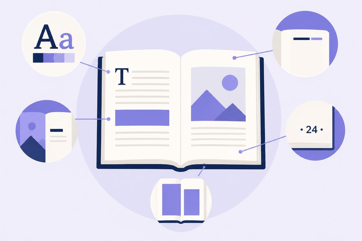
The format of book writing extends beyond body text to include all the structural elements that guide readers through your book.
Chapter Openings
Each chapter should start on a new page, traditionally on the right-hand (recto) page in print books. The chapter opening page includes:
- Chapter number or title positioned one-third to halfway down the page
- Optional decorative elements or drop caps
- First paragraph often without indentation
- No running header on the chapter opening page
Front Matter Organization
Front matter appears before Chapter One and includes these elements in order:
- Half-title page (book title only)
- Title page (title, author, publisher)
- Copyright page
- Dedication (optional)
- Table of contents
- Foreword or preface (if applicable)
- Acknowledgments (can also go in back matter)
Not every book needs all these elements. Fiction often skips the table of contents, while nonfiction typically includes it. The University of Nevada Press formatting guidelines note that traditional publishers have specific preferences for front matter order, so check submission guidelines carefully.
Back Matter and Special Pages
After your final chapter, back matter provides additional context and information:
- Epilogue: Continues the story or provides closure
- Afterword: Author's reflection on the book
- Appendices: Supporting documents, resources, or data
- Glossary: Definitions of specialized terms
- Bibliography or references: Sources cited
- About the author: Brief biography and photo
- Also by this author: List of other published works
Understanding print-ready book formatting ensures these elements appear professional and match the standards expected by platforms like Amazon KDP and IngramSpark.
Digital Book Formatting Considerations
The format of book writing differs significantly between print and digital editions. Ebooks require reflowable text that adapts to different screen sizes and reader preferences.
Ebook-Specific Formatting Rules
| Aspect | Print Books | Ebooks |
|---|---|---|
| Page numbers | Fixed | Locations or percentages |
| Fonts | Specified by designer | Reader-selectable |
| Margins | Fixed measurements | Responsive |
| Images | High resolution, CMYK | RGB, optimized file size |
| Hyperlinks | Not applicable | Active, clickable |
Ebook formatting prioritizes clean HTML structure over visual design. Avoid using tabs, multiple spaces, or manual line breaks. Instead, use proper paragraph styles and headings that ebook readers can interpret correctly.
Essential ebook elements:
- Linked table of contents for easy navigation
- Logical heading hierarchy (H1 for title, H2 for chapters, H3 for subheadings)
- Alt text for all images
- Clickable URLs and email addresses
- Properly formatted lists and block quotes
Tools designed for novel formatting handle these technical requirements automatically, ensuring your ebook validates properly across all major retailers.
Genre-Specific Formatting Conventions
Different genres have distinct expectations for the format of book writing. Romance novels typically use 5" × 8" trim with generous white space and clear chapter breaks. Epic fantasy writing often includes maps, glossaries, and appendices that require special formatting attention.
Nonfiction genres have their own conventions. Writing a self-help book requires careful attention to sidebars, pull quotes, and action items. Academic and technical books need proper citation formatting and reference management.
Formatting for Children's Books
Picture books and early readers have unique layout requirements:
- Larger fonts (14-18pt for early readers)
- Generous line spacing
- Image placement integrated with text
- Page turns that align with story beats
- Considerations for illustration bleed
Professional Formatting Tools and Resources
Many authors struggle with the technical aspects of book formatting, especially when preparing files for multiple formats. Modern writing platforms solve this challenge by combining writing, editing, and formatting in one place.
Storyloft for Authors gives authors everything needed to write, edit, format, and publish a professional book in one place. The platform handles the technical complexity of formatting, letting you focus on your story while ensuring your finished book meets professional standards for both print and digital publishing.

Common Formatting Mistakes to Avoid
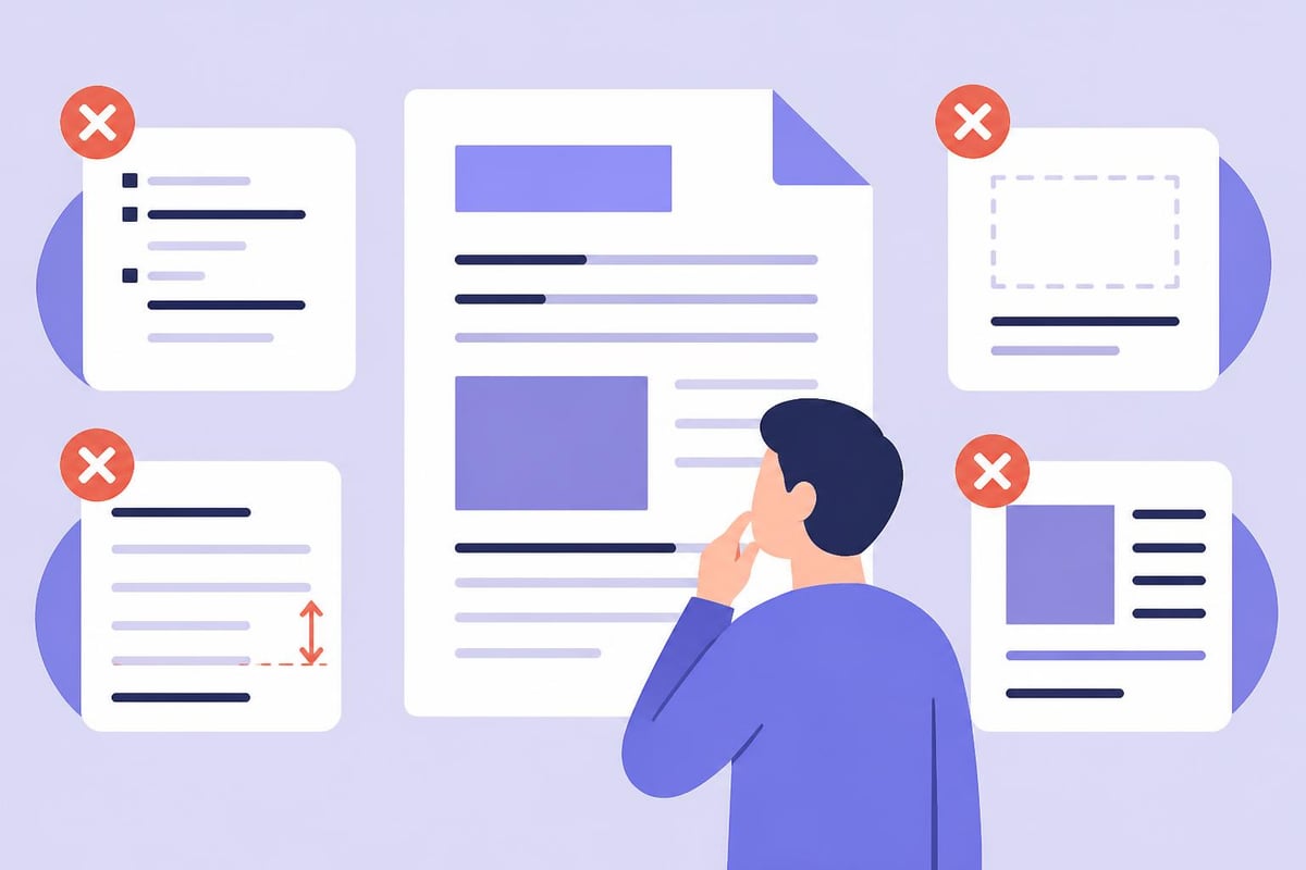
Even experienced authors make these errors:
- Using space bar instead of tab for indentation
- Manually adding extra line breaks between paragraphs
- Inconsistent heading styles throughout chapters
- Forgetting to check widow and orphan control
- Ignoring recto/verso page considerations in print
- Using low-resolution images in print books
- Failing to embed fonts in PDF files
The Wordy formatting guide emphasizes that small inconsistencies compound throughout a full-length manuscript, creating an unprofessional impression even when the writing itself is strong.
Formatting for Different Publishing Paths
The format of book writing requirements vary depending on how you plan to publish.
Traditional Publishing Submissions
Literary agents and publishers expect standard manuscript format. According to Chapter Blog’s complete formatting guide, deviating from these standards signals inexperience and gives agents an easy reason to reject your work before reading it.
Submit manuscripts as .DOC or .DOCX files unless guidelines specify otherwise. PDFs are generally not acceptable for submissions because editors can't add comments or track changes.
Self-Publishing Format Requirements
Amazon KDP specifications:
- Interior PDF or DOCX upload
- Minimum 0.25-inch margins (more for thicker books)
- Bleed settings for full-bleed images
- Specific file size limits for ebooks
- Cover dimensions based on page count and paper type
IngramSpark requirements:
- Higher resolution images (300 DPI minimum)
- PDF/X-1a:2001 or PDF/X-3:2002 standards
- All fonts embedded
- Color profile specifications
- Exact trim size matching their templates
Hybrid Publishing Considerations
Hybrid publishers often provide formatting services, but understanding the format of book writing yourself ensures you can review their work and catch errors. Some hybrid publishers use templates that create cookie-cutter layouts; knowing formatting principles helps you negotiate for custom design.
Advanced Formatting Elements
Professional books include subtle design elements that enhance readability.
Running headers appear at the top of each page, typically showing:
- Author name on left-hand (verso) pages
- Book title or chapter title on right-hand (recto) pages
- Omitted on chapter opening pages and front matter
Drop caps are enlarged initial letters beginning chapters or sections. Use them consistently or not at all.
Scene breaks within chapters need clear visual separation. Common options include extra line space, three asterisks centered, or a decorative ornament.
Pull quotes and sidebars in nonfiction require careful positioning to avoid awkward page breaks. Professional layout software prevents widows (single lines at the top of a page) and orphans (single lines at the bottom).
Formatting Workflow and Process
Efficient authors separate writing from formatting. Draft your entire manuscript in standard manuscript format first, focusing solely on content. Only after completing revisions should you shift attention to published book layout.
The typical workflow includes:
- Write complete draft in manuscript format
- Self-edit and revise content
- Incorporate beta reader or editor feedback
- Proofread final manuscript version
- Convert to published book format
- Format for print specifications
- Format ebook version separately
- Proof both formats on actual devices
- Make final corrections
- Generate print-ready PDF and ebook files
This separation prevents the common trap of endlessly tweaking formatting during the writing process, which disrupts creative flow and wastes time.
Modern book writing apps streamline this workflow by maintaining your manuscript in a clean format during writing, then generating professionally formatted print and ebook files with a few clicks when you're ready to publish.
Format Validation and Quality Control
Before publishing, validate your formatting across multiple platforms and devices. For print books, order proof copies and review every page for:
- Text that disappears into the gutter
- Inconsistent headers or page numbers
- Orphaned or widowed lines
- Awkward page breaks mid-paragraph
- Image resolution and placement
- Font substitution or missing characters
For ebooks, test on multiple devices and apps:
- Amazon Kindle (multiple generations)
- Apple Books on iPad and iPhone
- Google Play Books
- Kobo readers
- Nook devices
The Automateed formatting guide recommends keeping a checklist of formatting elements to verify before final publication, preventing costly mistakes that require republishing.
Accessibility and Universal Design
Modern book formatting increasingly considers accessibility for readers with visual impairments or reading difficulties. This includes:
- Sufficient contrast between text and background
- Scalable fonts that remain readable when enlarged
- Logical heading structure for screen readers
- Alt text for images and diagrams
- Avoiding color as the only way to convey information
- Clear navigation in ebooks
These considerations don't just help readers with disabilities; they improve the reading experience for everyone. High contrast reduces eye strain, logical structure aids comprehension, and clear navigation helps all readers find what they need.
Mastering the format of book writing transforms your manuscript from a rough draft into a professional publication that readers trust and enjoy. Whether you're preparing a submission for literary agents or formatting your own book for self-publishing, understanding these standards ensures your work gets the attention it deserves. Storyloft combines manuscript writing, professional formatting, and AI-powered editing in one platform, helping you create print-ready books and ebooks without juggling multiple tools or learning complex formatting software. From first draft to published book, you have everything you need in one place.