How to Layout a Book: A Complete Guide for Authors
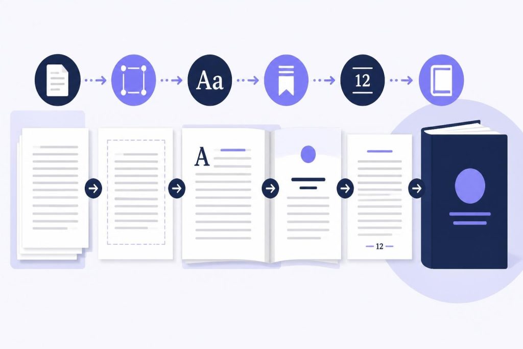
Getting your manuscript into a properly formatted book can feel overwhelming. You've poured your heart into writing, and now you're staring at a wall of technical decisions about margins, fonts, and spacing. The good news? You don't need to be a professional typesetter to layout a book that looks polished and professional. With the right knowledge and tools, you can create a book layout that readers will love and that meets industry standards for both print and digital publishing.
Understanding the Basics of Book Layout
When you layout a book, you're essentially taking your raw manuscript and transforming it into pages that look and feel like an actual book. This involves much more than just choosing a pretty font. You're making decisions about how text sits on the page, how chapters begin, where page numbers appear, and how readers will experience your words visually.
Book layout directly impacts readability. A poorly formatted book with cramped margins or tiny text will frustrate readers, no matter how brilliant your story is. On the flip side, a well-designed layout becomes invisible. Readers won't consciously notice it, but they'll enjoy a smoother, more comfortable reading experience.
The standards for book layout have evolved over centuries. Publishers developed these conventions because they work. Readers expect certain things when they open a book, and meeting those expectations helps your work feel professional and credible.
Print vs. Digital Layout Considerations
Print books and ebooks require different approaches. When you format a book for print, you're working with fixed page sizes and need to account for physical elements like binding and page turns. Digital books reflow based on screen size and reader preferences, so your layout needs flexibility built in.
For print, you'll need to think about:
- Trim size (the physical dimensions of your finished book)
- Bleed areas for full-page images
- Gutter margins for the binding area
- Left and right page differences (recto and verso)
For ebooks, focus on:
- Clean paragraph styling without manual line breaks
- Proper heading hierarchies
- Image sizing that adapts to different screens
- Font embedding or web-safe alternatives
Setting Up Your Document Structure
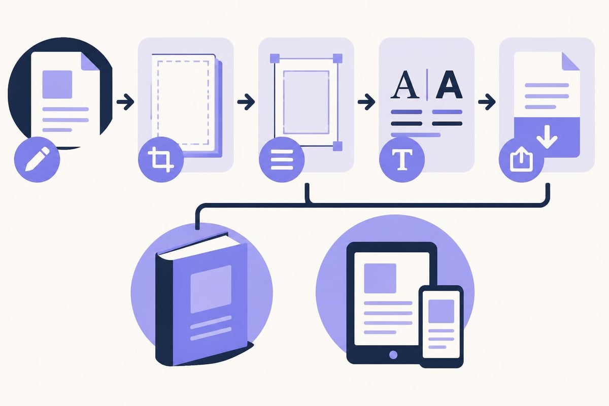
Before you dive into fonts and spacing, you need to set up your document correctly. This foundation determines everything else about your layout.
Start by choosing your trim size. For fiction, the most common sizes are 5" × 8", 5.25" × 8", and 6" × 9". Nonfiction often uses 6" × 9" or larger formats. These standard book formats work well with print-on-demand services like KDP and IngramSpark, keeping your printing costs reasonable.
Your page count matters too. Most printers require page counts in multiples of four or eight because of how they fold and bind signatures. If your book comes out to 247 pages, you might need to add or trim content to reach 248 or adjust your layout to hit that target.
Margins Make or Break Your Layout
Margins aren't just empty space. They're breathing room that makes text comfortable to read. When you layout a book, getting margins right is one of the most important decisions you'll make.
Standard margins for a typical trade paperback:
| Margin Type | Recommended Size | Purpose |
|---|---|---|
| Inside (gutter) | 0.75" – 1.0" | Accounts for binding |
| Outside | 0.5" – 0.75" | Comfortable thumb space |
| Top | 0.75" – 1.0" | Visual balance |
- Bottom | 0.75" – 1.0" | Room for page numbers |
Thicker books need wider gutter margins because more pages mean less flexibility in the binding. A 400-page book needs at least a 1" inside margin, while a 150-page book can work with 0.75". Understanding proper margin standards prevents text from disappearing into the spine.
Choosing Typography That Readers Love
The fonts you choose shape how readers experience your book. This isn't about finding the most creative or unique typeface. It's about selecting fonts that disappear into the background and let your words shine.
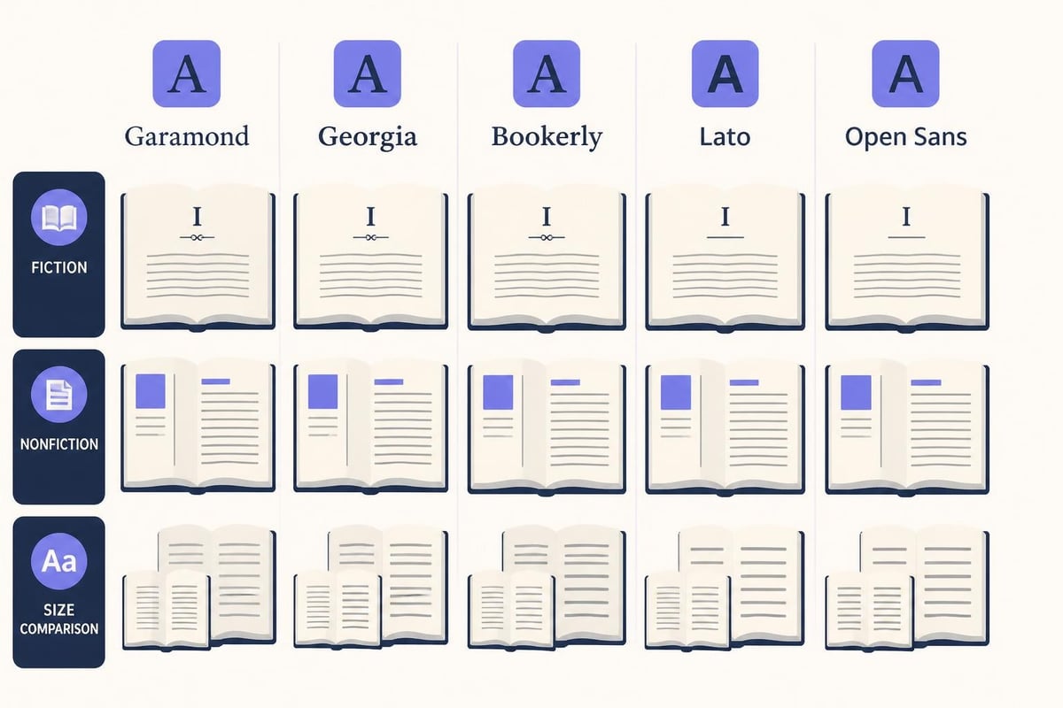
For body text in print books, stick with serif fonts. These are the fonts with little decorative strokes at the end of letters, like the feet on the bottom of an "h" or "n". Serif fonts guide the eye across lines of text, making long-form reading easier.
Popular body text fonts include:
- Garamond
- Baskerville
- Caslon
- Palatino
- Minion Pro
Sans-serif fonts (without the decorative strokes) work better for headings, chapter titles, and digital books where screen resolution affects readability. For detailed guidance on selecting fonts that enhance readability, consider how different typefaces perform across various book sizes and paper types.
Font Size and Leading
Body text for most books should be 10 to 12 points, depending on your chosen font and trim size. Smaller books often use 10 or 11 point, while larger formats can accommodate 11 or 12 point comfortably. The right font size for your book depends on several factors working together.
Leading (the space between lines) affects readability as much as font size does. Too tight and lines blur together. Too loose and the text feels disconnected. A good starting point is 120% of your font size. If you're using 11-point type, try 13.2-point leading.
Test your choices by printing sample pages at actual size. What looks good on a computer screen might feel cramped or oversized when you're holding the physical book in your hands.
Formatting Front Matter and Back Matter
Your book's content extends beyond the main manuscript. Front matter and back matter need careful formatting to layout a book that feels complete and professional.
Front matter typically includes:
- Half-title page
- Title page
- Copyright page
- Dedication (optional)
- Table of contents (especially for nonfiction)
- Foreword or preface (if applicable)
Each element has traditional placement and formatting. The half-title page shows just your book title, centered vertically. The full title page includes your name, publisher, and sometimes a subtitle. The copyright page contains legal information, ISBN, and publishing details.
Back matter might include:
- Acknowledgments
- Author bio
- Bibliography or references
- Appendices
- Preview of your next book
Number your front matter with lowercase Roman numerals (i, ii, iii) and start Arabic numerals (1, 2, 3) with Chapter One. This convention helps readers distinguish preliminary pages from the main content.
Chapter Openings and Page Breaks
How you start each chapter creates visual rhythm in your book. Consistent chapter formatting signals to readers that they're beginning a new section and gives them natural pause points.
Most books start chapters on a right-hand (recto) page. This means your previous chapter might end with a blank left page. That's normal and expected in traditional book design. For cost-conscious authors printing with POD services, starting chapters on any new page (rather than always right-hand) saves pages without looking unprofessional.
Chapter openings typically include:
- Extra white space at the top (often 1.5 to 2 inches)
- Chapter number in a decorative or distinct font
- Chapter title (if you use them)
- Drop cap or extra space before the first paragraph
Don't indent the first paragraph of a chapter. This signals to readers that it's a beginning. Every subsequent paragraph should be indented about 0.3 to 0.5 inches.
Running Headers and Page Numbers
Running headers appear at the top of each page and help readers orient themselves in your book. The left page typically shows the book title or author name, while the right page shows the chapter title. Keep these in a smaller font than your body text (usually 9 or 10 point).
Page numbers can go at the top corners (with your running headers) or centered at the bottom. Bottom placement is more common in contemporary books and feels less formal. Don't put page numbers on chapter opening pages or other special pages like your title page.
Working with Styles and Consistency
When you layout a book, consistency matters more than any single design choice. Readers notice when formatting bounces around, even if they can't articulate what feels wrong.
Create and use paragraph styles for every element in your book:
- Body text
- Chapter headings
- Section breaks
- Block quotes
- Bulleted lists
- Captions
Most professional formatting software lets you save these styles. Once you define that your body text uses 11-point Garamond with 13.2-point leading and 0.4-inch first-line indent, you can apply that styling to any paragraph instantly. If you decide to change your font later, updating the style automatically updates every paragraph using it.
This approach saves enormous amounts of time and prevents errors. You won't accidentally have some chapters in 11-point and others in 12-point because you applied the wrong formatting manually.
Special Elements and Text Treatments
Beyond straight paragraphs, most books include special text elements that need distinct formatting. How you handle these details separates amateur layouts from professional ones.
Scene breaks in fiction traditionally use extra white space, sometimes with a centered decorative element (like three asterisks or a small ornament). Maintain consistency throughout your book.
Block quotes should be indented from both margins, often in a slightly smaller font. Don't use quotation marks around block quotes since the formatting itself indicates quoted material.
Emphasis in your text can use italics, but use them sparingly. Bold text rarely appears in body text of traditional books. Italics work for internal thoughts, foreign words, book titles, and occasional emphasis.
Dialogue formatting follows standard rules, but make sure your quotation marks are "curly quotes" not "straight quotes." Most word processors can handle this automatically once you enable smart quotes.
| Element | Treatment | Notes |
|---|---|---|
| Scene breaks | Extra line space + ornament | Keep consistent |
| Block quotes | Indent both sides | Often smaller font |
| Emphasis | Italics | Use sparingly |
| Dialogue | Curly quotes | Enable smart quotes |
Images and Illustrations
If your book includes images, their placement and formatting require extra attention. Images need sufficient resolution for print (300 DPI minimum) and should be sized appropriately for your trim size.
For print books, images can be:
- Full-page bleeds (extending to the page edge)
- Framed within margins
- Wrapped with text
- Centered on their own page
Make sure images are in CMYK color mode for print, not RGB. This prevents color shifts when your book prints. For black and white images, grayscale mode works perfectly.
Captions should use a smaller, distinct font from your body text. Place them consistently either above or below images throughout your entire book.
Exporting Print-Ready Files
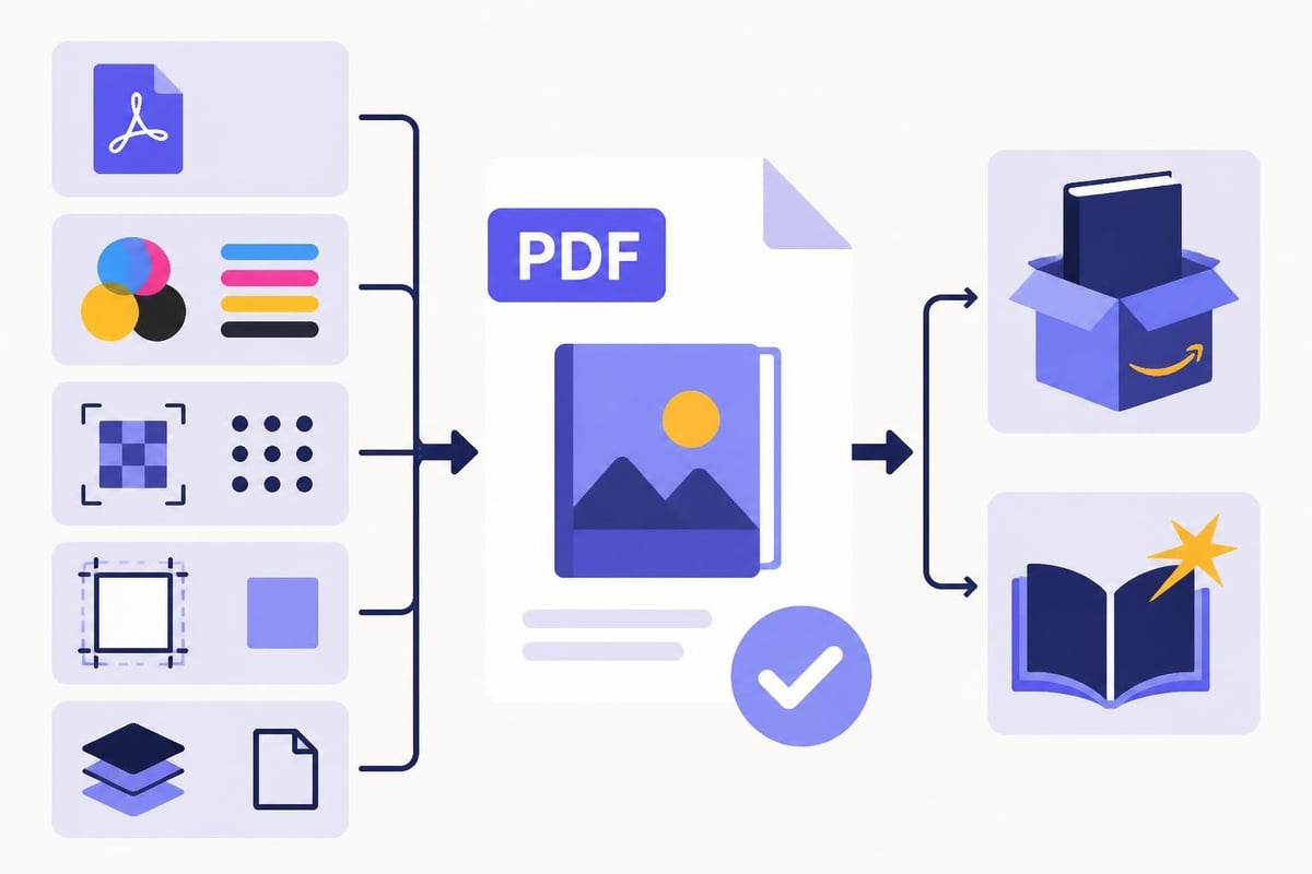
Once you've finished your layout, exporting correctly ensures your book prints exactly as you designed it. For print-on-demand services, you'll typically need a PDF file that meets specific requirements.
KDP and IngramSpark both provide detailed PDF specifications. Generally, you'll need:
- PDF/X-1a or PDF/X-3 format
- Fonts embedded
- Images at 300 DPI or higher
- Proper bleed (usually 0.125 inches)
- Color profile matching their specifications
If you're using a platform that handles formatting for you, it should export print-ready files automatically. Storyloft’s print book formatting generates professionally formatted PDFs that meet KDP and IngramSpark standards without requiring you to understand all the technical specifications.
Always order a proof copy before approving your book for sale. Screen previews don't show you how text density feels, whether margins provide enough breathing room, or if your font size is comfortable to read. Hold the physical book in your hands and read several pages.
Common Layout Mistakes to Avoid
Even experienced authors make layout mistakes that compromise their book's professional appearance. Knowing these pitfalls helps you avoid them.
Don't manually insert page breaks everywhere. Use your software's chapter break or section break features. Manual page breaks cause chaos when you make even small text changes later.
Avoid justified text with poor hyphenation. Justified alignment (where both left and right edges are straight) can create awkward spacing if your software doesn't hyphenate well. Left-aligned text often works better for print-on-demand books.
Don't use multiple fonts throughout your body text. Pick one font for body text and stick with it. You can use a different font for chapter headings, but your main text should be consistent.
Skip double spaces after periods. Modern typesetting uses single spaces. Double spacing is a holdover from typewriter days and looks amateurish in printed books.
Don't ignore widow and orphan control. A widow is a single line of a paragraph stranded at the top of a page. An orphan is a single line stranded at the bottom. Both look sloppy. Most layout software can prevent these automatically.
For comprehensive guidance on avoiding these and other issues, check out resources on professional book formatting that cover the complete process from manuscript to finished layout.
Tools for Book Layout
You have several options when it's time to actually layout a book. The right tool depends on your budget, technical comfort level, and specific needs.
Professional software like Adobe InDesign offers complete control over every aspect of your layout. It's the industry standard for book design, but it has a learning curve and monthly subscription cost.
Specialized book formatting tools like Vellum (Mac only) and Atticus provide templates and simplified interfaces designed specifically for book layout. These strike a balance between control and ease of use.
Word processors like Microsoft Word or Google Docs can work for simple layouts, but they're not designed for professional book production. You'll fight with them more than necessary and might not achieve print-ready results.
All-in-one writing platforms combine writing and formatting in a single tool. Storyloft gives authors everything needed to write, edit, format, and publish in one place. You can work on your manuscript and then format it for both print and digital publication without switching between different apps. The platform handles technical specifications automatically while giving you control over design choices.
Professional Typography Guidelines
Typography elevates your book from acceptable to excellent. Small details in type treatment create subtle impressions that readers absorb unconsciously.
Pay attention to these typography best practices that professional book designers follow:
Paragraph spacing should come from space between paragraphs OR first-line indents, never both. Most novels use first-line indents with no extra space. Many nonfiction books use space between paragraphs with no indents.
Hyphenation should be enabled for justified text but limited to avoid too many consecutive hyphenated lines. Two or three in a row is the maximum before text looks choppy.
Ligatures are special character combinations where letters connect (like "fi" or "fl"). Good book fonts include these, and they should be enabled for a polished look.
Optical margin alignment makes punctuation at line edges hang slightly outside the margin, creating a cleaner visual edge. This subtle refinement appears in traditionally typeset books.
For deeper insights into typography settings for self-published books, explore resources that break down how professionals achieve that polished look.
Testing Your Layout
Before you commit to printing hundreds of copies, test your layout thoroughly. Print sample pages or order a single proof copy. Read it carefully with fresh eyes.
Check these elements:
- Text feels comfortable to read at arm's length
- Margins provide adequate space
- Headers and page numbers are positioned correctly
- Chapter openings are consistent
- Special elements (quotes, breaks, etc.) look intentional
- Images are clear and well-positioned
Ask other people to look at your proof. They'll notice things you've become blind to after staring at the same pages for hours. You don't need them to read the content, just to flip through and share first impressions about how professional it looks.
Formatting for Multiple Editions
Many authors publish their books in multiple formats: paperback, hardcover, and ebook. Each format requires its own layout considerations when you layout a book for different markets.
Paperback formatting follows the guidelines we've covered. It's the most common format for indie authors and the easiest to produce.
Hardcover books typically use larger trim sizes (6" × 9" is more common than 5" × 8") and different cover specifications. The interior layout might be identical to your paperback version, just with adjusted margins for the larger size.
Ebook formatting strips away most of your carefully crafted page design. Focus on clean paragraph styles, proper heading hierarchies, and simple formatting that works across devices. Complex layouts with text wrapped around images or decorative elements often break in ebooks.
Creating all these versions used to mean reformatting your book multiple times. Modern tools that understand book formatting for different outputs can generate multiple formats from a single source file, saving significant time and reducing errors.
Learning to layout a book properly takes some effort upfront, but the skills apply to every book you publish. Once you understand margins, typography, and formatting conventions, you can create professional-looking books that readers trust and enjoy.
Whether you're preparing your first manuscript or your tenth, having the right tools makes all the difference. Storyloft combines professional formatting with AI-powered editing and a complete writing environment, so you can focus on your words while the platform handles the technical details of creating beautiful print and digital books. Start writing and formatting your book today with tools built specifically for authors who want professional results.