How to Format a Book for Print and Ebook with Storyloft
Book formatting has a reputation for being way more painful than it should be. A manuscript is finished, the writing is done, and then suddenly the next hurdle is trim sizes, margins, mirrored headers, drop caps, EPUB exports, and trying not to destroy everything in Word.
I built this workflow around a very simple idea: authors should not need to become typesetters to publish professional books. You should be able to choose the style of your book, make a few smart publishing decisions, and let the software handle the fussy details correctly.
That is exactly what Storyloft is designed to do. It takes one manuscript and helps me create both a print-ready PDF and a polished EPUB without fighting line spacing, manual indents, page breaks, or layout hacks.
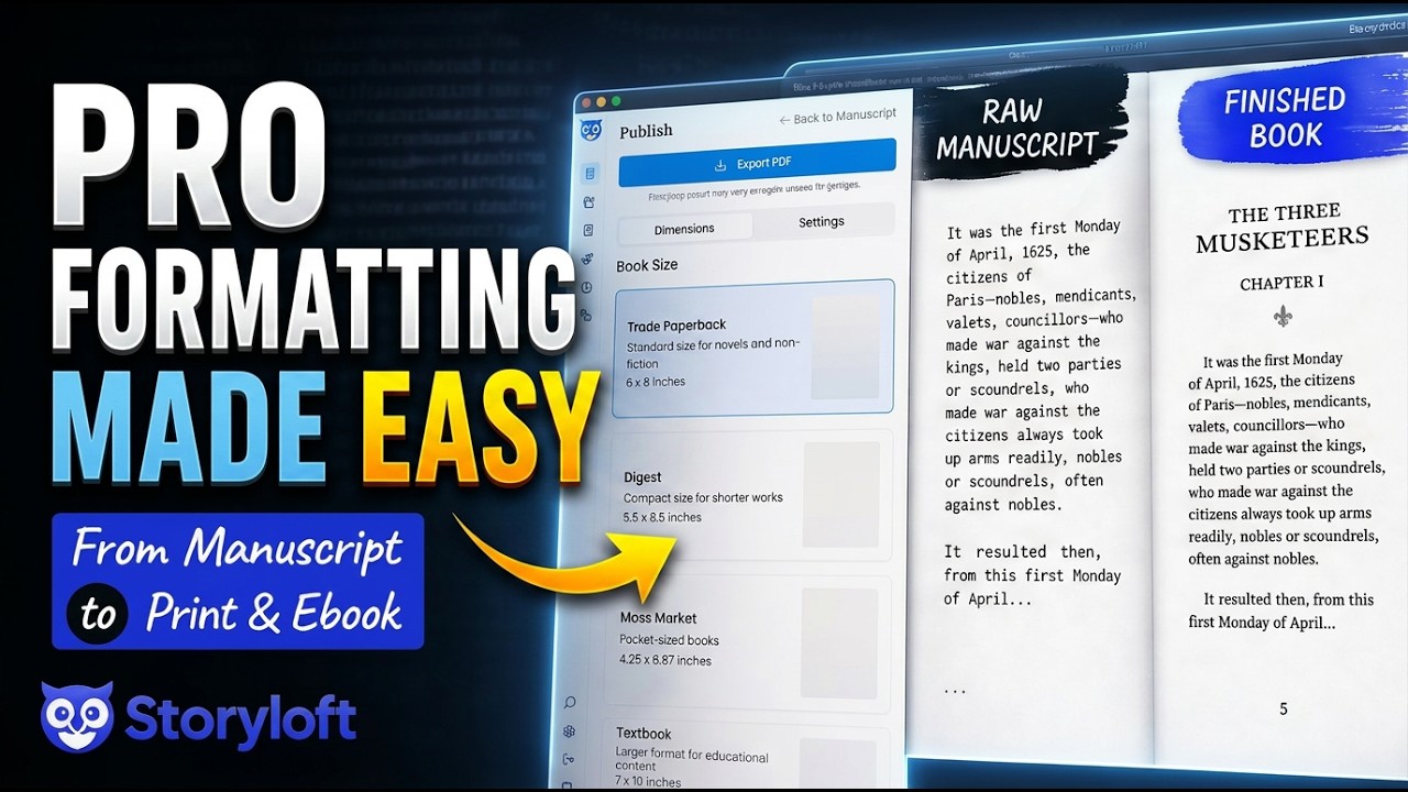
Table of Contents
- Why formatting feels harder than it should
- Starting with a large manuscript
- Formatting the print book
- Previewing the print layout
- Customizing the print book before export
- Exporting a print-ready PDF
- Formatting the ebook from the same manuscript
- Why one-manuscript publishing matters
- What makes Storyloft different from a generic document editor
- The bigger philosophy behind the workflow
- FAQ
- Final thoughts
Why formatting feels harder than it should
The biggest problem with most formatting workflows is that they start in tools that were never really built for books. General word processors can absolutely hold text, but once I need professional print layout or clean ebook output, things start to get fragile fast.
That is where people lose hours tweaking paragraph styles, fixing chapter starts, trying to line up headers, or cleaning up the same issue over and over across dozens of chapters.
Book formatting should feel more like publishing and less like wrestling a document. That is also why print and ebook formatting deserve their own proper output paths. If you want a deeper explanation of why they need different treatments, this breakdown of ebook vs print formatting covers the key differences clearly.
Inside Storyloft, most of the heavy lifting is automated. I do not need to manually manage:
- First paragraph indentation rules
- Line wraps and justification
- Mirrored headers and page numbers
- Consistent chapter styling
- Layout flow across large manuscripts
That matters even more when the manuscript is big.
Starting with a large manuscript
To show that this process holds up under real pressure, I used The Three Musketeers. It is a great stress test because it is large, chapter-heavy, and long enough to expose weak formatting systems.
In this case, the book runs to 67 chapters plus an epilogue, with roughly 250,000 words. That is exactly the kind of manuscript that can become annoying to format manually.
But the size of the manuscript really is not the point. The point is that Storyloft can take something heavy and still make the publishing workflow feel simple.
Formatting the print book
Once the manuscript is open, I start in the book controls and move straight to chapter presentation. The first thing I like to add is a chapter counter. That gives each chapter a clean, consistent heading structure such as “Chapter One” followed by the title.
As soon as that style is applied, it carries across the whole book. If chapter one has the right heading treatment, chapter seven does too. That consistency matters because chapter pages are one of the places where books instantly feel either professional or improvised.
Adding decorative chapter elements
After the chapter counter, I choose a decorative element that fits the tone of the book. For a story set in France, it makes sense to use something with a slightly French feel.
This is one of those places where taste matters. Some decorative elements are more ornate, some are more restrained. I tend to prefer cleaner, simpler designs over anything too gaudy, so I usually pick something elegant and understated.
The important part is that the decorative choice becomes part of the book’s visual identity without requiring manual design work on every chapter.
Choosing a theme and typography
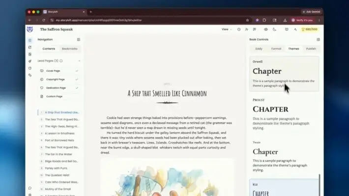
Next comes theme selection. This is where the book starts to feel like a real edition instead of just a manuscript with headings.
Different themes create different personalities. Some feel more classic, some more modern, some more literary. In my example, I looked through options like Dante, Hemingway, and Kinney, then landed on Augsburg because it had the right balance of readability and a modern feel.
That choice affects the typography throughout the project, which is exactly how it should work. Instead of hunting down font settings chapter by chapter, I apply a cohesive system once and let it propagate across the book.
Previewing the print layout
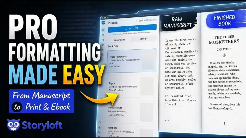
After the chapter and theme setup, I go to Publish, select Print Book, and use the export workflow to preview the layout.
At this point, one of the most useful publishing decisions is trim size. For the example project, I chose 6 x 9 trade paperback, which is a common size for many self-published books and is often used for both trade paperbacks and some hardcovers.
As soon as that size is selected, Storyloft calculates the page count in real time. That is incredibly useful because length affects binding, print cost, readability, and margin choices.
With a manuscript this large, the projected page count came in over 1,000 pages. That is exactly the kind of situation where layout decisions matter.
What the automatic typesetting handles
This is the point where it becomes obvious why automated typesetting is so valuable. Storyloft takes care of the things that usually eat time and create mistakes:
- Headers are aligned properly
- Chapter decorations appear consistently
- The first paragraph after a chapter opening is not indented
- Subsequent paragraphs are indented correctly
- Continuing paragraphs flow naturally across pages
- Book title and chapter header behavior follow print conventions
- Page numbers are mirrored correctly
In other words, the book looks like a book.
If you have ever tried to force this result manually in a word processor, you already know how much friction that removes. If print is your priority, this print book formatting software guide shows more of what a dedicated workflow should handle.
Customizing the print book before export
Automatic formatting should get me most of the way there, but I still want room to shape the final result. Storyloft gives me that flexibility without making me rebuild the layout from scratch.
Turning print marks on or off
One optional adjustment is print marks. If I do not need them visible in the preview, I can turn them off. The bleed guide is still represented visually in the editor, but that guide line itself is not part of the exported file. It is there to show where the bleed begins.
That distinction is useful because it keeps the preview informative without cluttering the final output.
Adding drop caps
Drop caps are another easy enhancement. With one click, I can add them to chapter openings, and Storyloft matches them to the theme fonts automatically.
That matters because drop caps only look polished when they are integrated into the typography. If they feel bolted on, they distract. If they match the design system, they add a subtle sense of craft.
Adjusting inner margins for thick books
For a very large book, inner margins become especially important. A thick book needs more breathing room near the gutter because the middle of the book can feel tight when physically opened.
In this example, I increased the inner margin to 1.5. That simple adjustment improves readability and makes the printed object more comfortable to use.
These are exactly the kinds of details that should be easy to tweak. If you are getting ready for upload, a dedicated print formatting checklist can help catch those final production details before submission.
Adjusting bleed
I also increased the bleed to a quarter inch in the example workflow. That is a bit generous for a text-heavy interior, but it can make sense when a project includes images or design elements that need to run to the edge.
The larger lesson is simple: I can make practical production adjustments without touching the underlying structure of the manuscript.
Exporting a print-ready PDF
Once everything looks right, I export.
This is not a lightweight browser trick trying to fake a print file on the spot. Storyloft uses a dedicated PDF export engine to generate a proper, print-house-quality file. The system sends the project through the export engine, checks the layout, and creates a PDF intended for real publishing workflows.
That means the result is suitable for platforms such as Amazon KDP and IngramSpark.
When the finished PDF came back for this example, it looked exactly the way a professional print interior should look:
- Indentations were correct
- Drop caps were in place
- Headers and page numbers were clean
- Page flow remained intact deep into the book
- The formatting held steady across more than 1,200 pages
That last point matters. It is one thing for software to produce a nice sample. It is another thing entirely for it to stay stable across a manuscript of this size.
Formatting the ebook from the same manuscript
Once the print edition is done, the ebook workflow is refreshingly simple.
I go back to the manuscript and export the ebook version. Because the chapter styling and overall theme have already been established, there usually is not much else I need to do first. The structural work has already been done.
This is one of the biggest advantages of using a purpose-built writing and formatting platform. I am not creating a print book in one environment and then trying to reconstruct a digital edition somewhere else. I am generating both from the same source.
Adding the ebook cover
Before exporting the EPUB, I select the ebook cover. In the example, the cover was already prepared, so it was just a matter of selecting it and moving forward.
Storyloft also includes tools for creating high-quality covers, including print-ready cover support with CMYK and 300 DPI output. That keeps another major publishing task inside the same workflow instead of requiring yet another app.
Exporting the EPUB
After choosing the cover, I export the ebook. The goal here is not just to produce an EPUB file, but to create one that keeps the same visual identity as the print edition where appropriate.
That is exactly what happens. The theme carries through, the formatting remains clean, and the ebook feels like the digital counterpart to the print book rather than a rushed conversion.
That consistency is a big deal. Readers may move between formats, and a coherent design language helps the book feel intentional across both. If you are preparing digital files specifically for Kindle and EPUB distribution, this guide on how to format a book for Kindle is also useful for understanding the platform-specific basics.
Why one-manuscript publishing matters
The real power of this workflow is not just speed. It is control.
I do not have to hand my manuscript off and hope someone else interprets the style correctly. I do not have to become an expert in page geometry. I do not have to manually force ebook and print outputs to behave as if they are the same thing.
Instead, I can:
- Write the manuscript in one place
- Apply a theme and chapter styling once
- Customize layout settings where needed
- Export a professional PDF for print
- Export a polished EPUB for digital publishing
That is a much better model for authors, especially self-publishers who want professional results without adding a maze of separate tools.
What makes Storyloft different from a generic document editor
At a high level, the difference is simple. Storyloft is built around the full book creation process, not just text entry.
That means the platform is designed to help with:
- Writing and organizing manuscripts
- Formatting for print and ebook
- Cover design
- Illustrations
- AI assistance for authors
- Exporting publication-ready files
When those tools live together, publishing becomes far smoother. I do not have to bounce between disconnected systems and hope each handoff goes well.
This is especially valuable if I am preparing books for self-publishing platforms that expect clean files and punish sloppy formatting with failed uploads, conversion issues, or poor reading experiences.
The bigger philosophy behind the workflow
More than anything else, I believe the author should have both agency and simplicity.
You know the feel of your book better than anyone. You know whether it wants a classic serif voice, a modern clean tone, or a slightly more decorative opening style. You should be able to make those artistic choices yourself.
But you should not also have to manage every typographic and production detail by hand.
That is the line Storyloft tries to hold. I want to give authors meaningful control over the style while removing the tedious mechanics that make formatting frustrating in the first place.
FAQ
Can I format both print and ebook versions from the same manuscript?
Yes. That is one of the core strengths of the workflow. I can apply themes and chapter styling once, then export both a print-ready PDF and an EPUB from the same manuscript.
Does Storyloft handle large books well?
Yes. The example project used a manuscript of around 250,000 words with 67 chapters and an epilogue. The formatting remained stable even when the final print file exceeded 1,200 pages.
Do I need to manually set indents, headers, and page numbers?
No. Storyloft automatically handles core typesetting details such as first-paragraph behavior, paragraph indentation, mirrored headers, and page numbering.
Can I customize margins, trim size, and decorative elements?
Yes. I can choose trim size, adjust inner margins, control bleed, add drop caps, and select decorative chapter elements and typography themes.
Is the exported PDF suitable for KDP or IngramSpark?
Yes. The export engine is designed to create print-house-quality PDFs that can be submitted to major self-publishing platforms, including Amazon KDP and IngramSpark.
Can I create covers in Storyloft too?
Yes. Storyloft includes cover design tools for ebooks and print books, including support for high-quality print specifications such as CMYK and 300 DPI output.
Final thoughts
Formatting is one of those publishing steps that too often feels separate from the creative process. I do not think it should.
A well-formatted book is not just technically correct. It carries the tone of the work. It supports readability. It helps the final product feel intentional and professional.
That is why I care so much about making this easy. I want authors to be able to move from manuscript to published book without getting buried in production headaches. Choose the style, make a few practical decisions, and let the platform take care of the rest.
That is the whole idea.