
How to Format a Book for Print: A Walkthrough for KDP, IngramSpark, and Beyond in 2026
Mark Twain was a trained typesetter before he was a novelist. He knew the machinery of bookmaking better than almost any author alive. And it nearly destroyed him. Here’s why that matters for the book you’re about to print — and how I built Storyloft so it never happens to you.
The author who tried to conquer the printing press — and lost
Before Samuel Clemens became Mark Twain, he set type by hand in a print shop. He picked individual lead letters out of a case, one at a time, and arranged them into lines. He understood, at a physical level, how a book gets made. So when an inventor named James Paige showed him a machine that promised to automate all of that — the Paige Compositor, a contraption with some 18,000 moving parts — Twain didn’t just admire it. He bet his life on it.
Over roughly a decade, Twain poured something close to $300,000 into perfecting that machine — the equivalent of eight to ten million dollars today, much of it his book royalties and a chunk of his wife’s inheritance. Paige was a perfectionist who could never leave the design alone; he was forever taking it apart to install one more improvement. Meanwhile a simpler, dumber, more reliable machine called the Linotype quietly took over the industry. By 1894, the orders for Paige’s marvel had dried up to zero and Twain was bankrupt.
He clawed his way back through lecture tours and new books, repaying every creditor he wasn’t even legally obligated to repay. Later he summed up the lesson with the kind of line only Twain could land: he’d learned never to invest when you can’t afford to — and never to invest when you can.
I think about that story a lot, because it’s the oldest trap in publishing. The most gifted storyteller of his century got swallowed by the production side of books. Not the writing. The formatting, the typesetting, the machinery. And here’s the uncomfortable truth: most indie authors today are running their own miniature Paige Compositor. They’re wrestling with margins and bleed settings and 300 DPI image exports at 2 a.m. instead of writing the next chapter.
I built Storyloft’s print pipeline so you never have to. Let me walk you through exactly how it works.
What “print-ready” actually means
Before the click-by-click, it helps to know what you’re aiming for — because “print-ready” is a real technical spec, not a vibe.
Print resolution: the 300 DPI rule
Screens are forgiving. A 72-DPI image looks crisp on a phone. Paper is merciless. To print without looking pixelated or muddy, images need to be at least 300 DPI (dots per inch) at their final printed size. This is the single most common reason a book that looked gorgeous on screen comes back from the printer looking cheap.
Bleed: why your background can’t stop at the page edge
If you have any image or color that runs to the edge of the page, it has to extend past the trim line — usually by 0.125″ to 0.25″ — so that when the printer slices the stack of pages, you never get a thin white sliver at the margin. That extra material is called bleed. KDP and IngramSpark both reject files that lack proper bleed on full-edge artwork.
Margins, gutters, and the inner edge
A printed book is bound, which means the inner margin (the gutter) gets eaten by the spine. If your inner margin is too narrow, readers have to crack the spine to read the last few words of every line. Print formatting means giving that inner edge extra room — and that requirement scales with page count, because thicker books curve more dramatically into the binding.
Running heads and right-aligned chapters
Open any professionally published novel and look at the top of the pages: the book title sits on one side, the chapter title on the other. Look at where chapters start: almost always on a right-hand page. These aren’t arbitrary. They’re the conventions readers’ eyes have been trained on for a century, and getting them wrong is the fastest way to make a book feel self-published in the bad sense.
Formatting a book for print in Storyloft, step by step
I’ll use one of our sample projects, a dark fantasy series called The Enderburn Series, because the heavier, war-torn tone makes the design choices easy to see. But everything here works for any genre — literary fiction, a cozy mystery, a nonfiction guide, a memoir.
1. Start with your themes
The first thing I do is set the typographic theme. Storyloft ships with named themes built for different kinds of books. For this fantasy manuscript I tried a heavier serif treatment, then landed on the “Kafka” theme — something with a little more weight and tension that matched the story. Themes control your typefaces, spacing, and chapter styling as a coordinated set, so you’re not making fifty small decisions that have to agree with each other. You make one.
2. Tag your chapter headings (and let the numbering handle itself)
This is where a lot of manual workflows fall apart. In Storyloft you mark a heading as a chapter heading — “Thrain Lives,” say — toggle numbering on, and the book auto-enumerates every chapter for you. Reorder them, delete one, add one in the middle, and the numbers re-flow automatically. No more discovering that you have two Chapter Sevens.
The system also understands that not everything is a chapter. For front matter — an introduction, a preface, a dedication — you use a generic heading instead. The difference is real: a generic heading won’t get stamped with “Chapter One” at the top, because it isn’t one. Storyloft knows the difference so you don’t have to babysit it.
3. Add a decorative element that fits the story
Under each chapter heading you can drop a small decorative ornament — the kind of flourish you see in traditionally published books. There’s a style for every genre. For this war-torn fantasy I had options like barbed wire, a bone, a stylized bird. I went with the barbed wire because it carried the right emotion. (I’d have skipped the bird unless the story gave it real symbolic weight — decoration should mean something, not just fill space.) It’s a tiny touch, and it’s exactly the kind of detail that separates a book that looks designed from one that looks defaulted.
4. Hit Publish — and choose your format
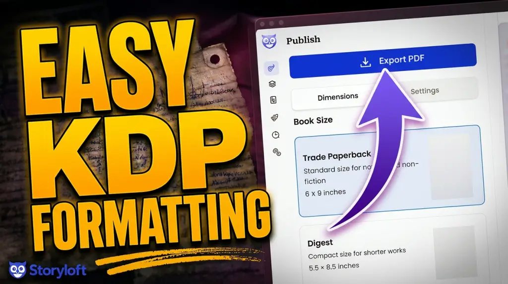
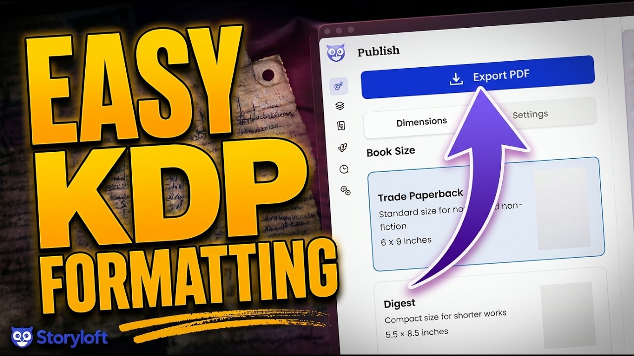
When the manuscript is ready, you click Publish. Storyloft gives you three paths: a print book, an e-book, or a plain DOCX if you need the raw document for some other purpose. For this walkthrough we’re going to print, so I select Export Print Book.
5. The part you can’t see: the 300 DPI asset swap
Here’s the piece I’m proudest of, because it solves the resolution problem invisibly. While you’re working in the editor, Storyloft shows you lightweight, web-optimized versions of your illustrations so the editor stays fast and responsive. But behind the scenes, every time you generate an illustration, we also save a full-resolution print master — at least 300 DPI — that you can download anytime.
When you export for print, Storyloft automatically reaches for those high-resolution masters and swaps them in for the web previews. Your editing experience stays snappy; your printed PDF comes out at the highest possible quality. You never have to think about resolution, manage two sets of files, or discover the problem only after the proof arrives. (For the consistent character illustrations you may have noticed in the sample — the same character appearing across multiple chapters — those come from Storyloft’s illustration tools, where you build a character once and reuse them throughout the book.)
6. Choose your trim and review the layout
I exported as a trade paperback, the most common size for indie print. Storyloft rendered the title page, the dedication, and the first chapter — “Thrain Lives” — with the barbed-wire ornament in place. Running heads are already correct: book title on the left page, chapter title on the right. Chapters open on the right-hand page by default, because that’s the industry standard.
7. A print trick worth stealing: white-space framing
Most books don’t run images corner to corner the way a web canvas or a full-bleed cover does. On the printed page, that can feel heavy and cheap. So Storyloft lets you pull the artwork in from the edges and surround it with white space. On paper, it reads as intentional and elegant — the difference between an image that’s placed in a book and one that’s just dumped onto the page.
8. Dial in the formatting settings (only if you want to)
Storyloft applies professional defaults, so you can ship without touching any of this. But the controls are there if you want them, all in the formatting settings: margins, bleed, print marks, heading layouts, and customizations like right-aligned chapter starts.
For this book, because it has full-edge images, I bumped the inner margin to 1.5″ to protect text from the binding and set the bleed to 0.25″ so nothing clips at the trim. I skipped the drop cap on this one, and I left footnotes alone since the novel doesn’t use them.
9. Export the print PDF
Finally, click Export PDF. Storyloft queues the file and builds it in the background using our own rendering engine — which means it’s also running layout checks while it works, catching issues before they reach your printer. It can take a few minutes for a full book; that’s the engine doing its job properly rather than cutting corners.
When it’s done, you download the file. I opened mine up and there it was: clean chapter styling, correct running heads, the white-space-framed illustrations sitting properly on the page, a true print-ready PDF at 300 DPI. Ready to upload to KDP, send to IngramSpark, or hand to a private printer. No Adobe gymnastics required.
KDP vs. IngramSpark vs. your own printer: which file do you actually need?
The good news is that a properly formatted print PDF from Storyloft works across all three. The differences are mostly about distribution, not formatting:
Amazon KDP
The easiest on-ramp. Free to upload, prints on demand, and feeds directly into the Amazon storefront where most indie print sales happen. Great default for getting your book live fast.
IngramSpark
Built for wider distribution — bookstores, libraries, and the broader retail channel that runs on Ingram’s catalog. If you want a shot at physical shelf space or library orders, this is the channel that opens those doors. Its file requirements are stricter, which is exactly why a validated, print-ready PDF matters.
A private or local printer
If you’re doing a special edition, a short run for an event, or a premium hardcover with a printer you’ve chosen yourself, you just need a high-quality print PDF to hand over. That’s the same file Storyloft exports — full resolution, proper bleed, the works.
The point is that you format once. The file is portable. You’re not rebuilding your interior three times for three platforms.
Why I built it this way
Twain’s tragedy wasn’t that he loved books too much. It’s that he got pulled into the machinery of making them — and the machinery is a bottomless pit if you let it be. There’s always one more setting to perfect, one more part to install.
Your job is to write a book worth printing. The formatting, the resolution, the bleed, the running heads, the endnote-to-footnote conversions — that’s machinery. It should be reliable, invisible, and out of your way. That’s the whole idea behind Storyloft’s print pipeline: you focus on the craft, and we make sure it looks professional at its very best when you take it to print.
Twain had to bet a fortune on a machine that never quite worked. You get to click Export.
Frequently asked questions about formatting a book for print
What is the difference between a print PDF and an e-book file?
A print PDF has fixed pages with exact dimensions, margins, bleed, and 300 DPI images, designed to be physically printed and bound. An e-book file (like EPUB) is reflowable — text resizes to fit any screen, so there are no fixed pages or print margins. Storyloft can export both from the same manuscript.
What resolution do book images need to be for print?
At least 300 DPI at their final printed size. Anything lower risks looking pixelated or soft on paper. Storyloft automatically saves 300 DPI print masters of your illustrations and swaps them in at export, so you don’t have to manage resolution yourself.
Do I need bleed for my book interior?
Only if you have images or color that run to the edge of the page. If everything stays within the margins, you may not need bleed. If anything touches the trim, you need bleed (typically 0.125″ to 0.25″) so nothing clips when the pages are cut.
Why do chapters in printed books usually start on the right-hand page?
It’s the long-standing print convention — chapters open on the right (recto) page, which sometimes leaves a blank left page before them. It makes chapter starts predictable and gives the book a polished, traditional feel. Storyloft does this by default but lets you turn it off if you prefer.
Can the same file be used for both KDP and IngramSpark?
Yes. A properly formatted print-ready PDF works for KDP, IngramSpark, and private printers alike. You format once in Storyloft and use the same file across distribution channels.
Can I convert endnotes to footnotes after I’ve written the book?
In Storyloft, yes — with a single toggle. It converts every endnote into a footnote and places each one on the correct page automatically, which is otherwise a tedious and error-prone manual task.