1-Click KDP Formatting Secret: How I Set Up a Print-Ready Book PDF in Storyloft
Getting a manuscript ready for print is where a lot of authors suddenly discover that writing the book and publishing the book are two very different jobs.
Words on a page are only part of it. Print publishing asks for trim size, margins, bleed, chapter placement, headers, image quality, and a final PDF that will not fall apart when it reaches Amazon KDP, IngramSpark, Barnes and Noble Press, or a private printer.
That is exactly why I like handling print formatting inside Storyloft. I can stay focused on the book itself while the platform handles the technical side that usually eats hours.
If you have ever wondered how to turn a manuscript into a professional paperback interior without wrestling with complicated layout software, this is the cleanest workflow I know.
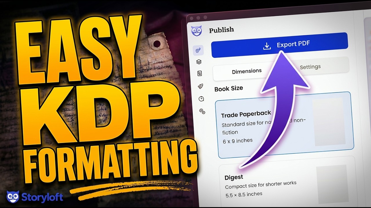
Table of Contents
- 📘 Start with the manuscript you already have
- 🎨 Choose a theme that fits the book
- 🧭 Set up chapter headings the smart way
- 🪄 Add decorative elements without overdoing it
- 🖨️ Move into print publishing mode
- 🖼️ Use high resolution print assets instead of web images
- 📐 Adjust the print settings that actually matter
- 🖼️ Make illustrations look better on paper
- 📄 Export the PDF and let the engine do the heavy lifting
- ✅ Why this workflow is so much easier than traditional formatting
- ❓FAQ
- 📝 Final thought
📘 Start with the manuscript you already have
I begin inside the manuscript itself. For the demonstration, I used a sample fantasy book from a series called The Enderburn, but the process works the same way whether I am formatting a novel, memoir, nonfiction book, or something illustrated.
The first thing I want to confirm is simple: the content is in place. Chapters are there, text flows correctly, and any images I want in the book are already part of the manuscript.
One especially useful detail here is image consistency. If I have created characters in Storyloft’s illustration tools, those visuals can carry through into the book itself. That matters more than people think. A print book with mismatched imagery can feel amateur fast. Consistency helps the interior feel intentional.
Before formatting for print, I do not need to overcomplicate anything. I am not rewriting the book here. I am preparing it to look excellent on paper.
🎨 Choose a theme that fits the book
One of the fastest ways to improve the look of a printed book is to pick a theme that matches the tone of the story.
For a dark fantasy book, I want something with enough weight and personality to support the mood. Storyloft includes multiple theme options, and switching between them is quick enough that I can compare styles without disrupting my flow.
This part matters because print design is not just mechanical. It is emotional. A thriller should not feel like a light romance. A war torn fantasy should not read like a business manual.
When I tested themes for this book, I landed on one that gave the chapter pages a stronger presence. That heavier typographic feel suited the material better.
If you are still figuring out what makes a print interior feel professional, I recommend studying books in your genre and comparing their chapter openers, heading styles, and white space. The closer your interior feels to reader expectations, the more polished it feels.
🧭 Set up chapter headings the smart way
This is one of my favorite parts of the workflow because it solves an annoying publishing problem automatically.
When I mark a heading as a real chapter heading, Storyloft can automatically number it. So if I need Chapter One, Chapter Two, and so on, I do not have to number every section manually.
That may sound small, but manual numbering becomes fragile fast. Add or remove a chapter late in the process and suddenly everything has to be checked again.
Even better, Storyloft understands the difference between actual chapters and other front matter or section headings. If I add something like an introduction or preface and mark it as a generic heading rather than a chapter, it does not get treated like Chapter One.
That is exactly the kind of detail that saves time. The software is respecting book structure, not just text styling.
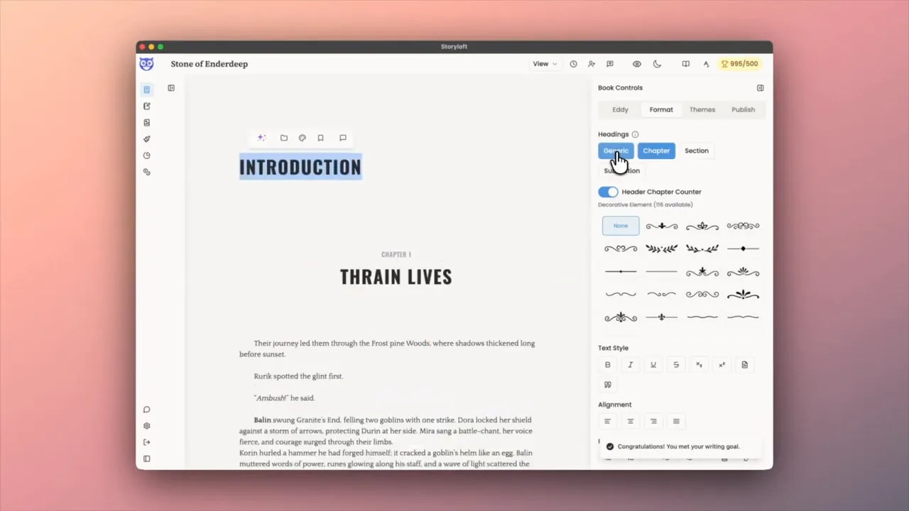
If you are building a print book interior manually, this is one of the easiest places to make a mistake. Proper heading logic keeps your structure clean from the start.
🪄 Add decorative elements without overdoing it
Chapter ornaments can add a lot of personality to a printed book, especially in fiction.
In this fantasy example, I added a decorative element that felt rough, tense, and war scarred. Storyloft offers a library of ornaments and decorative marks, so I can choose something that supports the story rather than distracts from it.
The trick is restraint.
I do not want a decorative element just because it exists. I want it because it reinforces tone. If the story is dark and battle worn, a sharp or distressed ornament can help. If the book is elegant historical fiction, I would choose something completely different. If the symbol feels random, I skip it.
This is where interior design stops being just formatting and starts becoming part of the reading experience.
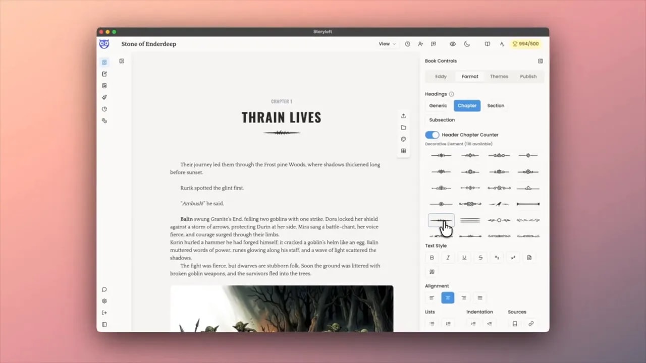
🖨️ Move into print publishing mode
Once the manuscript styling feels right, I head to the publishing options.
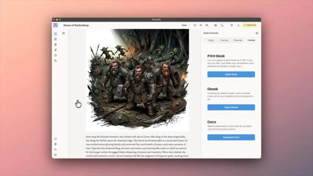
Storyloft separates publishing into clear outputs:
- Print book
- Ebook
- DOCX export
For this workflow, I choose print book.
That matters because a print interior is not just a repackaged ebook. Print layouts need different spacing, page logic, image handling, and file preparation. A proper print export should produce a real print ready PDF, not just a document that happens to be saved as PDF.
If you want a broader overview of what makes a print interior press ready, Storyloft also has a helpful print book formatting checklist that covers the details authors often miss before upload.
🖼️ Use high resolution print assets instead of web images
This is one of the biggest hidden problems in book formatting.
The images I see during drafting and editing are often optimized for speed and performance. That is great for writing inside an app. It is not great for print.
When I export a print book in Storyloft, the platform replaces those lighter web versions with high quality print assets. In this case, that means 300 DPI files suitable for professional printing.
That single step is huge.
Blurry or low resolution illustrations instantly cheapen a printed book. Clean, high resolution artwork makes the book feel intentional and premium. If you have ever opened a proof copy and found muddy images, you already know how painful that is.
Storyloft solves that by keeping the editing experience lightweight while preserving proper print quality at export time.
That is also why I do not recommend treating print setup like an afterthought. The final PDF needs to be built for paper from the beginning, especially when illustrations are involved. Storyloft’s guide on creating a print ready PDF is useful if you want a more technical breakdown of what printers expect.
📐 Adjust the print settings that actually matter
Once I am in the print layout, I can preview the paperback interior and make the important formatting decisions.
For this example, I selected a trade paperback layout and reviewed the front matter, dedication, chapter opener, headers, and image placement.
This is where the practical controls come in. Storyloft lets me adjust settings such as:
- Margins
- Bleed
- Print marks
- Heading layouts
- Chapter alignment
- Footnote behavior
I increased the inner margin to give the book a little more breathing room near the gutter. That is especially helpful in paperback formatting, where text can disappear too close to the binding.
I also added bleed because the book includes images. If artwork or design elements extend toward the page edge, bleed helps prevent awkward white slivers after trimming.
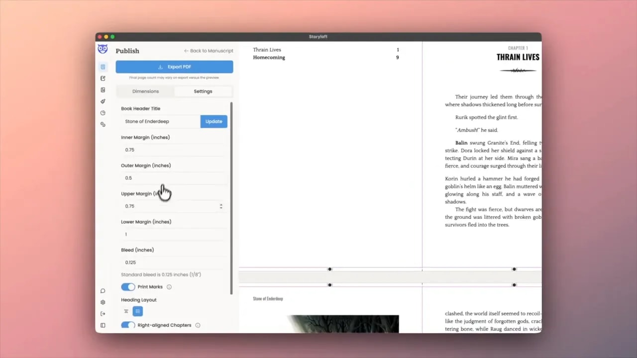
If you are uploading to platforms like Amazon KDP or IngramSpark, these settings are not cosmetic. They are part of meeting platform requirements and avoiding rejected files or ugly proofs.
Right aligned chapters and industry standards
By default, Storyloft places chapter openers on the right hand page. That is the traditional print standard.
Some people dislike the blank left page that sometimes comes before a chapter opener. I understand that reaction. But the reason it exists is predictability and convention. Many professionally printed books do exactly this.
That said, I still have control. If I do not want forced right hand chapter starts, I can change that setting.
I like having the standard as the default while still being able to override it when a specific project calls for something different.
Endnotes to footnotes with one switch
This is one of those deceptively powerful features.
If I have endnotes and decide late in the process that I actually want footnotes, I can flip that option and let Storyloft move them into the proper places.
Anyone who has tried to handle that conversion manually knows how tedious it can become. For nonfiction, academic work, annotated editions, and heavily referenced books, this is a serious time saver.
🖼️ Make illustrations look better on paper
Printed books handle images differently than screens do.
One subtle but important design move in this workflow is pulling back the edges of an illustration and introducing white space around it. Instead of forcing every image to feel like a full bleed digital graphic, I can give it room to breathe on the page.
That often looks better in print, especially for interior illustrations. It feels more like an intentional book layout and less like a pasted image block.
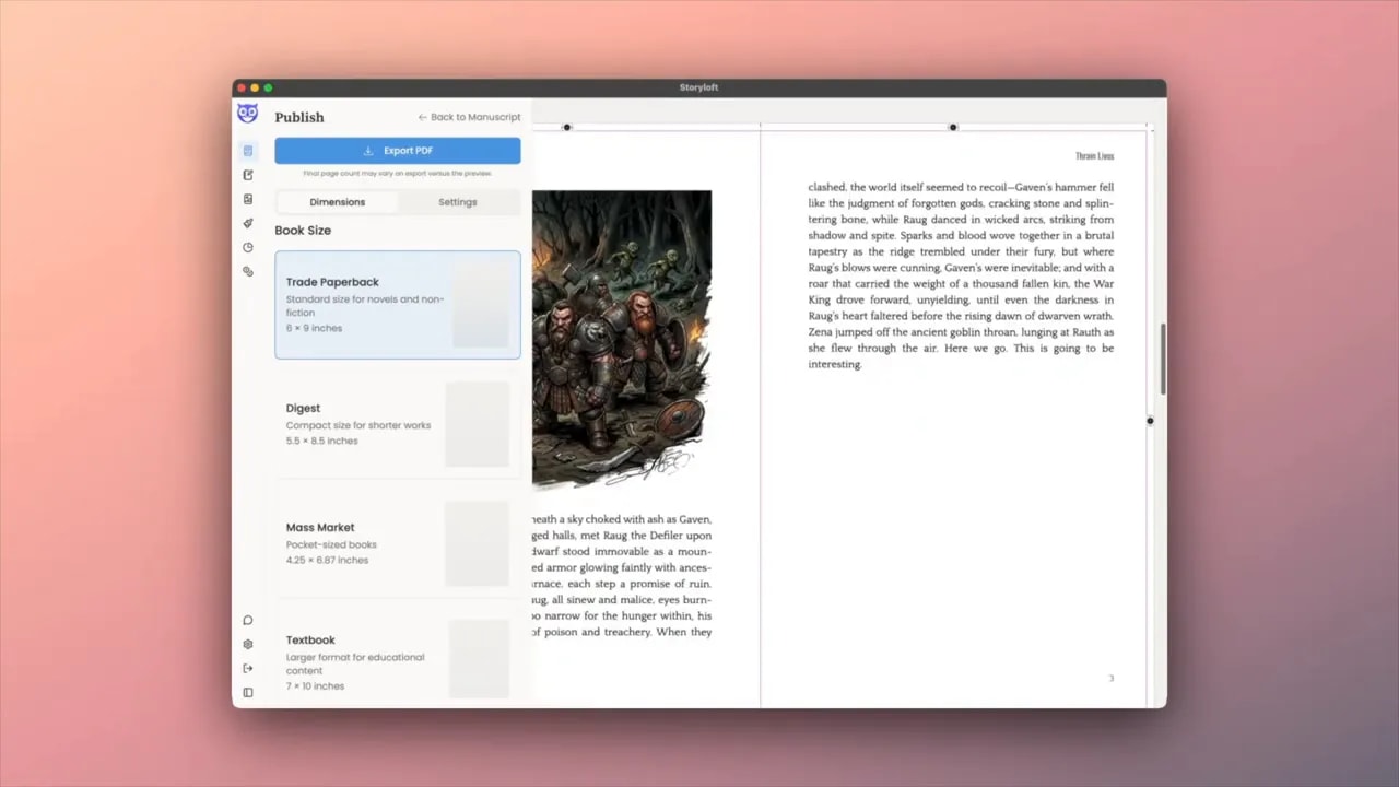
If your project includes artwork, diagrams, or chapter images, this kind of spacing can dramatically improve the final result.
And if you want an easier route than piecing everything together in design software, Storyloft also offers print book formatting software built specifically for authors who want a clean KDP or IngramSpark workflow.
📄 Export the PDF and let the engine do the heavy lifting
Once the settings look right, the export itself is refreshingly simple.
I click Export PDF, and Storyloft queues the job in the background. While it processes, the engine prepares the print file and checks for layout issues.
That matters because exporting is not just saving what is on screen. A proper print export should be validating the structure as it builds the file.
After that, I download the finished PDF and open it in a reader to inspect the real result.
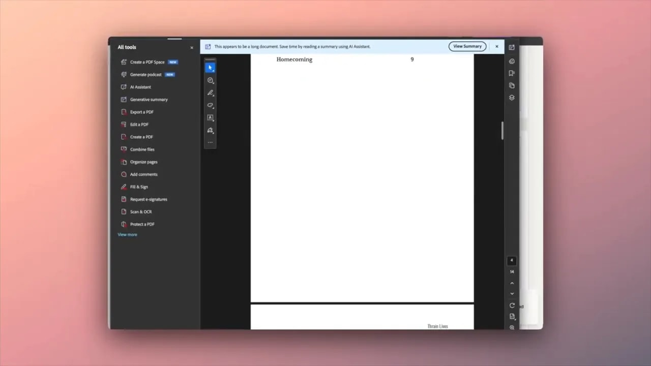
What I am checking at this stage:
- Chapter pages look balanced
- Headers are placed correctly
- Body text is readable and clean
- Images are crisp
- White space looks intentional
- Everything feels like a real book, not a dressed up document
In the final export, the chapter styling looked sharp, the white space around the illustrations worked, and the book was ready for print.
✅ Why this workflow is so much easier than traditional formatting
Traditional print formatting often means bouncing between a writing app, a word processor, a layout tool, image editors, and PDF export settings. That is where a lot of mistakes creep in.
What I like about this workflow is that it keeps the entire process close to the manuscript.
I can:
- Write the book
- Style the interior
- Set chapter behavior
- Handle images properly
- Adjust print settings
- Export a professional PDF
All without turning the publishing stage into a separate technical career.
That is the real secret here. It is not just that the export is fast. It is that the entire print formatting process becomes manageable.
And for most authors, that is the difference between a book that gets published and a book that gets delayed for another six months while formatting becomes a giant side quest.
❓FAQ
Can I use Storyloft for Amazon KDP and IngramSpark?
Yes. The print export workflow is designed for professional paperback formatting, including the kinds of PDF requirements typically needed for KDP, IngramSpark, and other print on demand platforms.
Do I need separate design software to create a print ready PDF?
Not necessarily. If your book fits a standard interior workflow, Storyloft can handle the formatting and PDF export inside the platform, which removes the need for juggling multiple tools.
What happens to images when I export for print?
Storyloft swaps lighter web optimized images for higher resolution print assets during export, helping the final PDF maintain print quality at 300 DPI.
Can I control margins and bleed?
Yes. You can adjust inner margins, bleed, heading layouts, chapter alignment, and other formatting settings directly in the print layout controls.
Will chapter openers always start on the right hand page?
That is the default because it follows common print industry standards, but you can change it if you prefer a different layout behavior.
Can endnotes be converted to footnotes automatically?
Yes. If your project uses endnotes and you decide you want footnotes instead, Storyloft can convert them and place them on the correct pages.
📝 Final thought
Print formatting should make a book look better, not make the publishing process miserable.
The reason I like this setup is simple. I get to focus on the craft of writing while still ending up with a professional print interior that feels ready for the real world.
If the goal is a paperback that looks polished, reads cleanly, and uploads with confidence, this workflow gets me there with far less friction than the old patchwork approach.