
How to Make a Professional Book Cover in Storyloft for Ebook and Print
A strong book cover has to do two jobs at once. It has to look sharp as a tiny ebook thumbnail, and it has to hold up as a real print cover with a front, spine, and back that feel like they came out of a publishing house. That usually means juggling multiple tools, export settings, bleed, trim, spine width, and a whole lot of little design decisions that can get messy fast.
I wanted to show a cleaner way to do it.
Here, I built a fantasy cover for a book in the Ender Burn series inside Storyloft, starting from the ebook front cover and then extending it into a full print wrap. The goal was simple: create something that looks good digitally, prints beautifully at 300 DPI in CMYK, and does not require hopping between a bunch of different apps.
Table of Contents
- 📘 Start with the ebook cover first
- 🖋️ Build a quick title with text tools
- 🧩 Use cover assets to add depth
- ✨ Generate a custom title graphic instead of relying on plain fonts
- 📤 Export ebook assets when you need them
- 📚 Switch to print mode and set the physical specs
- 🔄 Sync the ebook design to the print cover
- 🧱 Add spine content and keep it readable
- 🌌 Generate a full background for the back cover
- 📝 Generate and refine the back cover blurb
- 🧍 Add character art for a premium feel
- 🔢 Add the ISBN barcode correctly
- 🖨️ Export the right file for the job
- ⚙️ Why this workflow works so well
- ❓ FAQ
- 🏁 Final thoughts
📘 Start with the ebook cover first
I always like to begin in ebook mode because that is where the core visual identity gets set. The front cover does the heavy lifting. If the front is not working, no amount of spine polish or back cover copy will save it.
Inside Storyloft, I opened the Covers section and selected a book that already existed in the manuscript library. That matters because the cover tools pull from the material already connected to the project, including characters, scenes, and the general story context.
In this case, I used a fantasy image featuring Gavin, one of the characters, holding a golden sledgehammer and looking ready for a fight. It already had the tone I wanted. Dark cavern. Warm firelight. Strong heroic silhouette. Great starting point.
I like starting with a strong piece of art that already carries the mood of the book.
By default, ebook mode is where I create the front cover. From there, I can start layering in title, author name, and visual accents.
🖋️ Build a quick title with text tools
The fastest approach is to add a text layer and just start designing directly on the cover.
I created a new text element, center aligned it, and began testing fonts from Storyloft’s curated font library. One thing I like here is that the fonts are not just dumped into a giant list with no guidance. They are selected to work well for covers and organized in a way that makes genre matching easier.
For the title, I used a stylized display font that gave the book a pulpy fantasy energy. Then I switched the color to white so it would cut through the darker illustration. After that, I adjusted the size and added a shadow to help the title separate from the background.
For the author name, I used a second font with more restraint. That contrast matters. If your title is dramatic, your author name usually benefits from being simpler and more professional. You want hierarchy, not competition.
This is the same principle I talk about when discussing book cover design best practices. The title needs to command attention, but every element still has to feel like it belongs in the same visual system.
🧩 Use cover assets to add depth
Once the basic text was in place, I moved into the cover asset library.
Storyloft includes a large collection of decorative assets that can be dropped into the design and styled to fit the genre. I searched for fantasy assets, found one that worked with the mood of the cover, inserted it, and pushed it behind the text so it acted like a framing layer instead of a distraction.
This kind of asset can help a cover look more complete without forcing you to build ornamental detail from scratch. Used well, it gives the title more presence and can make the whole composition feel more intentional.
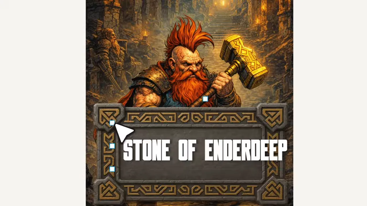
A small decorative frame can make the title feel more deliberate and more premium.
That said, I did not stop there, because there is an even better option when a book needs a real visual identity.
✨ Generate a custom title graphic instead of relying on plain fonts
If I am working on a standalone book, plain text can be enough. If I am building a series, though, I usually want something stronger. A title treatment can become part of the brand of the series itself.
That is where the Title Graphic tool comes in.
Rather than just typing words on a canvas, I can generate a title graphic that behaves more like a custom logo. I entered the book title and subtitle, chose a fantasy style, and let Eddie handle the first pass.
Because the system already understands the book context and the illustration style, it can generate something that fits the cover instead of something generic and disconnected.
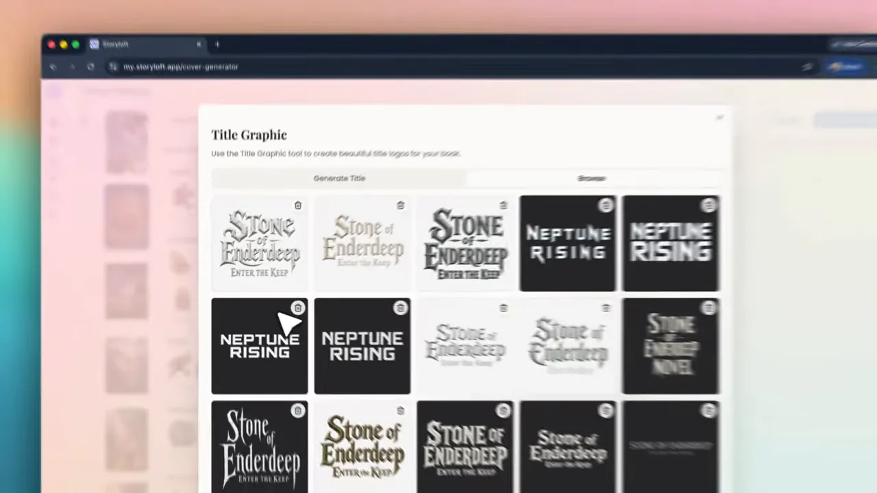
This is where the cover starts to move from functional to memorable.
When the generated title came back, it looked fantastic. The typography had texture, weight, and the right fantasy feel. More importantly, it matched the artwork. I did not have to manually chase color harmony or glow effects.
Storyloft automatically maps glow, shadow, and color behavior to the existing cover image, which is a huge deal. That kind of cohesion is what often separates a decent DIY cover from one that actually looks polished.
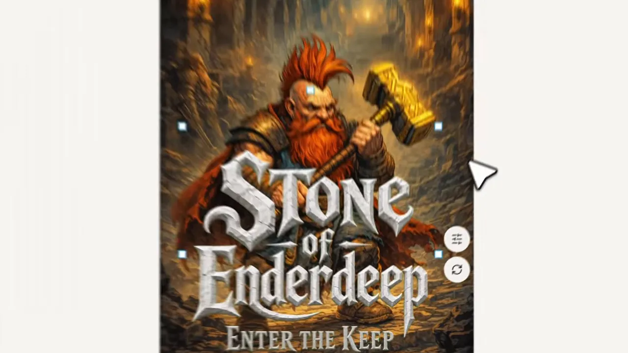
A custom title graphic instantly gave this cover the series feel I wanted.
From there, I fine tuned brightness, contrast, warmth, and shadow size until the title sat naturally in the scene. Usually I prefer shadow over glow for fantasy covers like this, because it gives better readability without making the lettering feel artificial.
Try Storyloft for your next book cover
Create ebook and print-ready covers in one place with title graphics, AI assistance, and export tools built for authors.
📤 Export ebook assets when you need them
Before moving on to print, I like that I can already export what I have built. Storyloft lets me download the artwork alone, a PNG, or a PDF version of the ebook cover. That is useful for marketing graphics, ad mockups, preorder pages, or adding the cover elsewhere in my publishing workflow.
If you are also thinking ahead to production, it helps to understand how final files should be prepared. I have a more detailed walkthrough on creating a print-ready PDF that covers the practical side of export quality, file setup, and proofing.
📚 Switch to print mode and set the physical specs
Once the ebook front looked right, I switched to Print mode.
This is where a lot of cover workflows become annoying, because suddenly you are rebuilding things manually. Storyloft smooths that out by letting me define the book size and production settings first, then pull the ebook design into the print layout.
I selected a standard trim size, adjusted bleed, and entered the page count. Storyloft uses those values to calculate the basic structure of the wrap, including the spine width. If I want to, I can also enter spine width manually in inches, which can be helpful when I am accounting for paper stock differences.
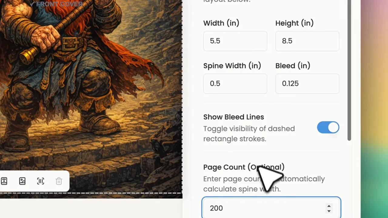
Getting the trim size, bleed, and page count right early saves trouble later.
That setup takes seconds, and it gives me a clean template for the full wrap.
🔄 Sync the ebook design to the print cover
After the dimensions were set, I used the single cover sync tool to pull the ebook layers into the print layout.
This gets me close right away. Since ebook and print proportions are not identical, I still need to resize and nudge a few things, but I am not starting from zero. The title, author text, and major front cover composition come over in a way that is already usable.
I made the title a bit larger and heavier for print because printed covers often reward bolder treatment. A heavy shadow can also reproduce more clearly on a physical object than a subtle one.
This is one of the biggest advantages of keeping everything inside a unified system. Ebook and print stay aligned instead of drifting apart.
🧱 Add spine content and keep it readable
Next came the spine.
I used the spine content tool to insert the title and author name automatically, then customized the typography. I reused the simpler supporting font for the spine because spine text needs clarity above all else.
At full size on a design canvas, almost anything can look acceptable. On an actual spine, the wrong choice becomes obvious fast. Thin fonts, weak contrast, and cramped spacing all fall apart. So I kept the spine clean, high contrast, and easy to read.
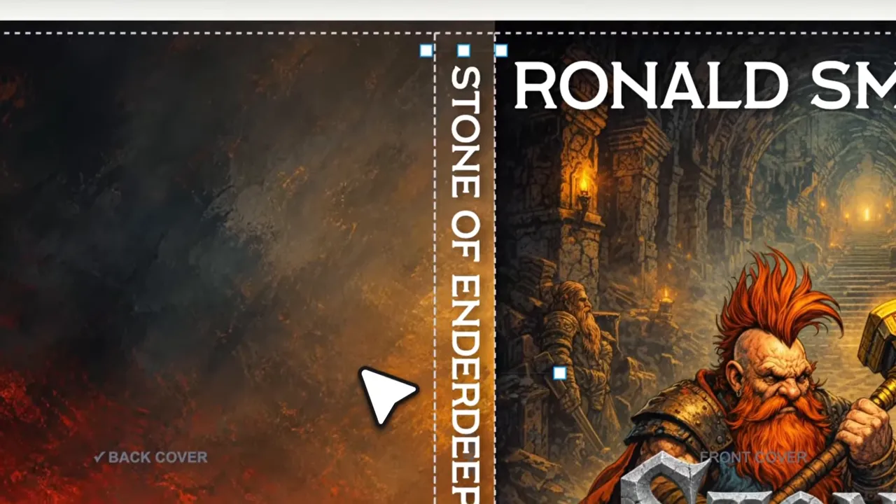
Spine text needs to be simple enough to read and strong enough to survive print.
Storyloft also makes it easy to move, rotate, and style the spine text until it feels balanced against the front cover.
🌌 Generate a full background for the back cover
The back cover usually creates a design problem. You need something that matches the front artwork, but you do not want so much visual noise that the blurb becomes unreadable.
That is why I really like the Generate Full Background tool.
When I click it, Storyloft analyzes the front cover image, its colors, and its style, then creates a matching background intended to support text rather than compete with it. The result is usually a softer, distraction free extension of the world established on the front.
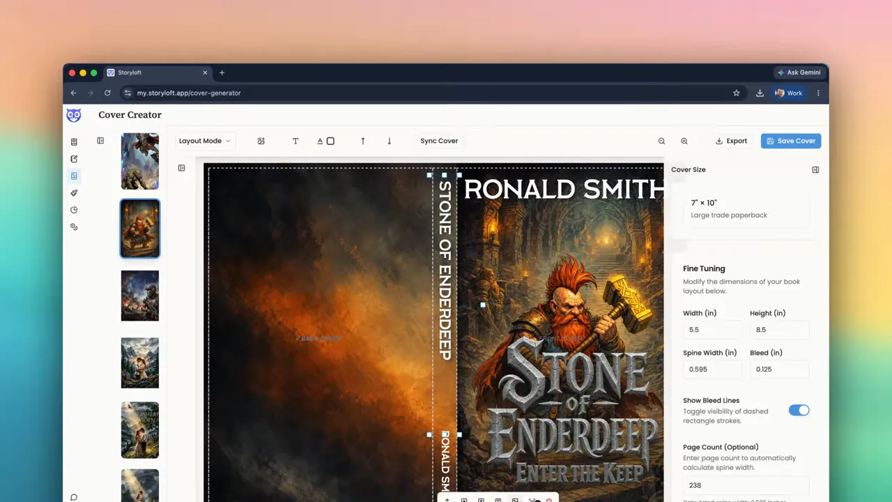
The back cover background matched the front nicely without fighting the text.
That is exactly what happened here. The generated background preserved the warm, subterranean fantasy mood while opening up enough space for copy.
If I ever want a completely custom background, I can upload my own. But for speed and cohesion, this generator is incredibly useful.
📝 Generate and refine the back cover blurb
Then I used another handy tool: Generate Cover Blurb.
Back cover copy is weirdly difficult. It has to promise tension, communicate genre, hint at stakes, and stay concise. Storyloft can generate that first draft automatically by using the material already connected to the book.
The generated version for this fantasy novel was actually solid. It introduced the dwarven setting, the dark threat, and the rising stakes in a way that felt marketable. I still edited it, of course. AI is a strong assistant here, not a substitute for taste.
My biggest formatting change was increasing line height to make the text breathe. Dense paragraphs are one of the easiest ways to make a back cover feel amateur. I also switched to a readable serif face and separated out the opening hook so the top line could function as a stronger visual lead.
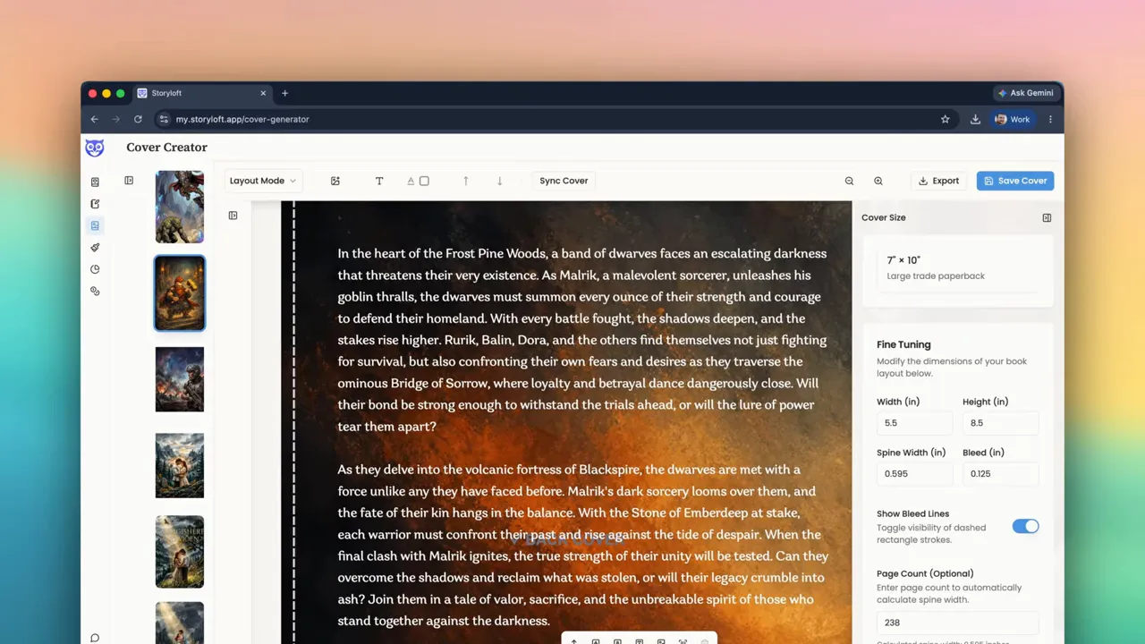
Readable spacing matters just as much as good copy when the back cover is carrying sales weight.
If you need more help thinking about sales presentation, Amazon listing performance, and what makes people click in the first place, it is worth paying attention to the role of book cover quality in reader decisions.
🧍 Add character art for a premium feel
Once the text looked good, I added a character sticker to the back cover.
This is where the design starts feeling less like a template and more like a finished product. I selected a character from the library and used a prompt to generate an image of Roth looking back over his shoulder with an angry glare. Storyloft returned sticker style options that could be inserted directly into the design.
I placed the character near the bleed on the back cover. That added depth and energy without interfering with readability. A well placed sticker like this can help the back cover feel like part of the story world, not just a slab of text.
This is also a good reminder that premium does not always mean adding more. It means adding the right thing in the right place.
🔢 Add the ISBN barcode correctly
For print, I also need the barcode area handled properly. Storyloft includes an ISBN barcode generator, so I can enter the 13 digit ISBN and place the barcode directly on the back cover.
That 13 digit requirement matters. If the number is not in the correct format, the barcode will not generate correctly.
Once created, I can move and resize the barcode as needed. Storyloft drops it into a standard bottom right placement, which is a sensible starting point for most books.
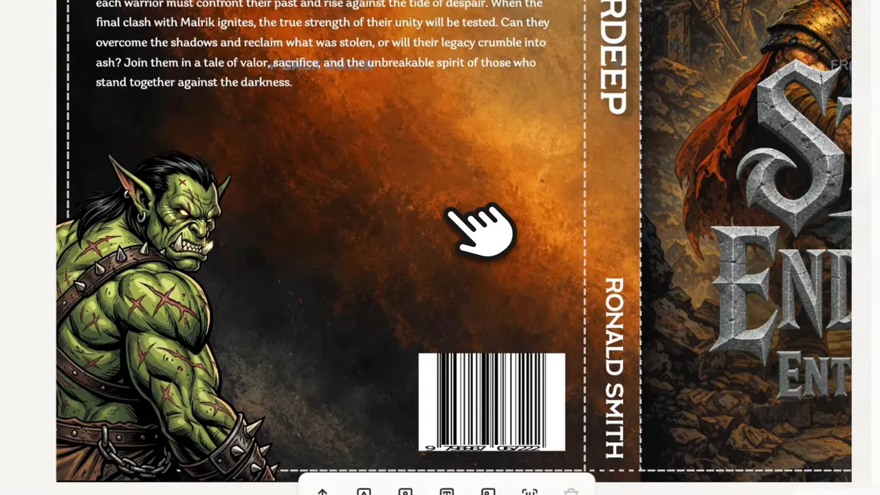
Having the barcode generator built in removes one more annoying production step.
🖨️ Export the right file for the job
When the wrap is finished, export options matter almost as much as the design itself.
Storyloft gives me several choices:
- Artwork only
- PNG
- Quick PDF
- Print shop RGB PDF
- CMYK 300 DPI print shop PDF
That last one is the one I care about most for professional printing. CMYK at 300 DPI is what helps the final cover reproduce cleanly and feel shelf ready. For many self publishers using print on demand platforms, those settings are essential.
If you are producing the full interior as well, it helps to think of cover prep and print formatting as part of one system. That is exactly why I recommend handling the rest of the production process with a print-ready workflow rather than patching files together at the end. For that, this guide to print-ready book formatting is a useful companion.
For general publishing specs, it is also smart to review the documentation from platforms like Amazon KDP and IngramSpark, especially if you are checking trim sizes, bleed expectations, or final upload requirements.
⚙️ Why this workflow works so well
The biggest win here is not just that I made a cover quickly. It is that the whole process stayed connected.
I did not design an ebook cover in one app, build a wrap in another, generate a barcode somewhere else, and manually hunt for export settings in a separate tool. The manuscript, characters, AI assistance, title generation, layout tools, and print exports all lived in one place.
That means:
- My ebook and print covers stay visually aligned
- My title treatment can become consistent across a series
- My back cover copy starts with actual story context
- My print file is ready for real production
- I spend more time making decisions and less time wrestling software
For authors, that is the difference between a cover process that feels empowering and one that feels like a technical tax.
Frequently Asked Questions
Can I create both ebook and print covers in Storyloft?
Yes. You can start with an ebook front cover and then switch to print mode to build the full wrap, including the front cover, spine, and back cover.
Does Storyloft support 300 DPI and CMYK export?
Yes. Storyloft includes a CMYK, 300 DPI print-shop PDF export option for professional printing.
How is spine width calculated?
You can enter the page count and let Storyloft calculate the spine width automatically. You can also manually enter the spine width in inches if you need more control.
Can I generate back cover copy automatically?
Yes. Storyloft can generate a cover blurb based on your book’s content. You can then edit the wording, formatting, spacing, and font choices.
Can I add ISBN barcodes inside Storyloft?
Yes. Storyloft includes a built-in barcode generator. You only need a 13-digit ISBN to create the barcode and place it on the back cover.
Do I need separate design software for this workflow?
No. The cover design tools, syncing, text tools, character assets, AI support, and export options are all available inside Storyloft.
🏁 Final thoughts
This whole cover came together fast, but speed was not the real point. The real point was quality without chaos.
If I can create a fantasy ebook cover, turn it into a full print wrap, generate a matching background, draft a back cover blurb, add character art, insert a barcode, and export a print-ready CMYK PDF in one workflow, that is a serious advantage.
A professional book cover should not require a maze of tools and workarounds. It should feel like part of the writing and publishing process itself. That is exactly what I wanted this workflow to deliver.
