How to Format Manuscript for Agents, Ebooks & Print
You typed “The End,” closed the document, and felt done for about ten minutes.
Then formatting showed up.
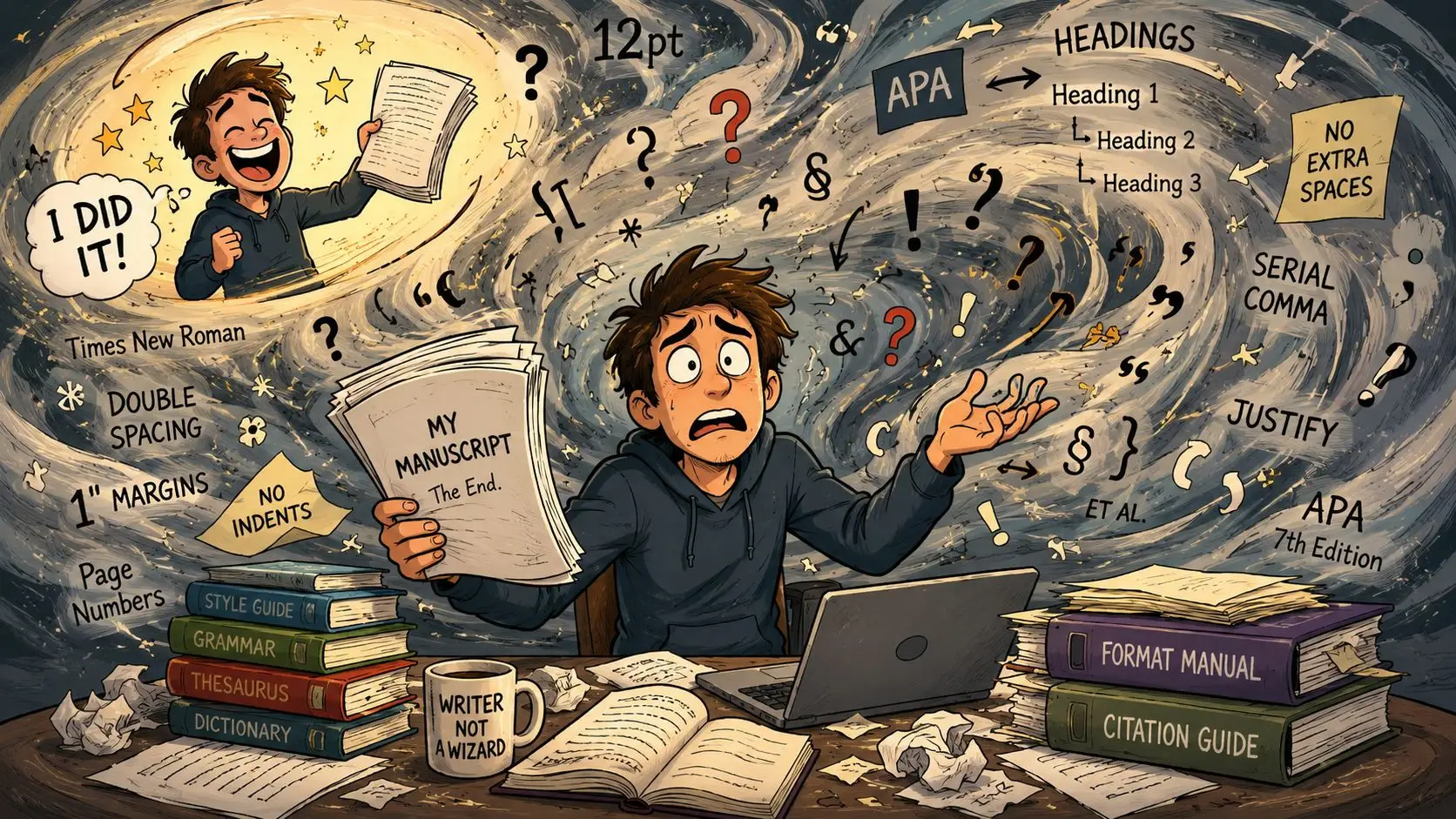
Now you're staring at conflicting advice about fonts, margins, title pages, chapter breaks, print settings, ebook exports, and file types. One guide talks about pleasing agents. Another jumps straight to paperback trim sizes. A third assumes you already know what “reflowable text” means. That confusion is normal because you're not solving one formatting problem. You're solving three different ones: submission format, ebook format, and print layout.
Most first-time authors get tripped up because they try to make one file serve all three jobs at once. That's where clean manuscripts turn messy. A document that works for an agent often looks wrong in EPUB. A Word file that feels acceptable on screen can break badly when you push it toward print.
The fix is simpler than it looks. Start with the standard manuscript format that publishing professionals expect. Then adapt that source file carefully for ebook and print, instead of improvising each version from scratch. If you're also setting up your platform as an author, this is usually the same stage when people create an author website quickly so the book, bio, and mailing list all move forward together.
A practical publishing plan helps here. This self-publishing checklist for authors is useful because formatting mistakes rarely happen in isolation. They usually show up alongside metadata, cover, and export mistakes.
Table of Contents
- You Finished Your Book Now What
- The Universal Foundation of Manuscript Formatting
- Formatting for Agent and Publisher Submissions
- Adapting Your Manuscript for Ebook Publishing
- Preparing Your Book for Print and Paperback
- Automate Your Formatting with a Unified Workflow
You Finished Your Book Now What
Finishing a manuscript creates a strange second wave of work. The writing part is over, but now every tiny presentation choice feels loaded. Writers who were decisive for 80,000 words suddenly freeze over whether to use Times New Roman or Arial, whether scene breaks need symbols, and whether page numbers belong on the title page.
That panic usually comes from treating formatting like decoration. It isn't. Formatting is a delivery system. Agents want one thing. Ebook platforms want another. Print files demand a level of mechanical precision that ordinary drafting software doesn't always enforce well.
The three destinations hiding inside one draft
A completed book manuscript usually needs to move through three forms:
- Agent submission format keeps the text readable, plain, and easy to evaluate.
- Ebook formatting turns that same content into flexible text that can resize across devices.
- Print formatting locks the book into a fixed page design where margins, images, and page flow must hold still.
Writers often run into trouble when they skip that distinction. They justify text too early, insert manual spacing to “make it look like a book,” or start tweaking page layout before the manuscript is even ready for submission. That work often has to be undone later.
Practical rule: Keep your drafting file clean and boring first. “Professional” in manuscript formatting usually means “easy to process,” not “visually impressive.”
What works and what doesn't
What works is a staged approach. Build a clean manuscript. Submit from that. Then create separate outputs for ebook and print.
What doesn't work is trying to force a submission document to double as a paperback interior. The habits that make a Word document acceptable for an agent can create avoidable cleanup later if you hard-code visual effects into the file.
If you've been searching for how to format manuscript files and getting contradictory answers, the contradiction is often real. Different publishing stages want different outcomes. The trick is knowing which standard applies right now.
The Universal Foundation of Manuscript Formatting
Before you touch EPUB settings or paperback interiors, you need one stable base file. That base is standard manuscript format. It's the format that gives editors and agents a predictable reading experience, and it's the safest starting point for everything that follows.
The format professionals expect first
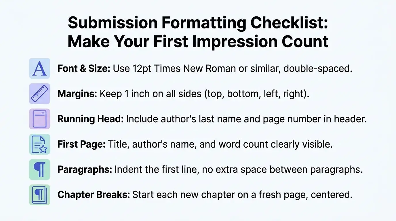
For fiction and general writing, the baseline standard is 12-point Times New Roman or Arial, double-spaced text, and 1-inch margins on all sides. That setup creates a reliable page-count baseline where 250 to 300 words occupy one page, which helps editors estimate reading time. A 300-word page translates to roughly 1.5 minutes of reading time. The same discussion of submission norms notes that 68% of professional editors cite deviation from those metrics as a primary reason for immediate rejection before content review in guideline-driven contexts, as summarized in this discussion of uniform manuscript format expectations.
Those rules can feel old-fashioned until you remember their purpose. An acquisitions editor doesn't need your manuscript to look like a printed novel. They need it to be easy to read, easy to mark up, and easy to estimate.
Three choices matter most at this stage:
- Keep the font ordinary. Times New Roman and Arial signal “readability first.”
- Keep the spacing loose. Double spacing gives room for comments and slows visual fatigue.
- Keep the margins standard. One-inch margins preserve white space and prevent a cramped page.
Manuscript format specs at a glance
The standard manuscript format is your source document, not your final design. This quick comparison helps keep those roles separate.
| Attribute | Agent Submission (SMF) | Ebook (Reflowable) | Print Paperback (6×9) |
|---|---|---|---|
| Font | 12-point Times New Roman or Arial | Reader-controlled on most devices | Chosen for final interior design |
| Spacing | Double-spaced | Reflowable, device-dependent | Set for print layout |
| Margins | 1 inch on all sides | Not page-based in the same way | Based on trim size and interior layout |
| Alignment | Usually flush left for manuscript readability | Reflowable display | Final typeset alignment |
| Page count purpose | Estimating length and reading time | Less important to reader experience | Fixed and essential |
| File goal | Submission-ready document | EPUB or similar digital output | Print-ready PDF |
The table above is why so many formatting guides seem to disagree. They aren't always talking about the same deliverable.
A strong source file should also stay structurally simple. Use real paragraph styles, not ad hoc bolding and spacing. If you need a deeper walkthrough for the setup itself, this guide on book manuscript format for authors is a useful companion.
Clean formatting is less about appearance than about preserving structure. Structure is what lets you convert the same manuscript into multiple outputs later.
Formatting for Agent and Publisher Submissions
Submission formatting is where small mistakes create outsized damage. A cluttered file tells the recipient you may be hard to work with, even if the writing is strong. The safest move is to make the document plain, consistent, and easy to follow.
What belongs on the first page
Your title page should do a quiet administrative job. It should identify the work, identify you, and avoid visual drama.
A standard submission package usually includes:
- Your contact details placed clearly on the title page.
- Approximate word count displayed in a straightforward way.
- Title and byline centered with no decorative treatment.
- Genre or category only if the recipient asks for it.
After the title page, the manuscript should start cleanly. Each new chapter should begin on a new page. The running header typically includes your surname, a short title, and the page number.
What makes a file look clean
The biggest hidden issue in submissions is not usually font choice. It's bad mechanics. The standard method calls for a 0.5-inch first-line paragraph indent without using tab characters, and tabs plus extra paragraph returns create hidden formatting errors that account for up to 30% of submission rejections in traditional publishing pipelines, according to this book manuscript formatting guide from Reedsy.
That one point explains a lot of messy manuscripts. Writers often create indents by hitting Tab, then add blank lines by pressing Enter twice, then adjust spacing manually in a few places to “fix” what moved. The file may look fine on one screen and still be structurally unreliable.
Use this checklist before you send anything:
- Set a first-line indent in paragraph settings. Don't fake it with tabs.
- Remove extra empty lines. Scene changes and chapter starts need control, not guesswork.
- Use page breaks for new chapters. Don't press Enter repeatedly until text lands where you want it.
- Keep the text plain. No embedded design flourishes, no decorative fonts, no visual experiments.
A submission file should look as if it could survive being opened on another computer without falling apart.
Scene breaks deserve restraint. A simple centered marker is enough if you need one. If an agent's guidelines say something specific, follow that exactly. Submission rules always outrank general best practice.
Adapting Your Manuscript for Ebook Publishing
Ebooks punish habits that look harmless in Word. The text doesn't live on fixed pages anymore. It has to resize, reflow, and behave well across different screen sizes, font settings, and reading apps.
Why ebooks break when print habits carry over
A manuscript for an agent assumes a static page. An ebook does not. Readers can enlarge the font, switch typefaces, rotate the device, or read on a phone one minute and a tablet the next. That means many visual decisions should be left to the reading system.
The trouble starts when authors manually force layout choices into the source file. Repeated spaces, extra line returns, faux page positioning, and decorative scene markers can produce ugly gaps or unpredictable breaks in EPUB.
The broader shift matters too. As noted in discussion around digital publishing standards, emerging ebook standards like EPUB3 and global market variations such as A4 vs. Letter require a different mindset, and traditional choices like asterisks for scene breaks may need to evolve for modern digital reading environments, as discussed in this video on manuscript formatting and ebook standards.
What to change before exporting EPUB
If you want a reliable ebook, strip the file back to structure.
- Use heading styles for chapter titles. EPUB navigation depends on recognizable structure.
- Delete fixed page concerns. Page numbers from a print-minded manuscript don't carry useful meaning in reflowable ebooks.
- Simplify scene breaks. Use a consistent marker that converts cleanly.
- Clean front and back matter. “Also by,” acknowledgments, and newsletter pages should be intentional, not copied over as afterthoughts.
A practical walkthrough helps if this is your first digital export. This guide on turning a Word document into EPUB in 7 steps is useful because it treats ebook conversion as a structural job, not a styling contest.
One more thing matters in ebooks: accessibility. If chapter titles are just enlarged text instead of true headings, navigation suffers. If scene breaks rely on visual spacing alone, some devices handle them poorly. Reflowable books reward consistency.
This demo is a good example of how digital publishing tools frame the conversion process:
The best ebook files feel invisible. Readers shouldn't notice your formatting at all.
Preparing Your Book for Print and Paperback
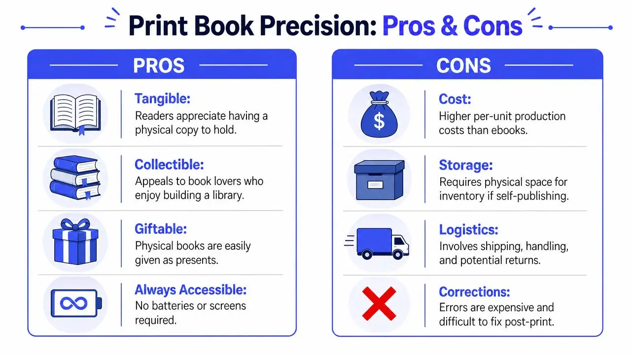
Print is where formatting stops being mostly editorial and becomes production work. A paperback interior has physical constraints. The page size is fixed. The margins have to account for binding. Images need enough resolution to survive paper and ink.
Submission pages are not print pages
A standard submission manuscript is intentionally rough. It's spacious, plain, and designed for review. A print interior is the opposite. It needs deliberate typography, stable page flow, and margins built for a real trim size.
That transition is where many indie authors lose time. They carry over habits from the submission file and expect the print version to emerge cleanly. It usually doesn't. Widows, awkward breaks, chapter openings, and inconsistent spacing all need attention once the page is fixed.
The hard part isn't learning one or two print terms. It's understanding that print formatting is a separate production pass. Your clean manuscript gives you the content structure. It does not give you a finished paperback interior.
Images tables and print-specific checks
Images are one of the fastest ways to create a bad print file. A key pitfall is image handling. For print, images must meet a minimum resolution of 100 ppi, and print files should use CMYK rather than RGB. The same guidance notes that the jump from submission format to print-ready layout is a major gap that creates substantial rework for indie authors in this manuscript formatting guide focused on publishing transition.
That matters because images often look fine on a backlit screen and disappointing on paper.
Watch for these print-specific problems:
- Low-resolution images that appear soft or muddy in the final book.
- Wrong color mode where RGB artwork shifts unexpectedly in print.
- Tables or figures pasted casually into the text without thinking through placement, scaling, or readability.
- Manual spacing fixes that seemed harmless in the manuscript but produce awkward page composition in the PDF.
If your book includes figures or tables in an academic or technical context, there are additional formal requirements. For example, tables are limited to five per article, manuscripts must not exceed 40 total pages, research articles may include no more than 36 references, review articles no more than 50, and short reports no more than 15 in the journal guidance from Population Medicine's manuscript formatting requirements. Those rules are specific to scholarly publishing, but they illustrate the larger truth. Print-oriented formats often impose hard mechanical limits.
For indie paperback publishing, the main lesson is simpler: don't treat print as a prettier version of your submission file. Treat it as production.
A final preflight checklist helps. This print book formatting checklist is a practical place to review trim, margins, image prep, and export choices before you order proofs.
Automate Your Formatting with a Unified Workflow
Once you've handled submissions, ebooks, and print separately, the pattern becomes obvious. Formatting isn't one task at the end. It's an output system. The manuscript stays conceptually the same, but each publishing destination asks for a different rendering of that source.
One source manuscript beats three separate files
The old approach is familiar. Draft in Word. Copy into another program for ebook conversion. Move the text again for print layout. Fix the same chapter title three times. Correct one typo in one file and forget it in another.
That process creates drift. The cleanest workflows keep one source manuscript and generate separate outputs from it.
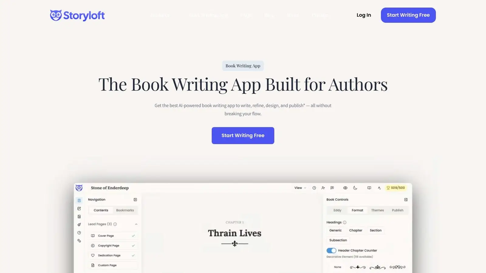
Integrated tools prove practical, not flashy. Storyloft is one example. It combines long-form drafting, manuscript-aware editing, cover and illustration tools, and export options for ebook and print inside one platform. Used well, that kind of setup reduces the copy-paste cycle that causes version confusion.
What an integrated workflow should handle
Whether you use one platform or a stack of separate tools, the workflow should solve the same core problems:
- Structure preservation so chapter headings, scene breaks, and front matter stay consistent across exports.
- Format switching so the submission file remains plain while the ebook and print outputs follow their own rules.
- Cleaner revisions because you're editing the source manuscript rather than chasing multiple derivative files.
- Export confidence so the PDF for print and the EPUB for digital stores don't require a full rebuild each time.
If your formatting process depends on remembering dozens of tiny manual fixes, the process is the problem.
A unified workflow doesn't replace judgment. You still need to know what an agent expects, what an EPUB can tolerate, and what a paperback requires. But once you know those rules, software should carry the repetitive load. That's the point where formatting stops feeling like punishment and starts behaving like production.
If you're ready to write, revise, format, and export from one manuscript instead of juggling separate tools, take a look at Storyloft. It's a practical option for authors who want drafting, editing, ebook output, and print-ready formatting in the same workflow.