What kind of data can I upload?
Any CSV file — survey results, spreadsheet exports, research datasets, sales data, statistics from published studies. Insight Studio supports up to 5,000 rows and 80 columns per dataset.

Upload your research, surveys, or statistics. Storyloft's AI surfaces what matters most — then turns it into publication-ready charts and infographics you can drop directly into your book.
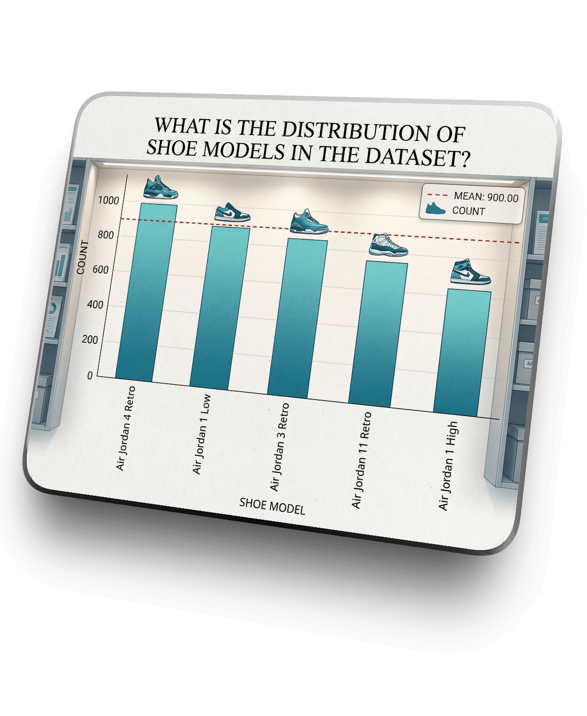
Upload your research, let AI do the analysis, and walk away with charts and infographics ready for your book.
Drag in your CSV files to begin the analysis workflow.
Refine dataset headers and remove statistical outliers.
Generate plain-language summaries and narrative goals.
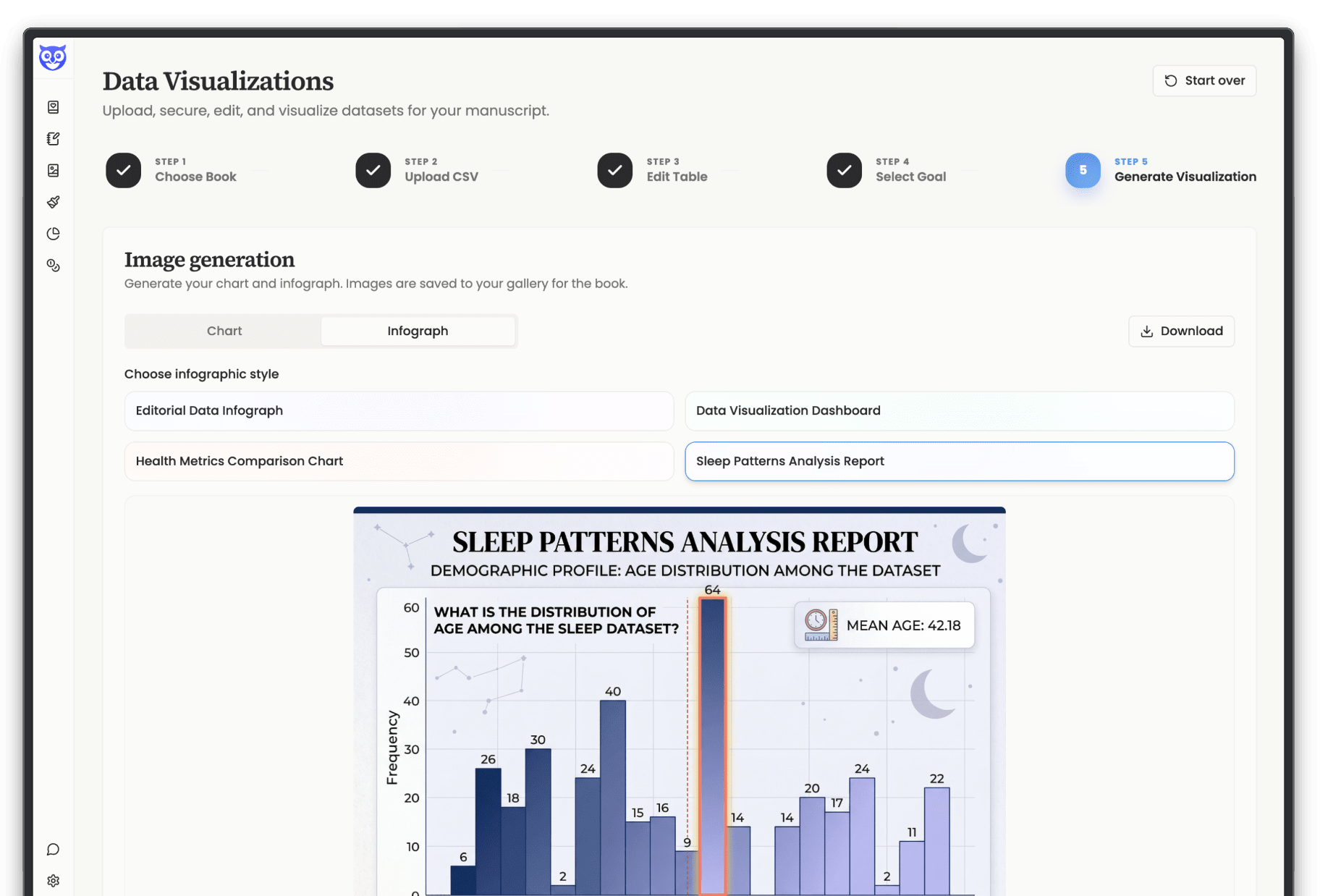
Transform raw numbers into professional infographics.
Save your results directly to your research gallery.
You've done the research. You have the survey results, the market data, the case study numbers that make your argument airtight. But prose alone can only carry so much weight. Readers scan. They skip tables. They skim appendices.
A single well-crafted visual does what three paragraphs of statistics can't: it lands.
The problem has always been that creating professional charts and infographics requires tools built for designers, not authors.
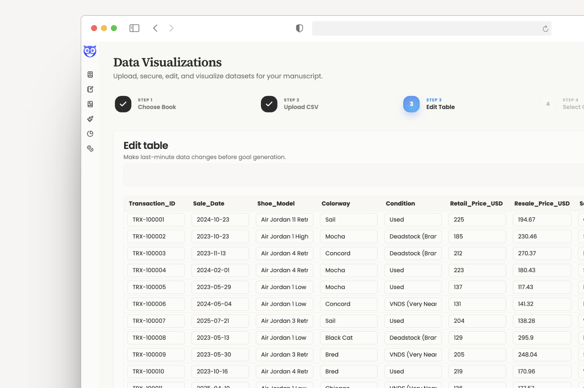
Drag and drop a CSV — survey results, financial data, research findings, population statistics. Storyloft opens it as a clean, editable table so you can refine before anything gets generated. Fix column labels, correct values, clean up formatting. When it's ready, commit a final version.
Your datasets stay attached to your manuscript and are editable anytime — so if your research evolves, your visuals can too.
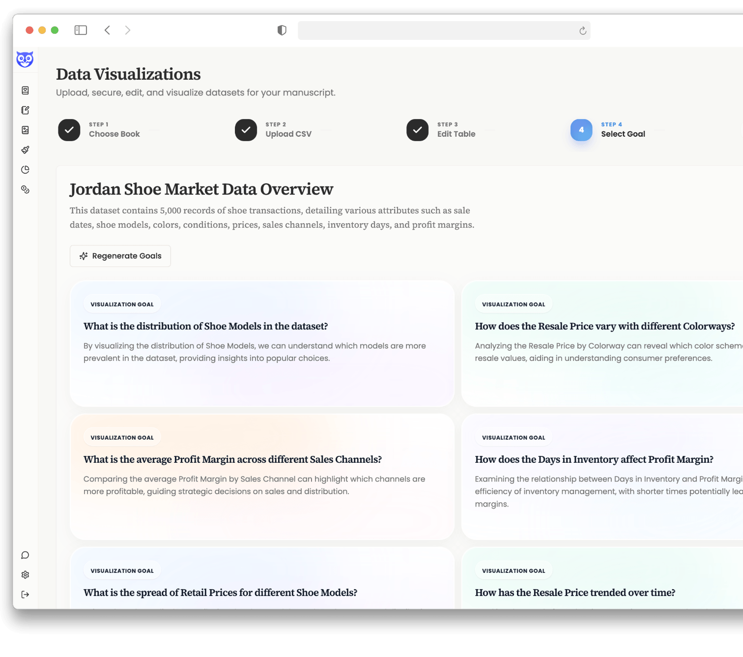
Once your data is committed, Storyloft's AI reads the full dataset and generates a plain-language summary — then surfaces a set of visualization goals: the specific questions your data is best positioned to answer visually.
Choose the angle that best supports your chapter's argument, or regenerate for fresh perspectives. No staring at a spreadsheet wondering what to chart.
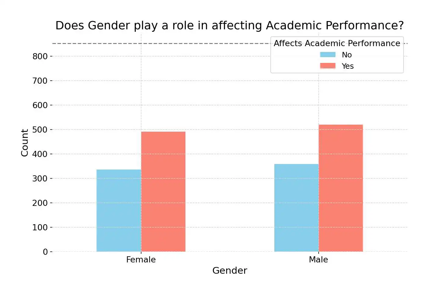
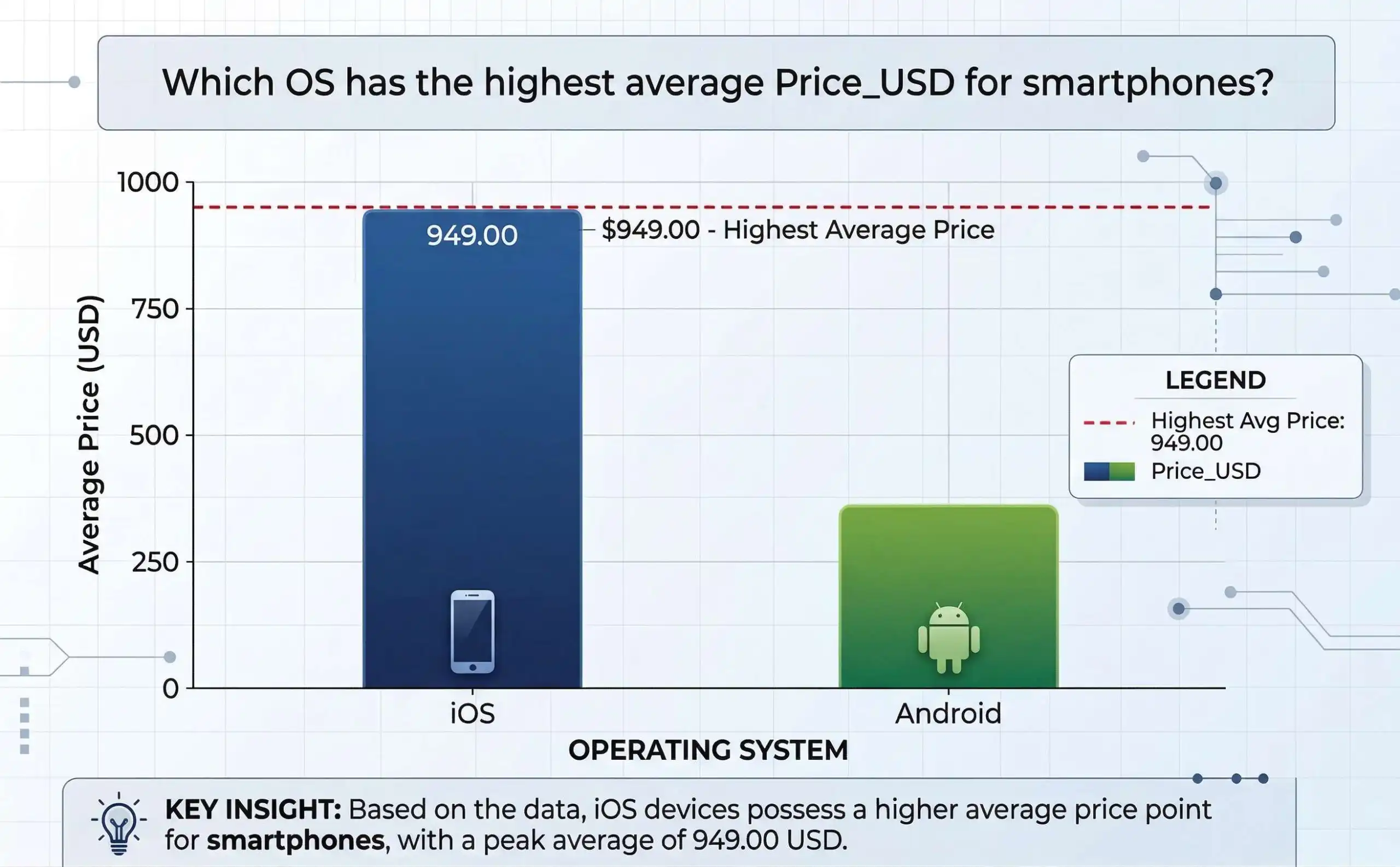
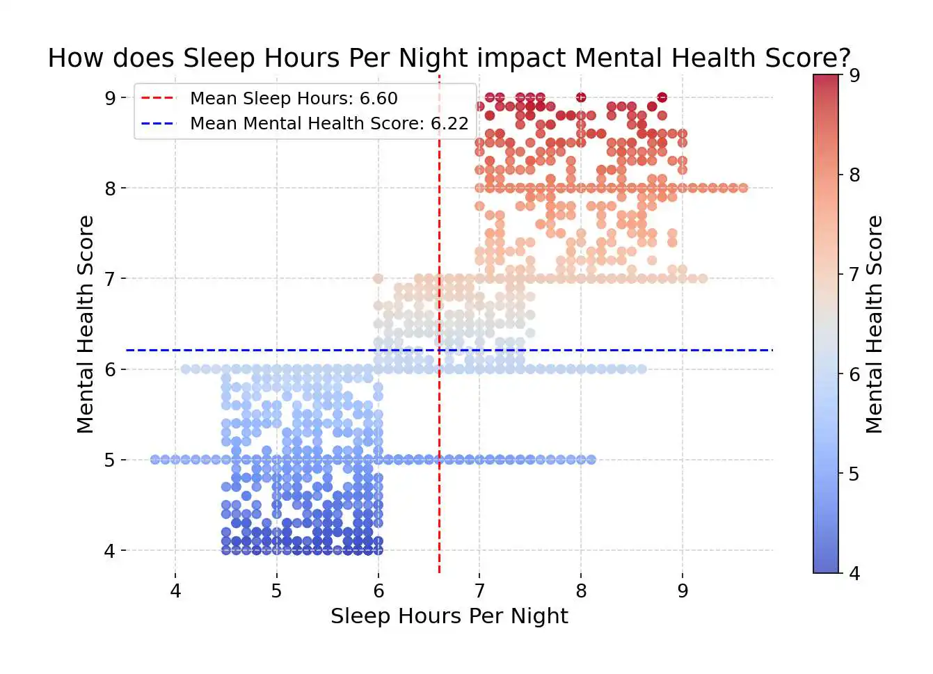
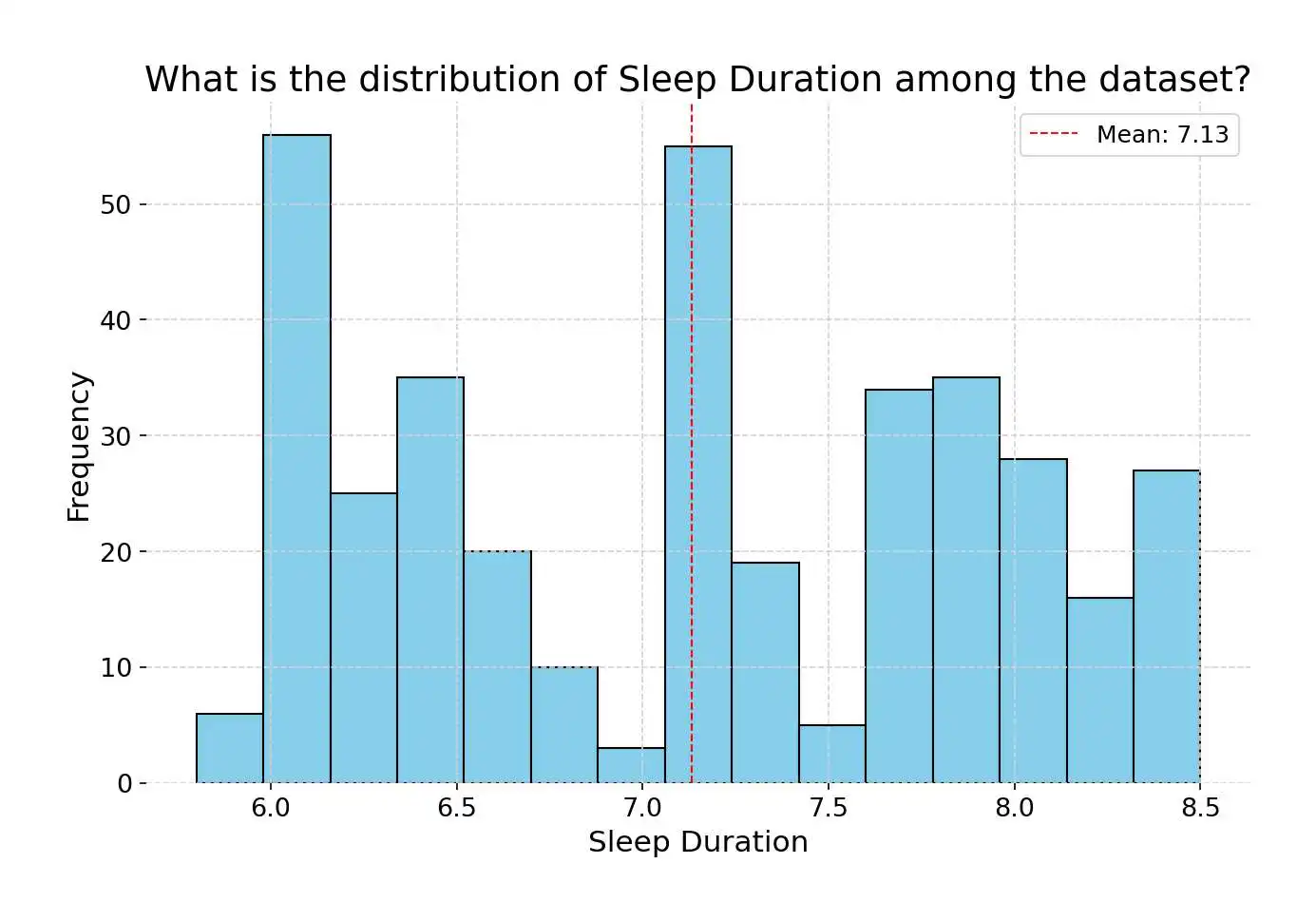
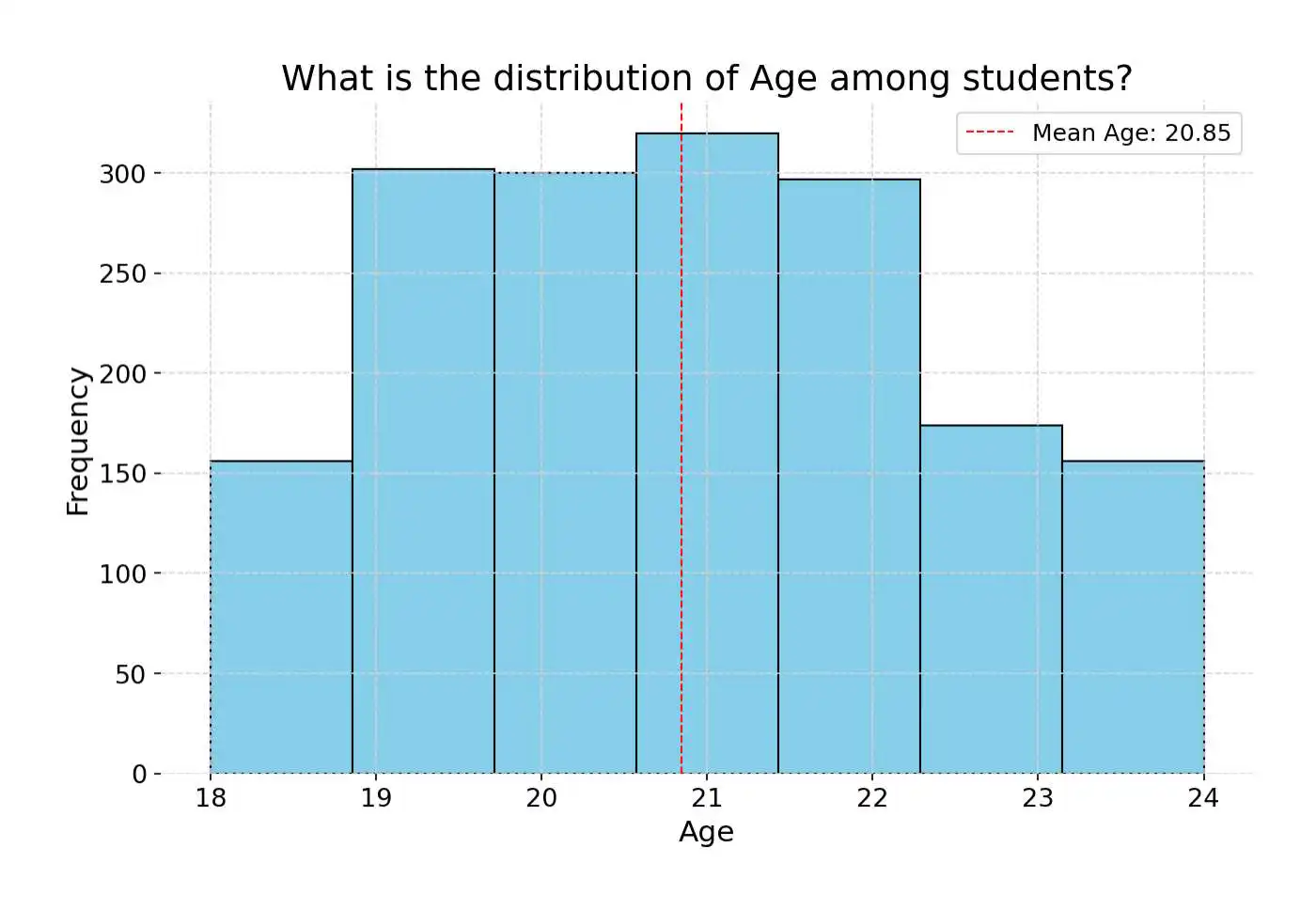
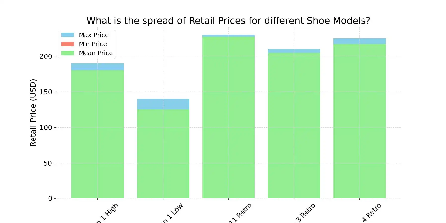
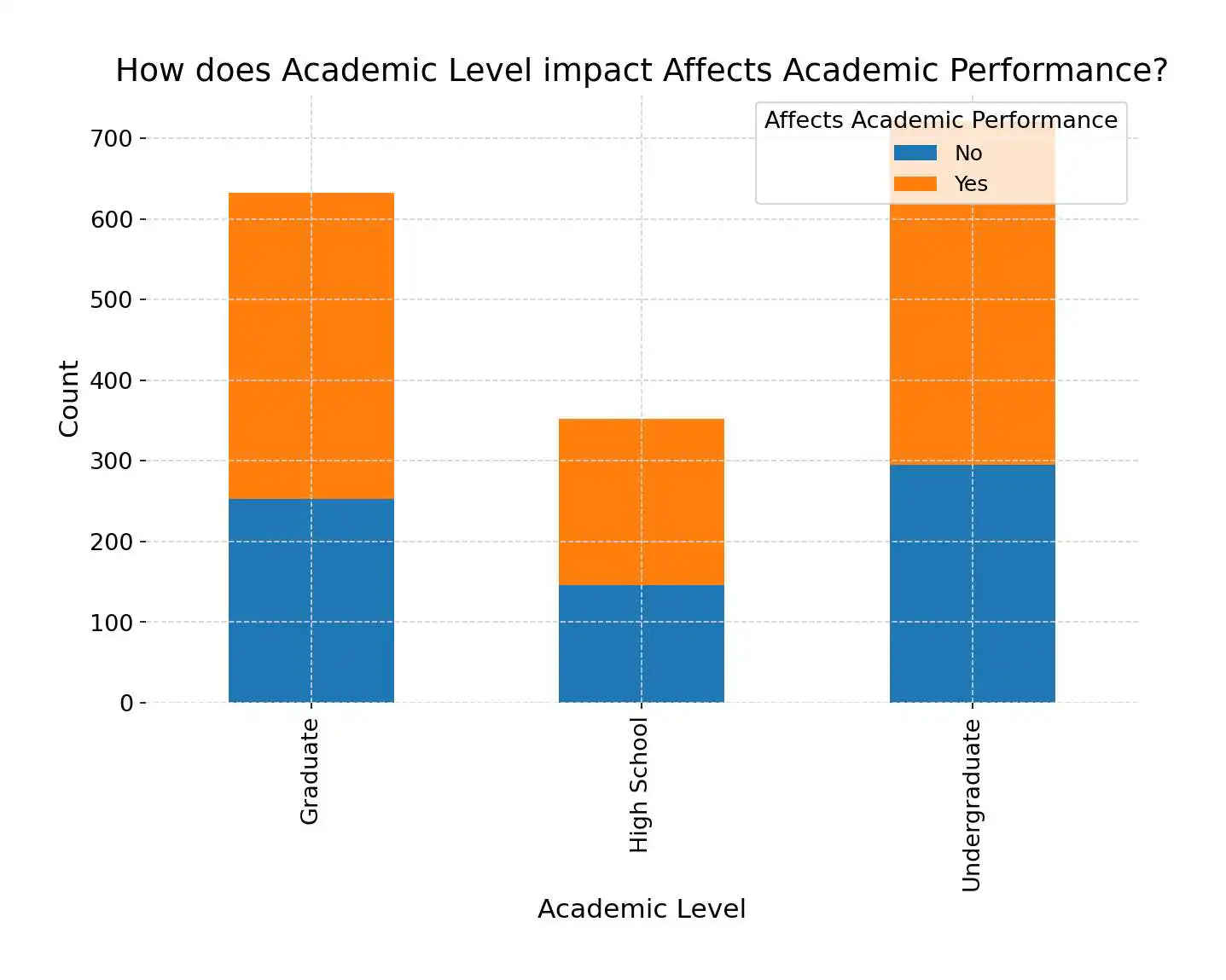
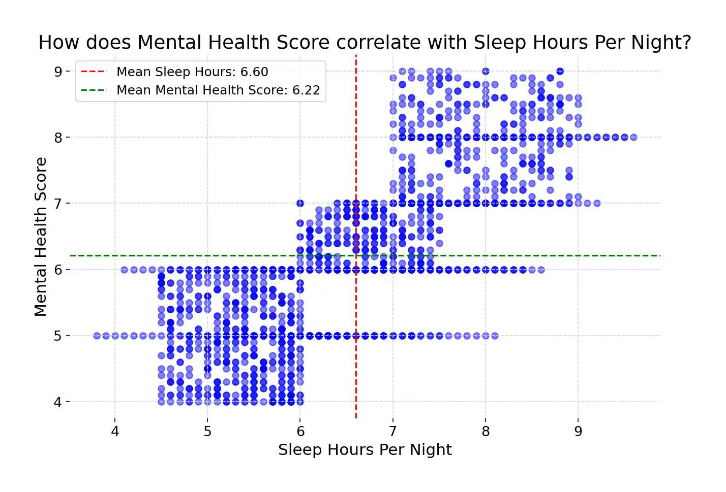
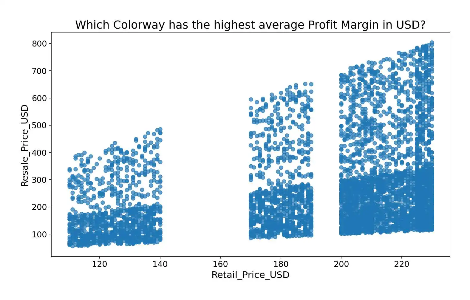
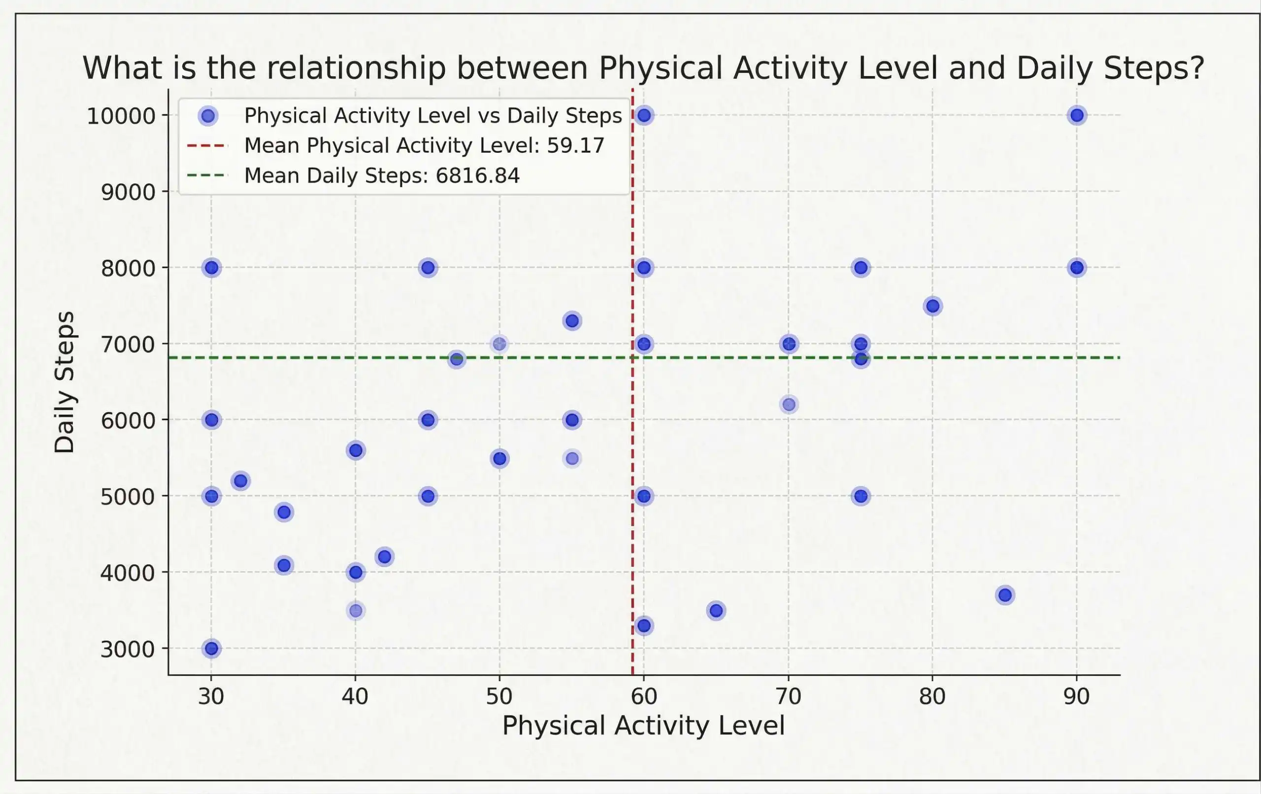
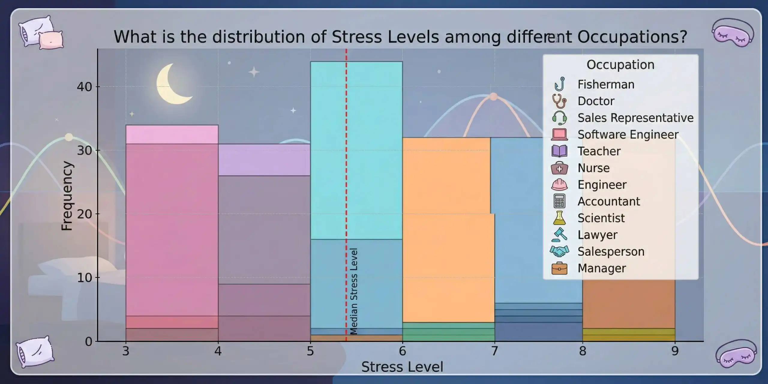
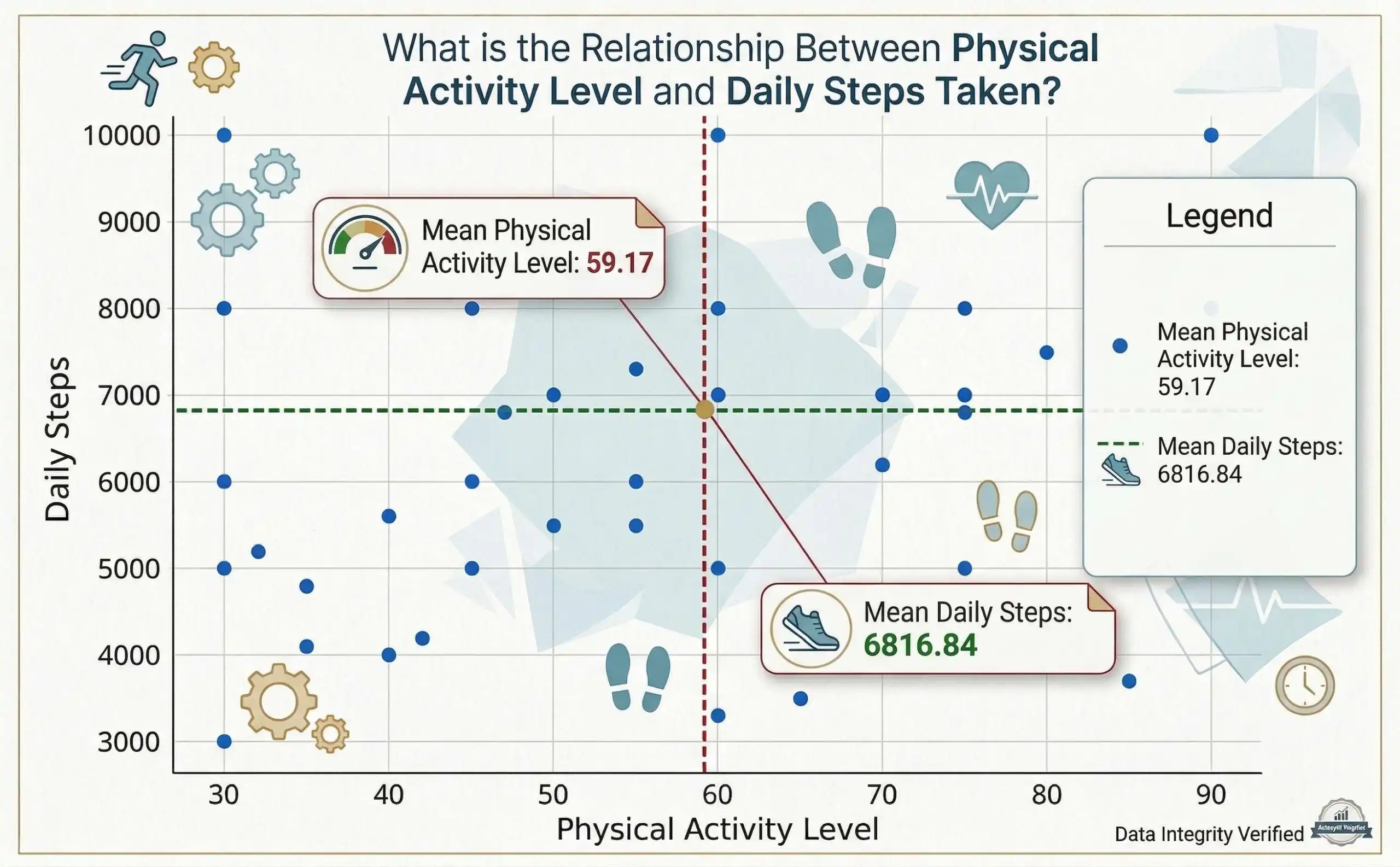
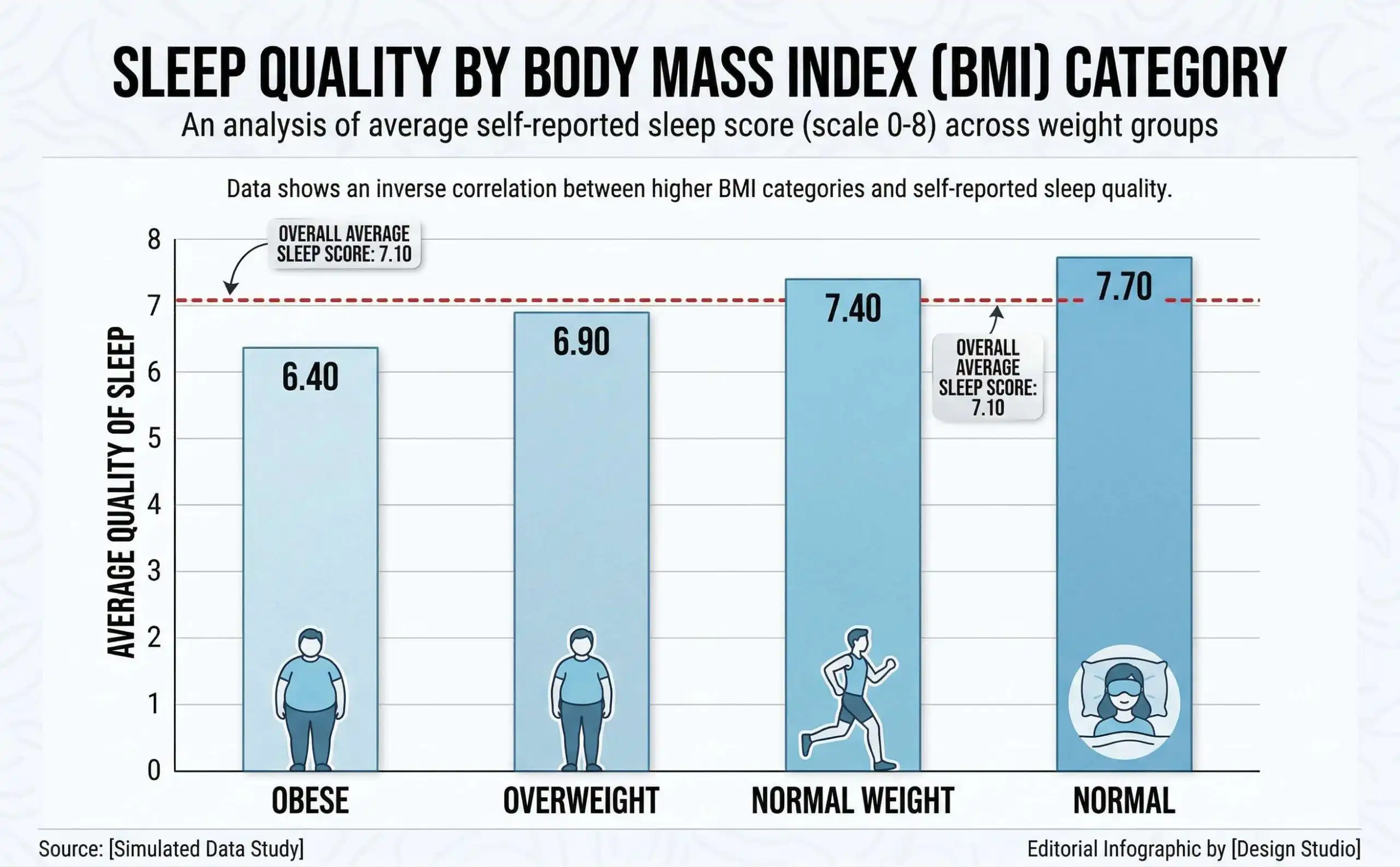
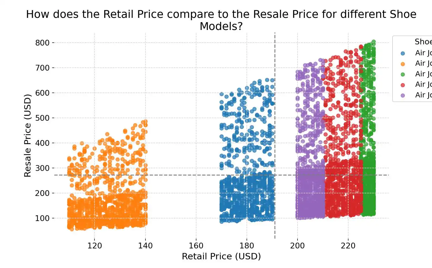
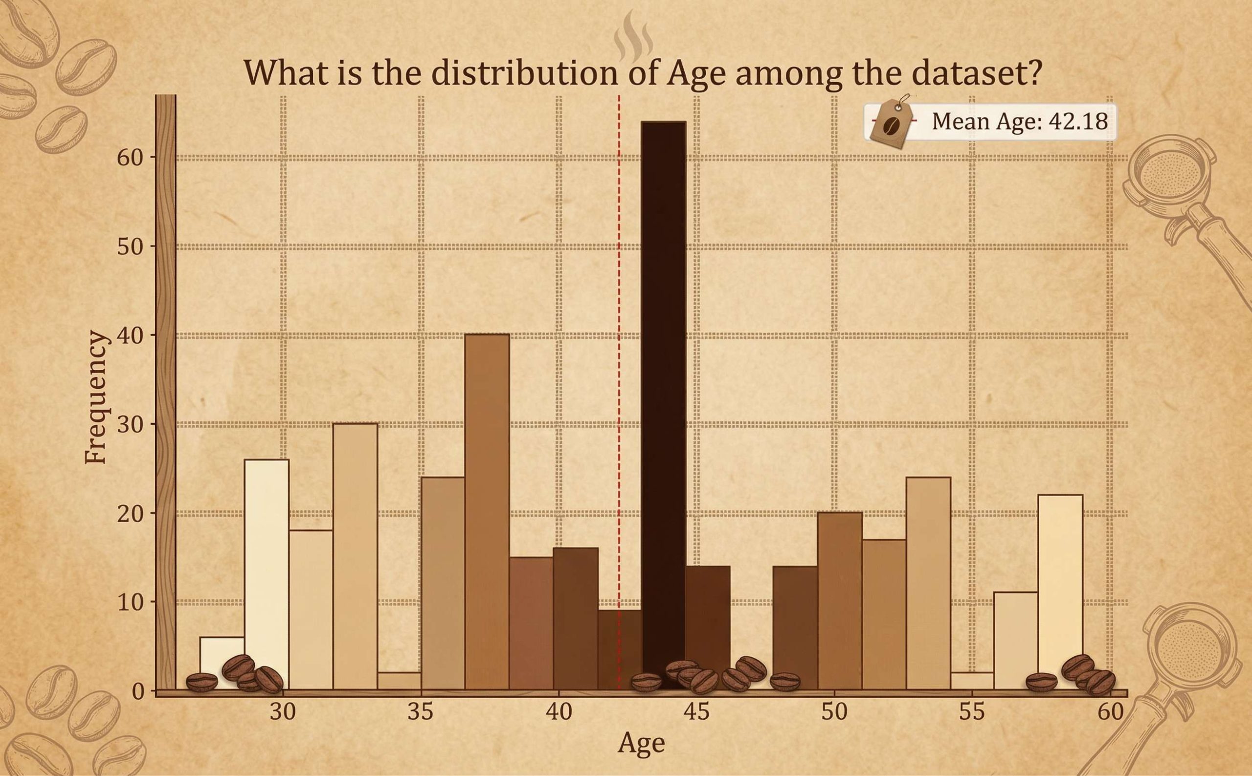
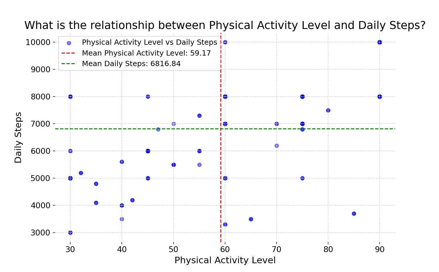
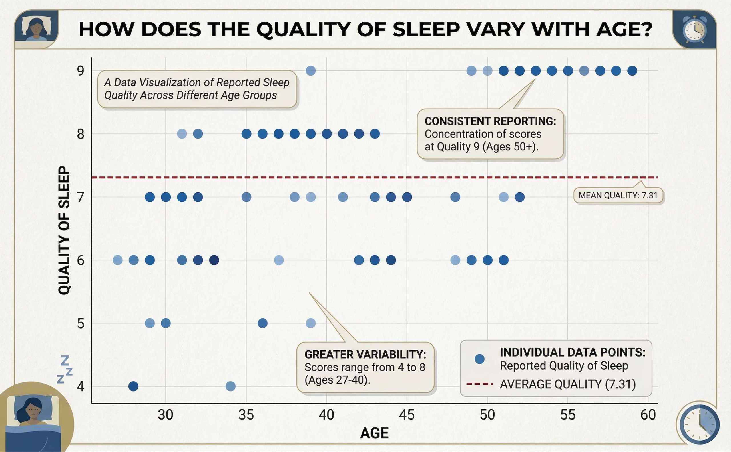
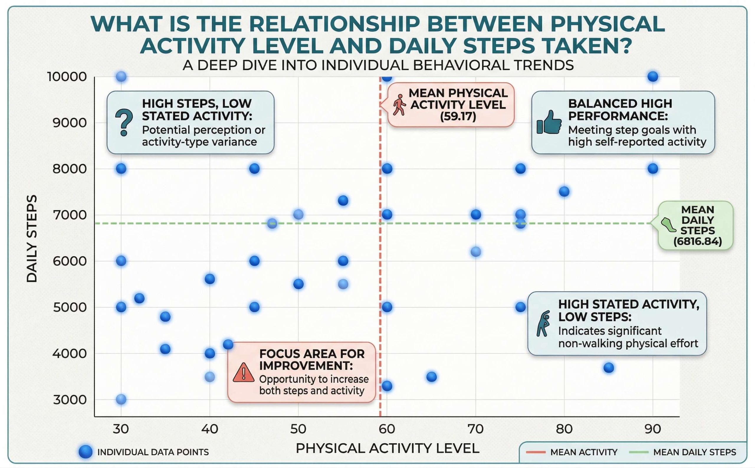
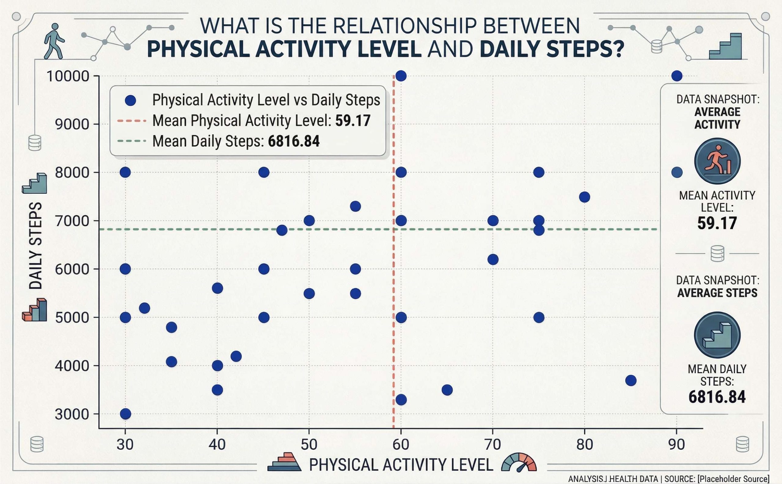
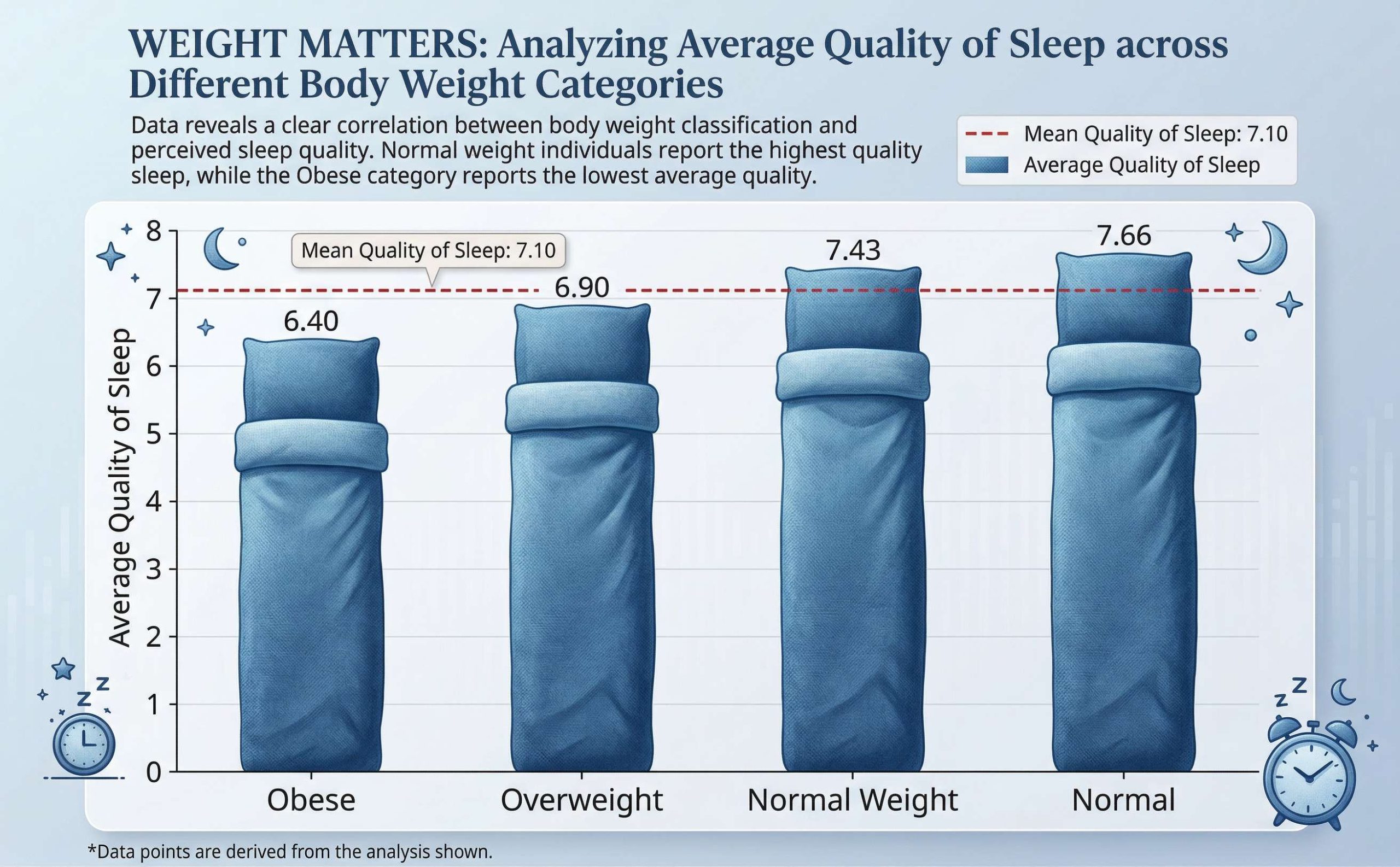
Choose a visualization goal and Storyloft generates a clean, high-resolution chart — bar graphs, line charts, scatter plots, and more. If the first result doesn't quite land, retry with one click. Every chart is automatically saved to your manuscript's illustration gallery and available to download.
What used to require a designer and a separate tool now takes thirty seconds.
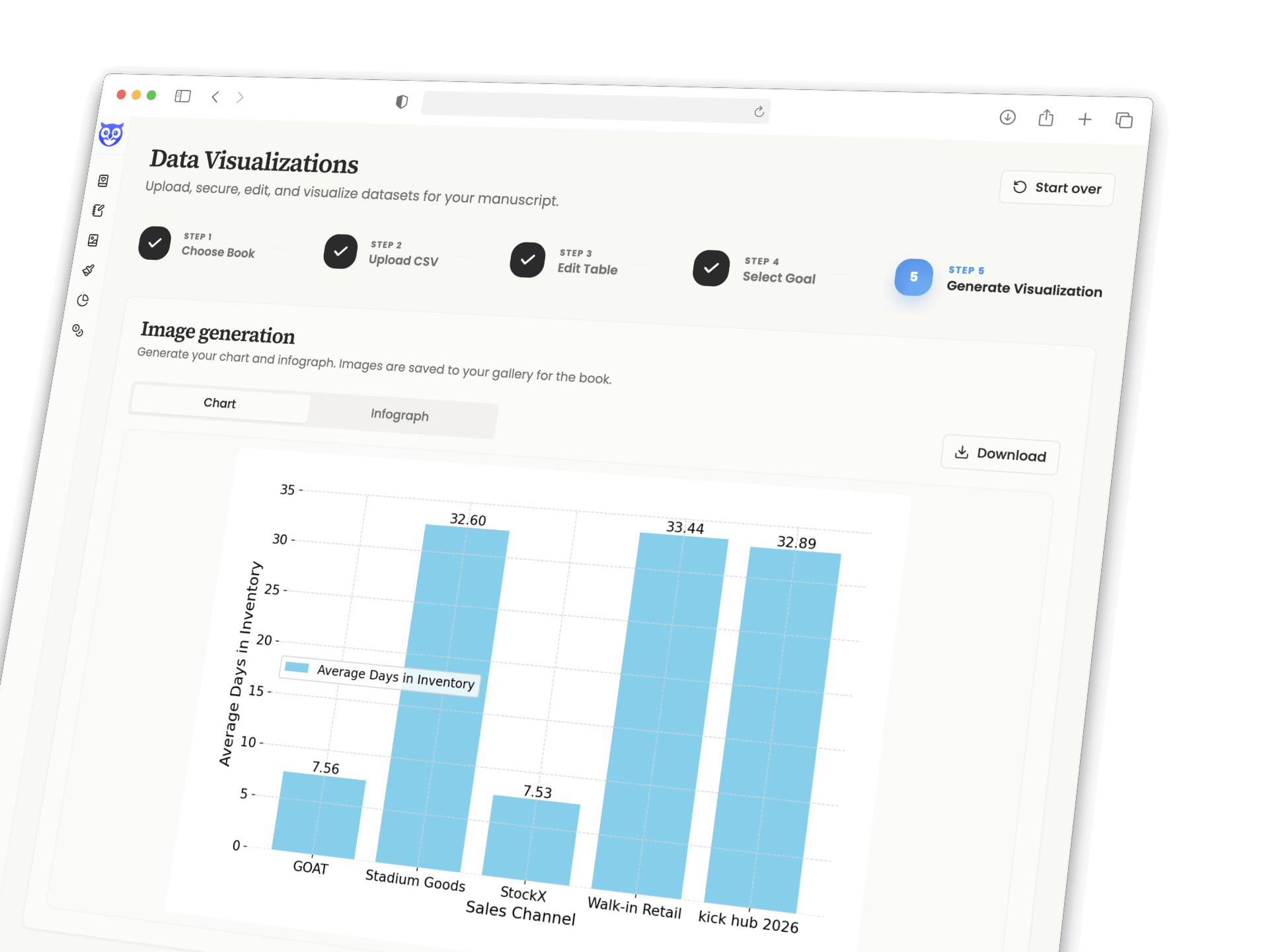
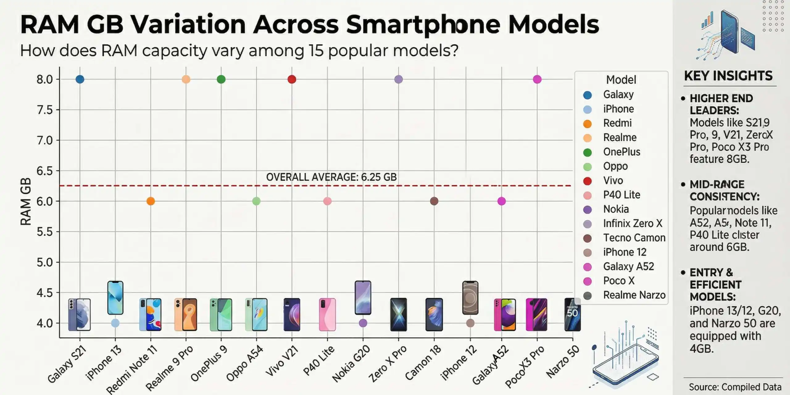
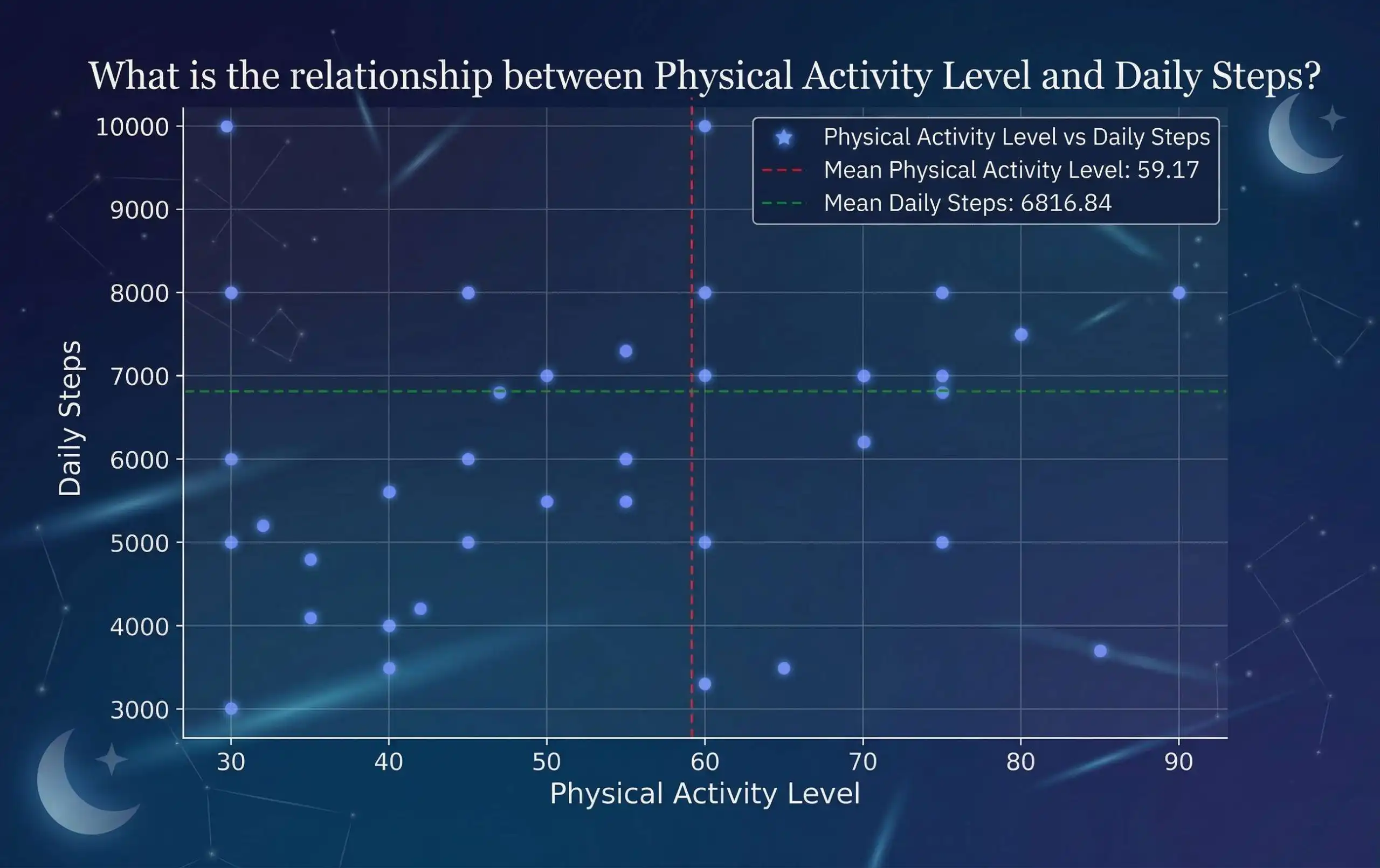
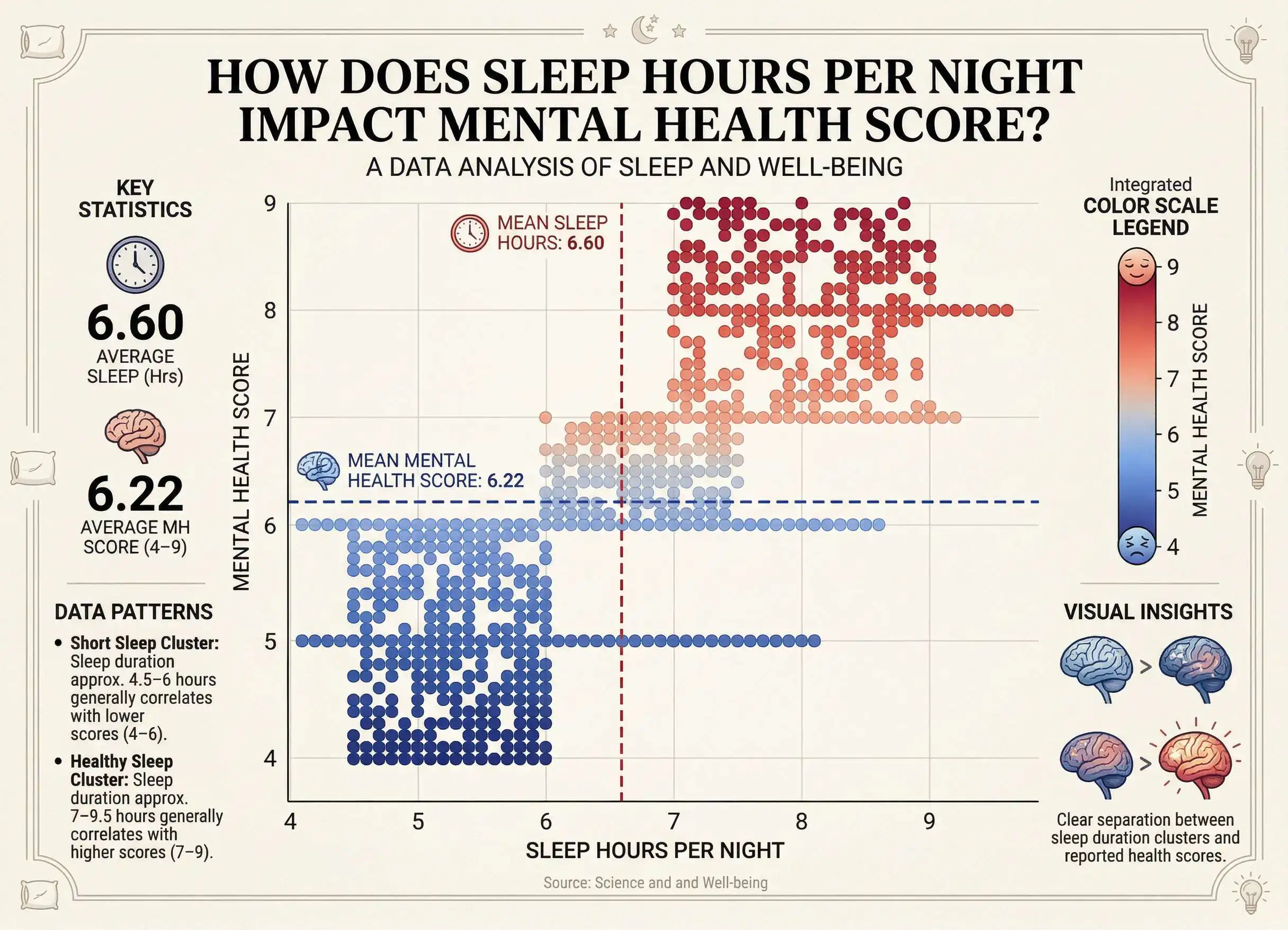
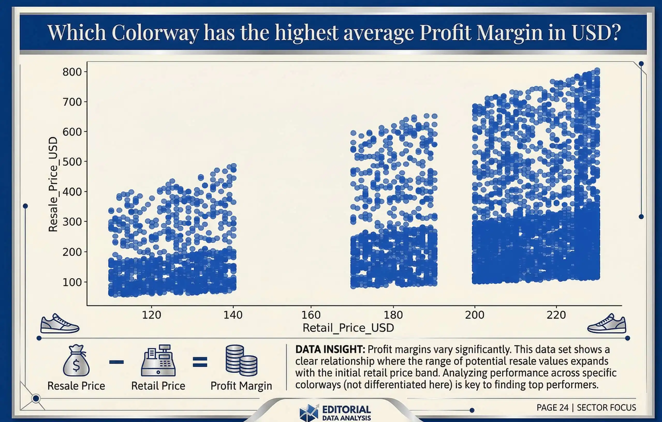
Take your generated chart further. Storyloft's infographic engine transforms it into a styled visual. Choose from multiple layout styles suited to business books, self-help titles, research-driven narratives, and more. The data stays accurate. The presentation becomes something readers actually stop to look at.
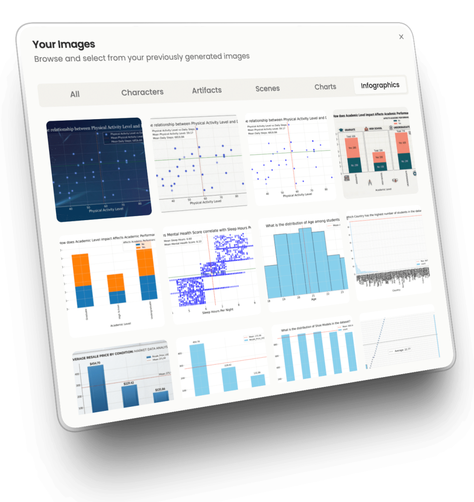
Every chart and infographic you generate is automatically saved as a manuscript image — no downloading, re-uploading, or switching tools. Find your visuals in the Illustrations gallery under Infographics, and insert them directly into any chapter, right where they belong alongside the text they support.
Your data visuals live inside your book from the moment they're created.
purpose-built for the books where data isn't a footnote — it's the argument.
Turn market research, performance data, and case study numbers into visuals that make your frameworks impossible to dismiss.
Bring behavioral research, survey findings, and habit-tracking data to life with visuals readers can see themselves in.
Present clinical research, study outcomes, and wellness statistics in a format your readers trust and remember.
Make complex financial data, economic trends, and statistical evidence clear, visual, and undeniably compelling.
Surface the patterns and turning points in your data that give your narrative its spine and show them to your reader.
Bridge the gap between scholarly rigor and general-audience readability with visuals that carry the full weight of your evidence.
View charts and infographs designed in Storyloft.
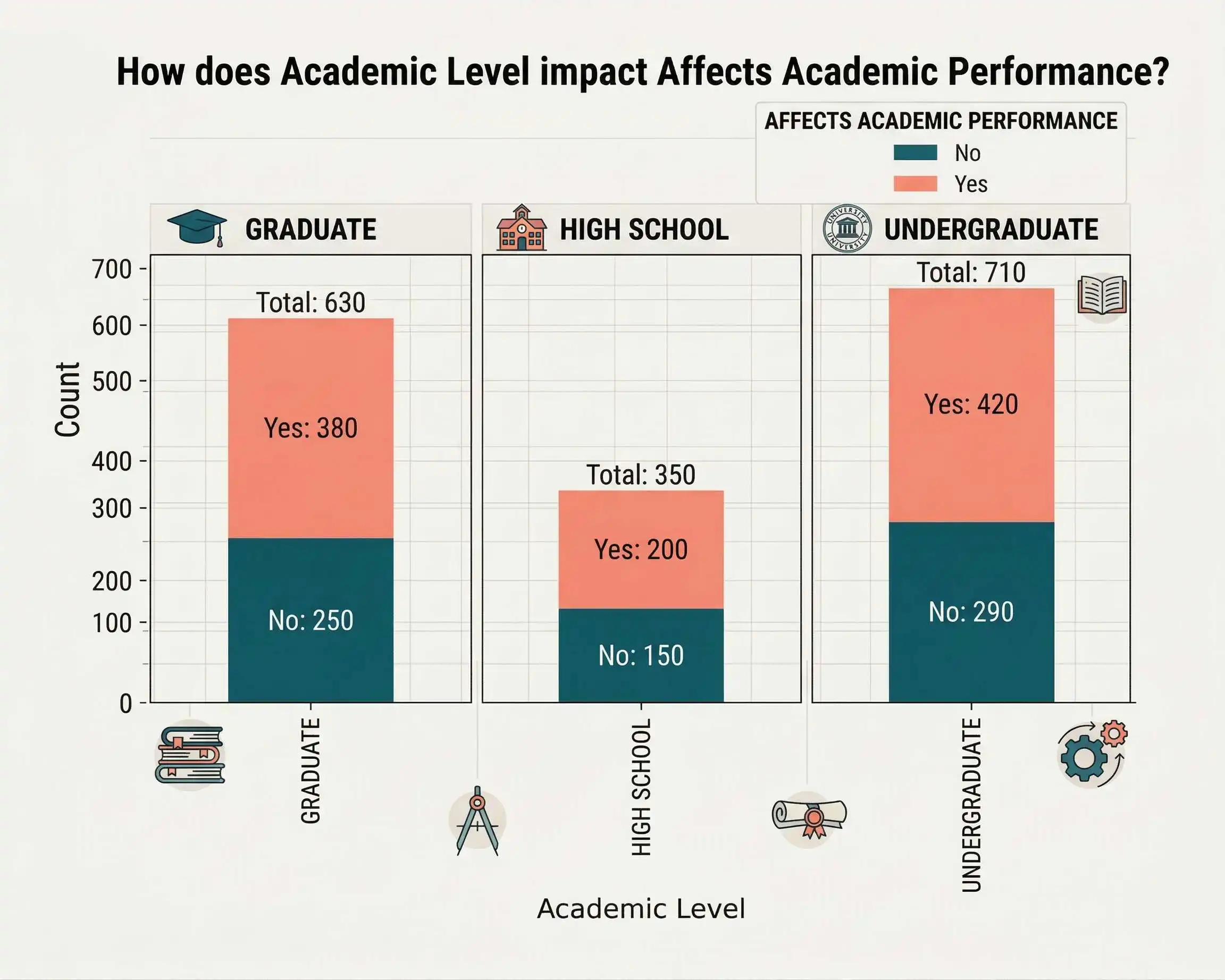
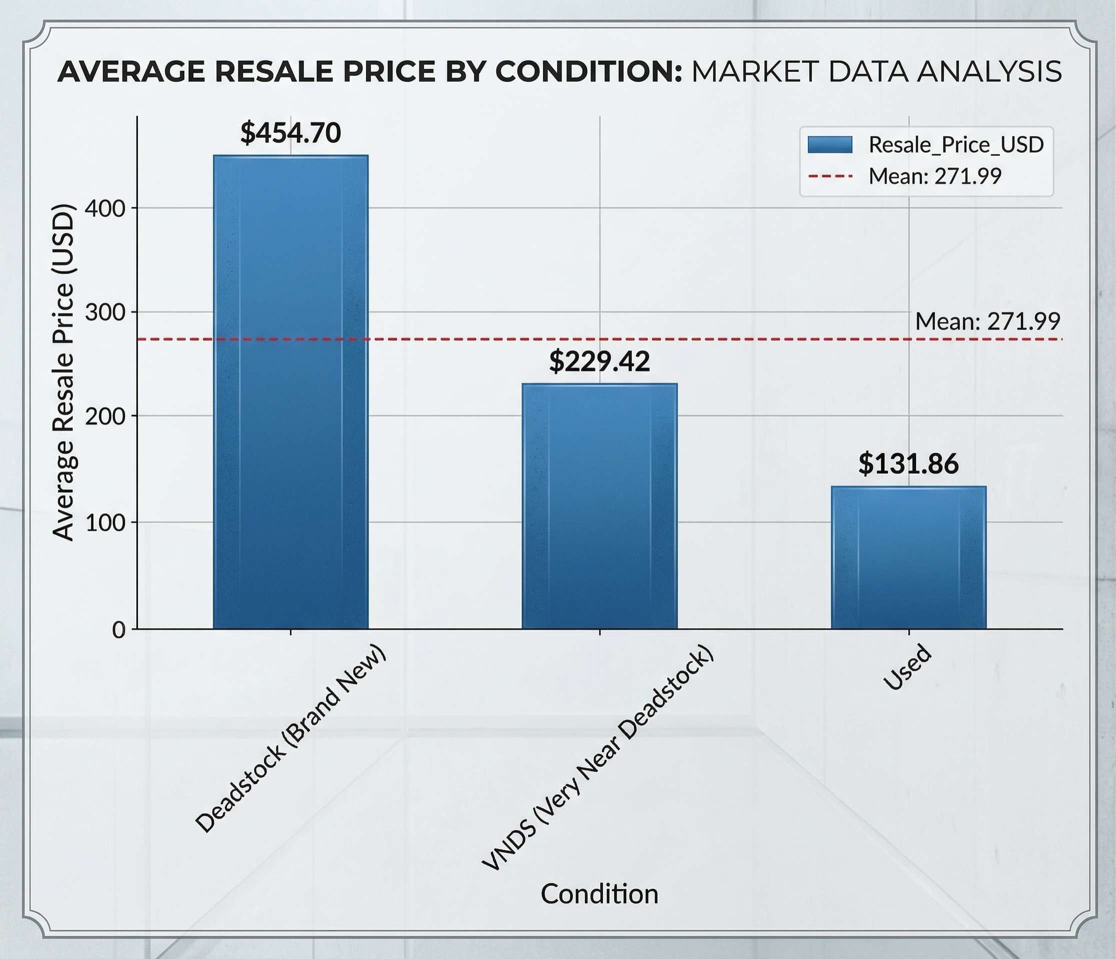
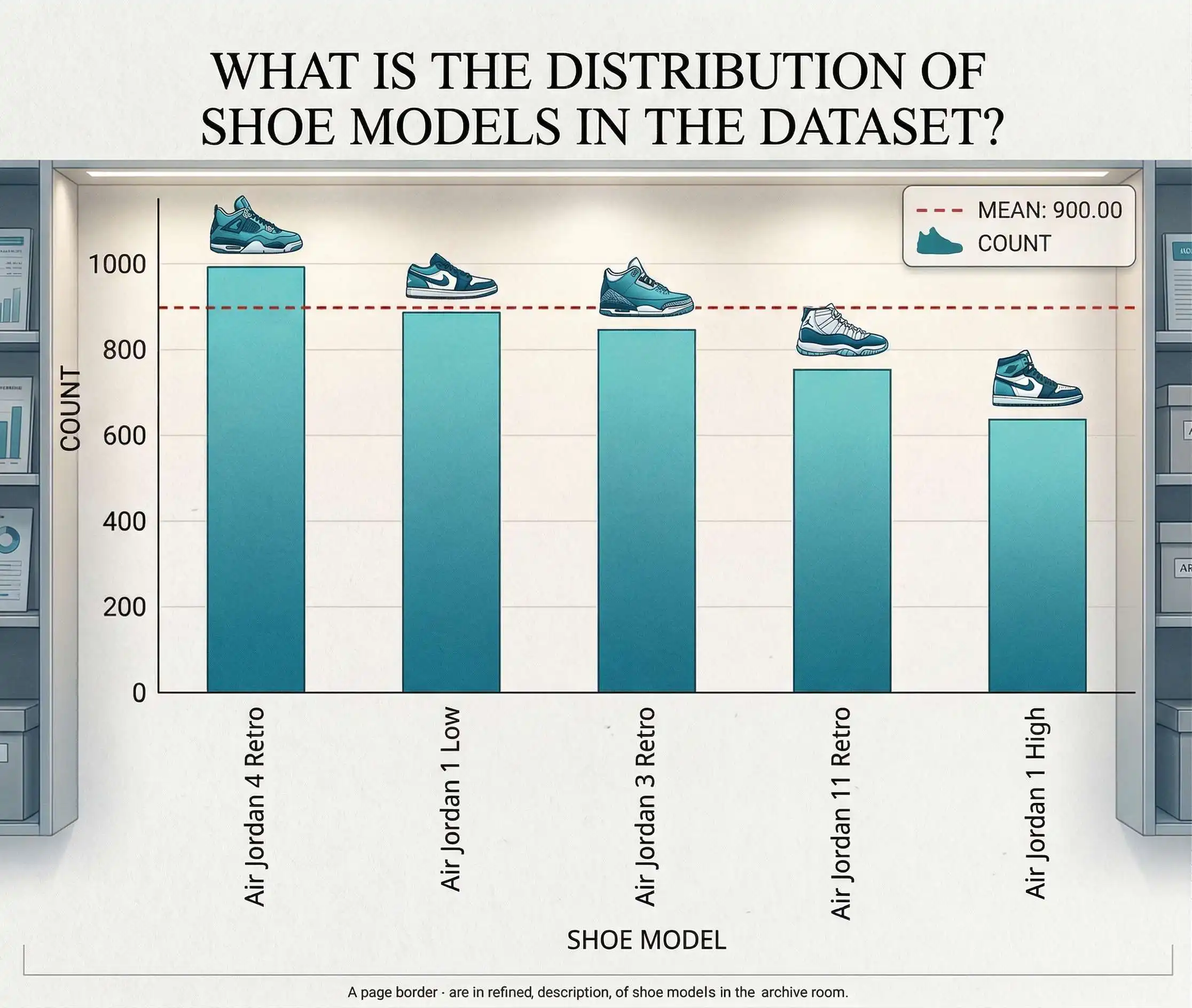
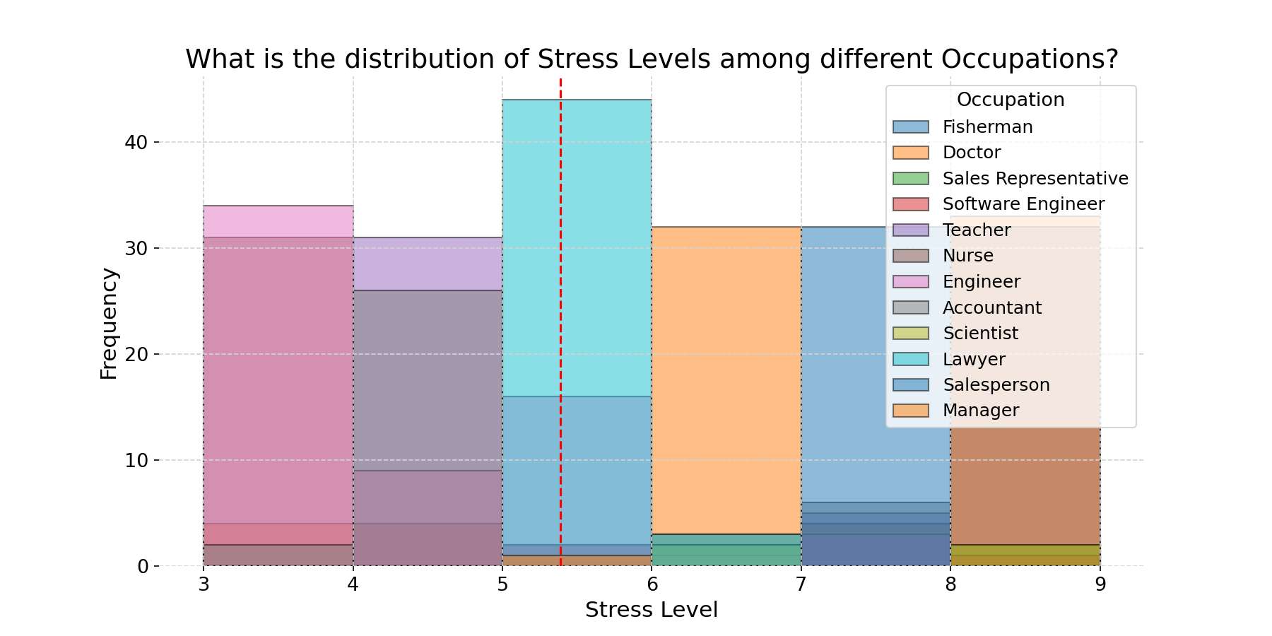
Everything nonfiction authors ask before uploading their first dataset.
Any CSV file — survey results, spreadsheet exports, research datasets, sales data, statistics from published studies. Insight Studio supports up to 5,000 rows and 80 columns per dataset.
Yes. Storyloft opens your data in a fully editable table where you can fix labels, update values, and clean formatting before generating anything. You can return and update your data at any time — and regenerate visuals with the revised dataset.
Bar charts, line graphs, scatter plots, and more — the chart type is chosen automatically based on your data structure and the visualization goal you select. If the first result doesn't land, retry with one click.
After you commit your data, Storyloft's AI reads the full dataset and generates a plain-language summary, then surfaces several visualization goals — specific questions your data is best equipped to answer visually. You choose the one that moves the needle for your chapter.
Every chart and infographic is automatically saved to your manuscript's Illustrations gallery the moment it's generated. Insert it into any chapter with one click — no downloading, re-uploading, or file management required.
Yes. Generating an infographic uses 4 image credits per visual. Image credits are purchased separately and can be topped up at any time from within your Storyloft account.
None at all. Storyloft handles every design decision — chart type, layout, style, and composition. You provide the data and choose the story. Storyloft handles the rest.
Your research is the foundation of your credibility. Insight Studio makes sure your readers actually see it — and feel it.